SALVÁ APARTMENT BARCELONA - POBLE SEC
This Pied-a-terre is situated in Poble Sec, a charming former worker´s district of Barcelona. One can see and experience the entire depth of the apartment and look from one end to the other, extending the space even further into the outside. Elegant materials were used in combination with light colors to give the spaces a simple but noble appearance. Materials like white Carrera marble, and oak for the herring bone parquet were used as reminiscence of the many wood and stone workshops in that area.
As typical for the area and time the apartment consisted of lots of small rooms, many of them lacking any natural light and ventilation. In order to meet the client´s needs, the apartment underwent a total redistribution and refurbishment. All small rooms were joint to form a free floating singular space, with the bedroom and bathroom set behind an imaginary, diagonally running line throughout the apartment. One has to step up in order to get into the bedroom or bathroom, almost like entering a house from the street, to enhance the separation between open and enclosed spaces.
Since the main issue was to fill the spaces with light, even inside the auxiliary spaces, we introduced several elements to create generosity and brightness.
Three large panels separate the bedroom from the living area. These panels can be opened in order to extend the bedroom into the space just in front, emphasizing visual connections. They are covered with linen textured wallpaper in two different shades-beige and dark grey- and enable changing the mood in one room or the other. A big glass wall was placed between bedroom and bathroom to bring in more natural light, and to allow seeing to the outside when using the bathroom. A curtain allows for privacy when needed.
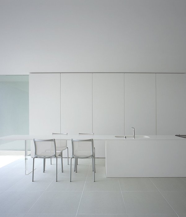
In the center of the apartment sits the open plan kitchen with its isle, separating living and dining area. Only here the ceiling is lowered to compress the space and house the air conditioning. The ceiling with its beautiful wooden beams, and the upper part of the brick walls stayed exposed, whereas the lower part was covered with plasterboard to improve insulation and hide all installations. The corners of these walls are curved to soften the “boxiness” of the space, and reduce dark corners. The upper part was painted in white, but the lower part in a light grey to bring out the different treatments of the walls and ceiling.
Instead of wasting space for a second bedroom, we opted for a built-in bed in the corner of the writing desk. It can be taken out when a guest stays over, but goes unnoticed when not in use.
{{item.text_origin}}

