墨西哥 Tulum 住宅区的有机设计之美
Architects:Gabriel Konzevik, reyes rios + larraín
Area :2300 m²
Year :2017
Photographs :Edmund Sumner, Pim Schalkwijk
Design Team : Salvador Reyes Ríos, Josefina Larraín, Gabriel Konzevik, Carlos Fleischer
Clients : Simca
Engineering : Simca
Landscape : Josefina Larraín
City : Tulum
Country : Mexico
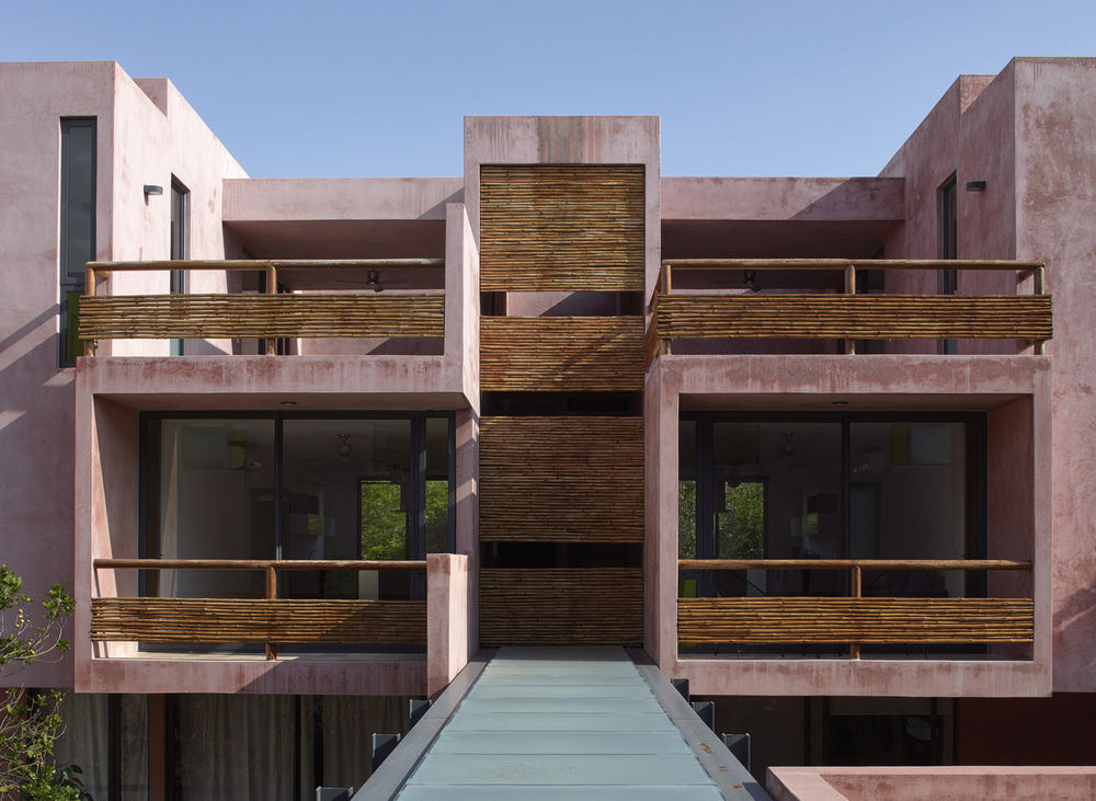

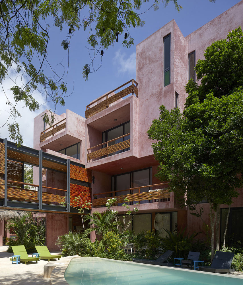
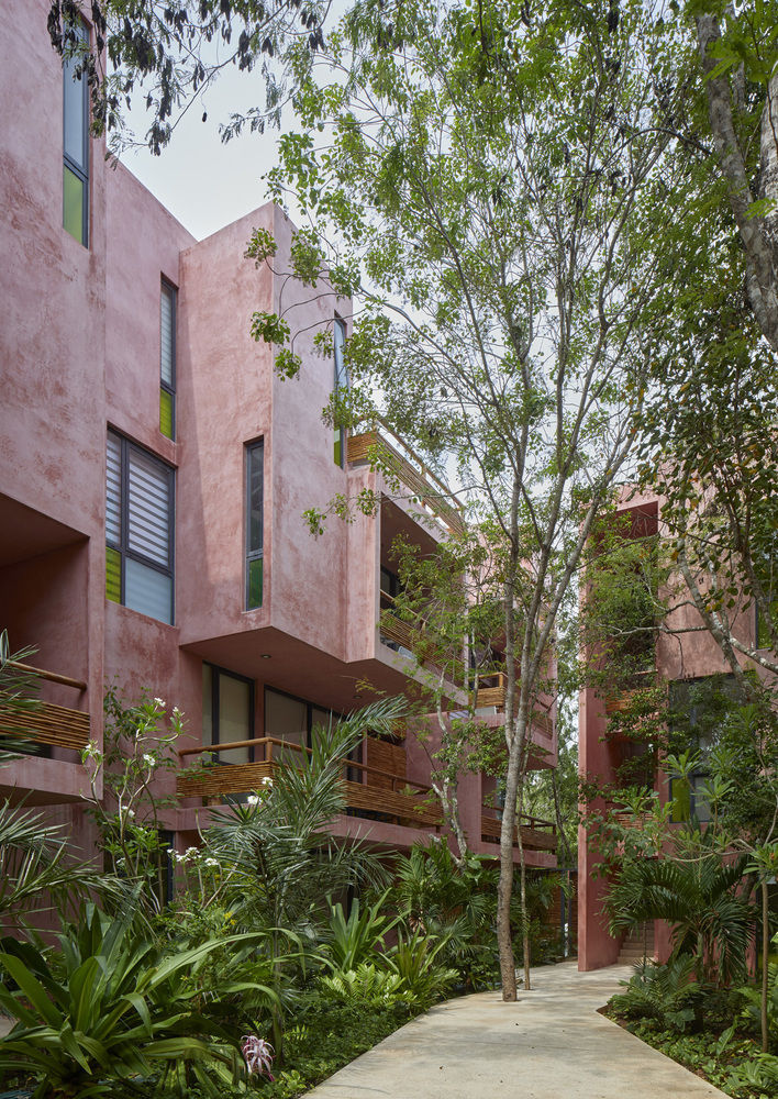
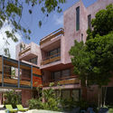
Located in Tulum, Quintana Roo in México, the design for the medium density apartment complex, targeted to a mid to high income market, has its basis on the following premises: - Improve the sense of community among the residents inside the scale of the complex, introducing meeting places into the architectural program. - Improve the sense of individuality and privacy inside each unit, using transitional spaces and thresholds between social and private areas of the apartment layouts - Reduce the energy consumption of each unit as much as possible by the composition of all the component bodies and their scale. - Preserve and relocate as much of the present flora as possible, while introducing new landscape compatible in density and composition with the endemic landscape of Tulum. - Create a building noted by the use of organic materials typical of the region, weather resistant and that age beautifully, contraposed with industrial materials which are cost effective for a commercial project with high quality design and a character of its own.
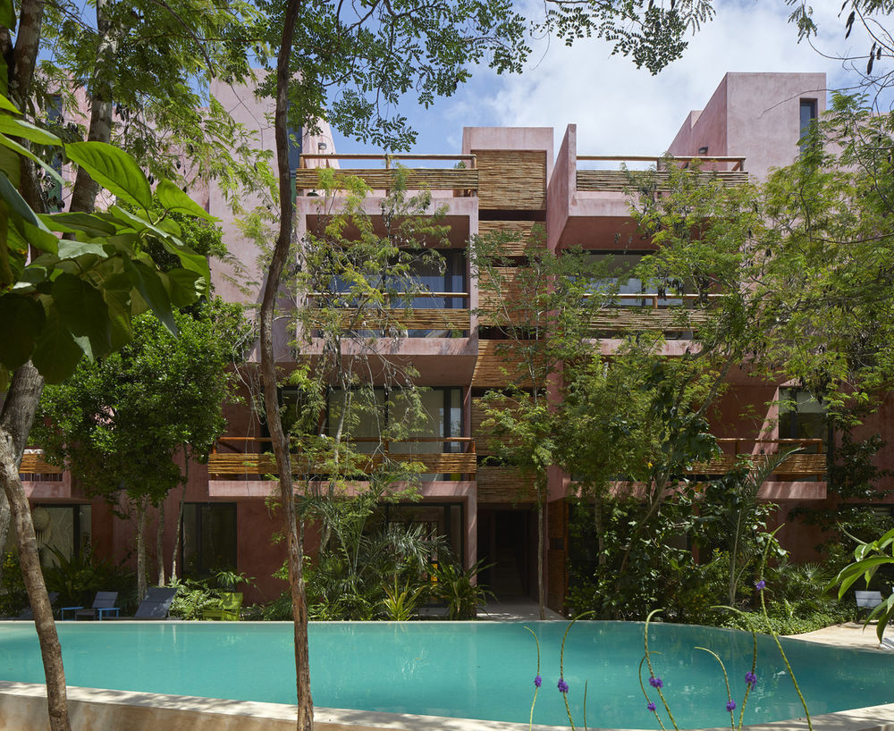
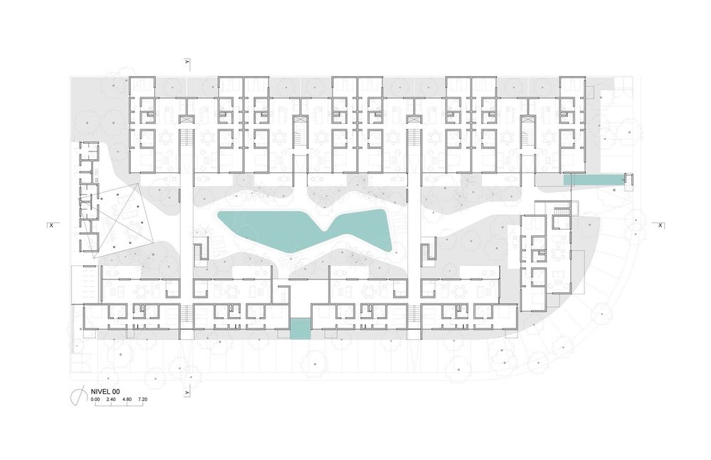
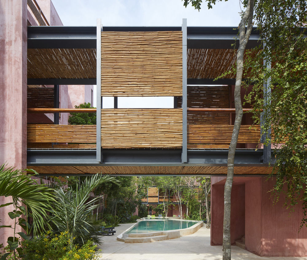
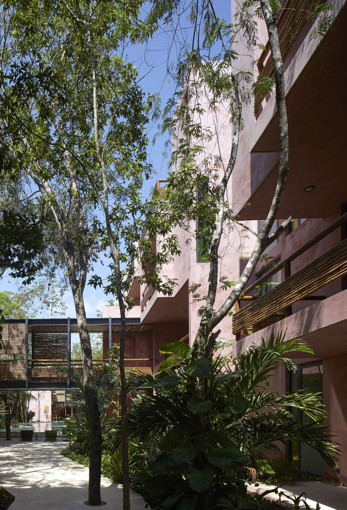
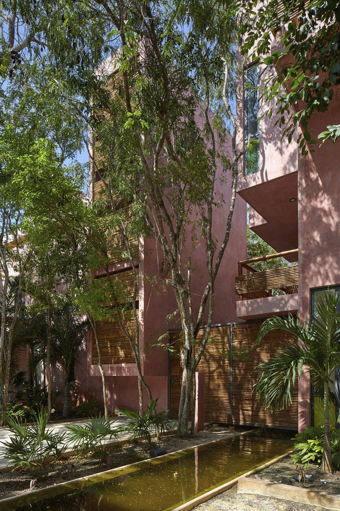
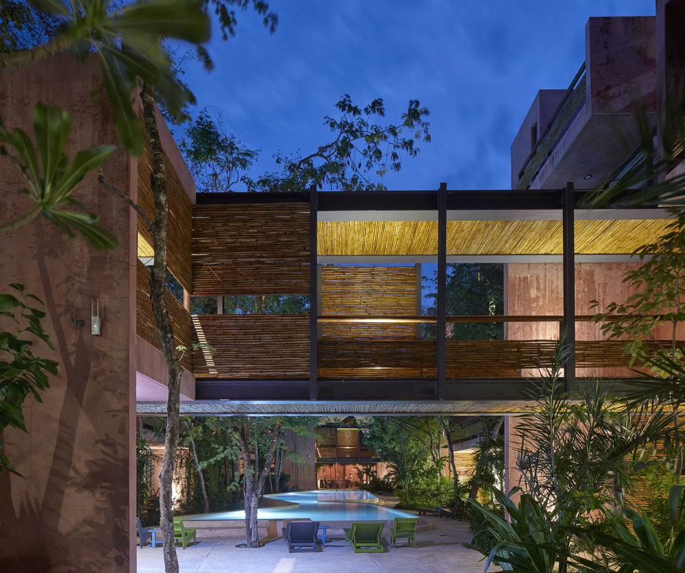
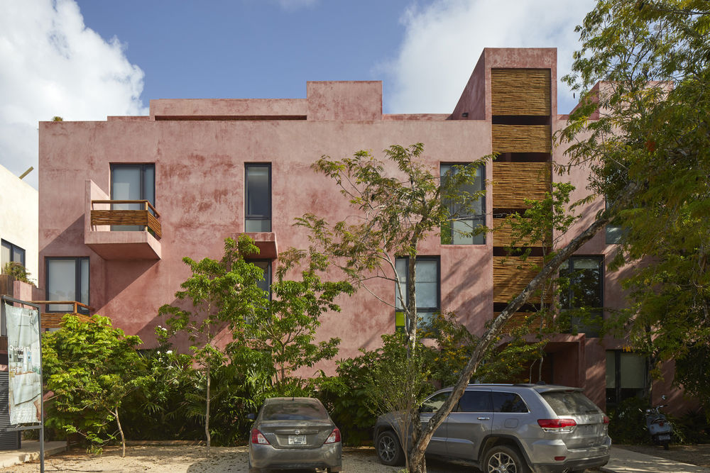
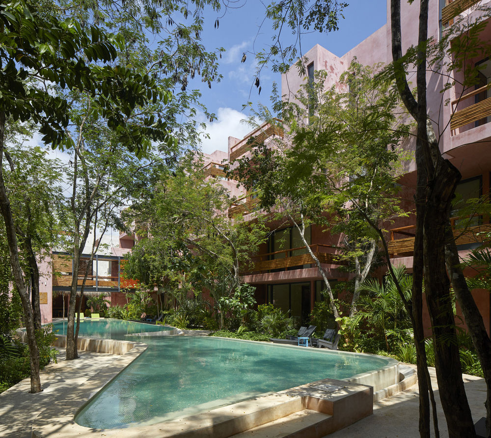
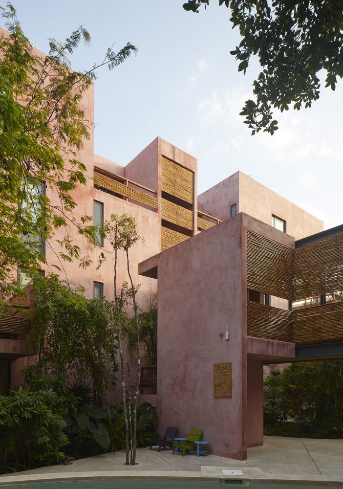
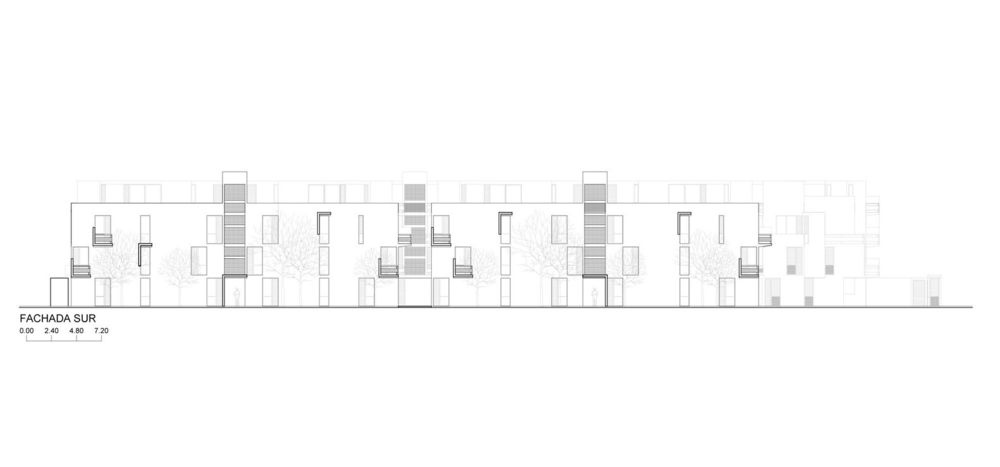
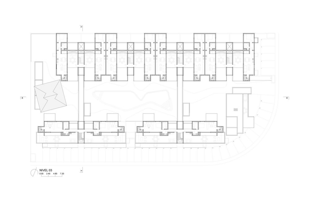
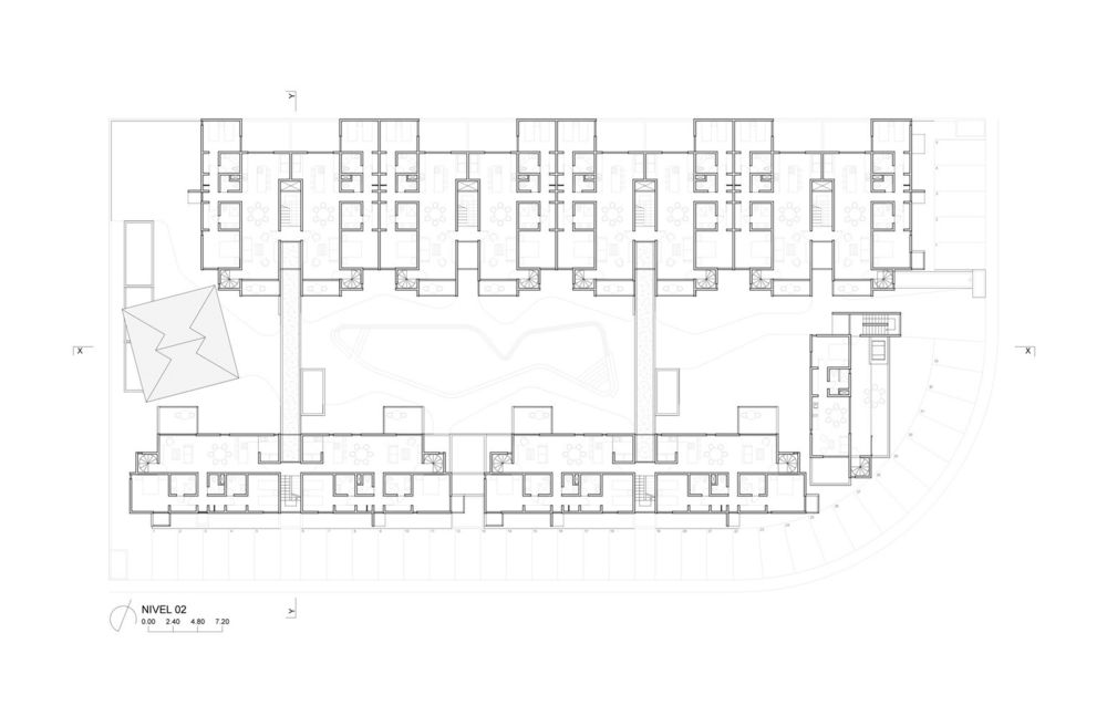
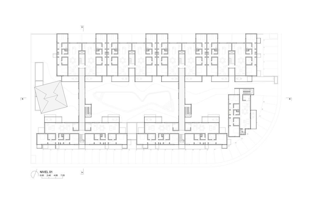
The result is a set of 38 apartments in three configurations, varying from 2 and 3 bedrooms and 110 and 220 sqm. The program also includes common areas, parking lot and service areas.The total built area is 5,600 m2, distributed in four narrow blocks of different sizes, according to their importance in the program and its position in the 3,700m2 rectangular plot. Two blocks have four storyes to a height of 12m and run across the plot from east to west, also catching natural breezes. A third three-story building closes the short side towards the corner of the plot that overlooks and connects the plot with the park across the street and creates a natural access plaza to the complex. The fourth block houses the services and the palapa, whose double height protects from the setting sun from the heart of the project named the patio of water and wind. This large central open space is the result of aligning the narrow blocks to the limits of the perimeter, thus achieving an average distance of 16 meters between each building that ensures a desirable visual distance, while at the same time configuring an expansive space of 55 meters long where the swimming pool is located. It is important to point out that at the street level, this wide longitudinal space is completely free for pedestrian traffic, thanks to the addition of two bridges that join the long blocks and at the same time make circulations more efficient by eliminating flights of stairs at the access level. Finally, the patio of water and wind not only is the convener and distributor space of the complex, it also contributes in itself for 20% of the green and permeable area of the project. It is part of the particular experience of inhabiting this housing complex in its relationship with the extraordinary tropical and domesticated environment in which it is located.

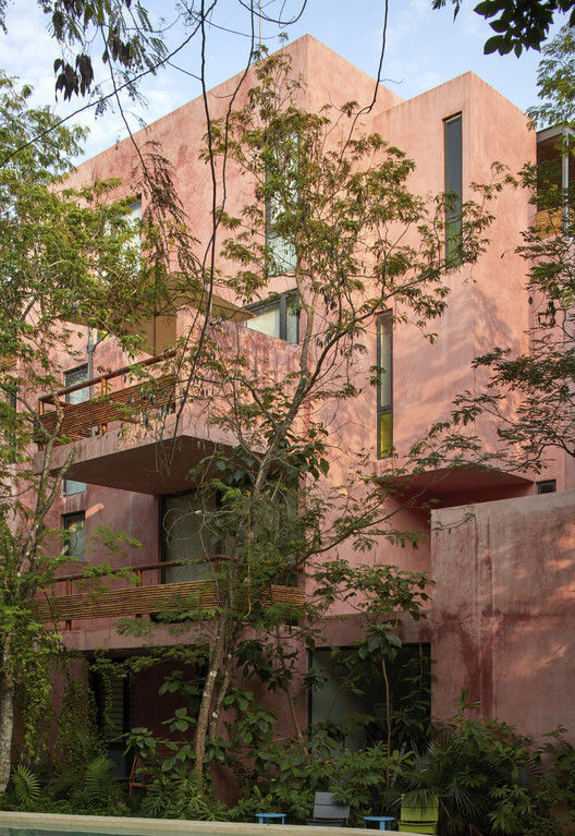
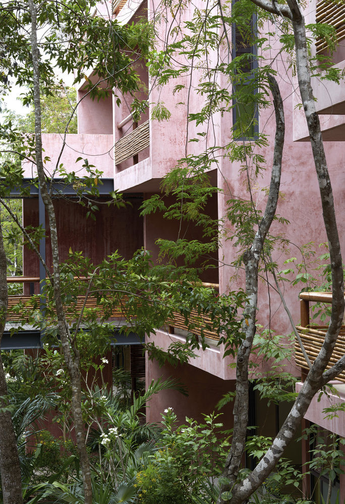
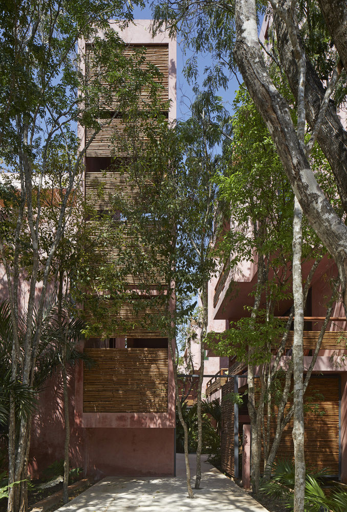
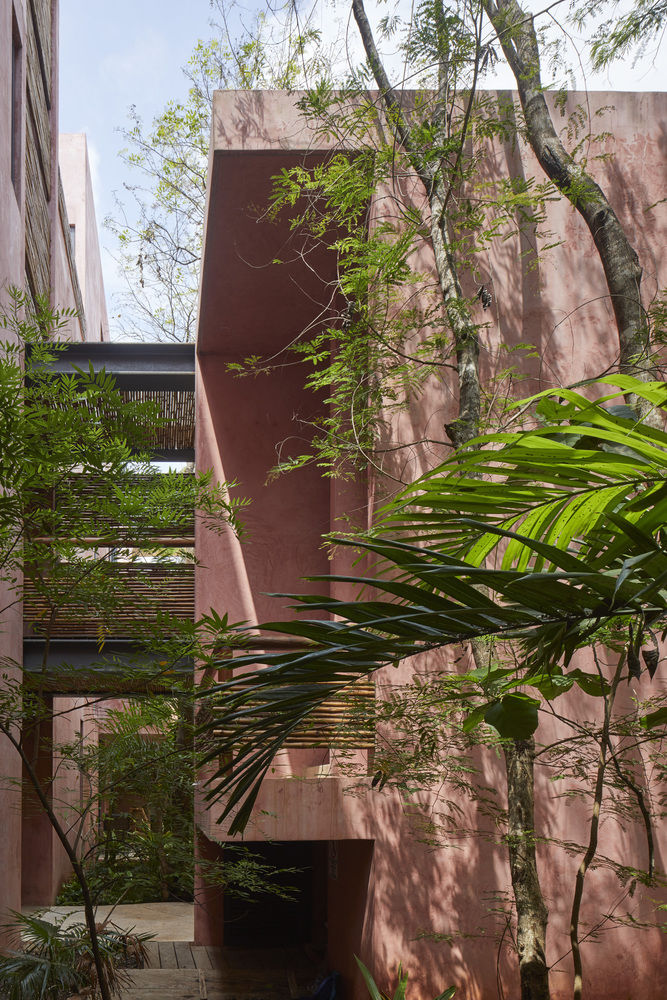
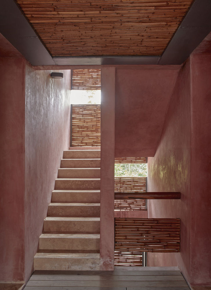
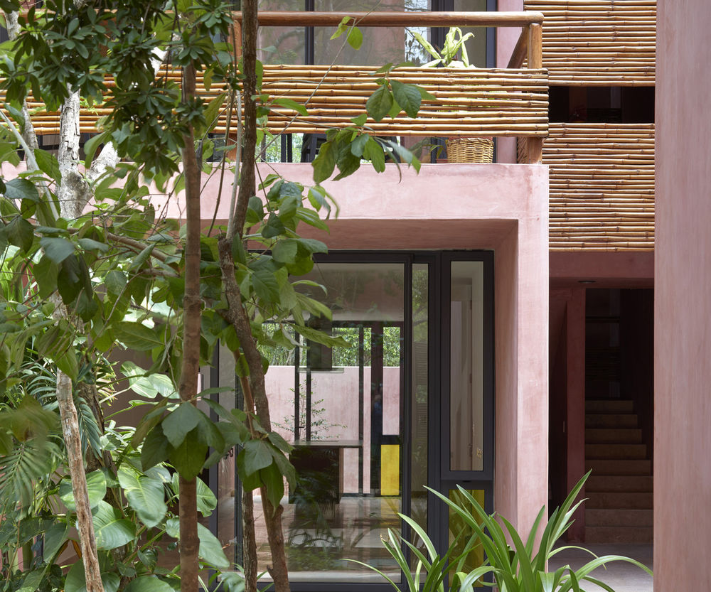
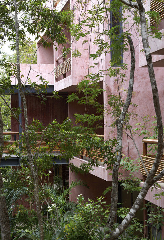
For its part, the palette of materials is minimal: cement stucco with integrated red pigment for walls and exterior facade. This color selected for its optical qualities of being a background that allows contrast to the body and volume of the flora. The interior walls of the apartments are plastered, allowing each user to introduce a color palette of their own. The organic materials are bamboo, for guardrails and privacy screens, limestone, for floors and bathrooms, and wood, resistant to moisture and insects. In counterpoint, the industrial materials required of their durability and structural resistance: Steel, aluminum and tempered glass in three degrees of opacity with an accent of color. For us, this project meant undertaking the challenge of making commercial architecture with local components and sensitivity to the particular conditions of the site, to demonstrate that quality design, measured in quality spaces reflected in quality of life for users, is a good deal.

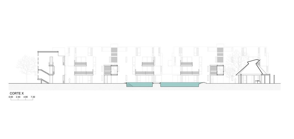
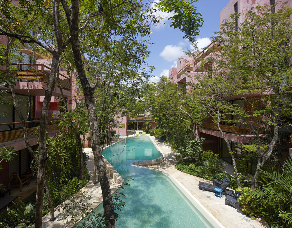
Un tercer bloque de tres niveles cierra el lado corto hacia la esquina del terreno que mira y conecta con un parque- glorieta y de forma natural marca uno de los principales accesos al conjunto. El cuarto bloque aloja los servicios y la palapa de estar, cuya doble altura protege del sol poniente a una parte importante del corazón central del proyecto que llamamos “patio de agua y viento”. Este amplio espacio abierto central es el resultado de alinear los bloques angostos a los límites de las restricciones perimetrales permitidas, logrando así una separación promedio de 16 metros que asegura una deseable distancia visual entre los propios bloques, al mismo tiempo que configura un espacio expansivo de 55metros de longitud donde se ubica la alberca. En suma, el "patio de agua y viento" es también un centro a la vez convocante y distribuidor, que aporta en sí mismo el 20% del área verde y permeable del proyecto. Forma parte de la experiencia particular de habitar este conjunto de vivienda en su relación con el extraordinario entorno verde y domesticado en el que se ubica. Por su parte, catálogo de materiales de acabado es mínimo: Estuco de cemento con pigmento integrado rojo para muros y fachada exteriores.
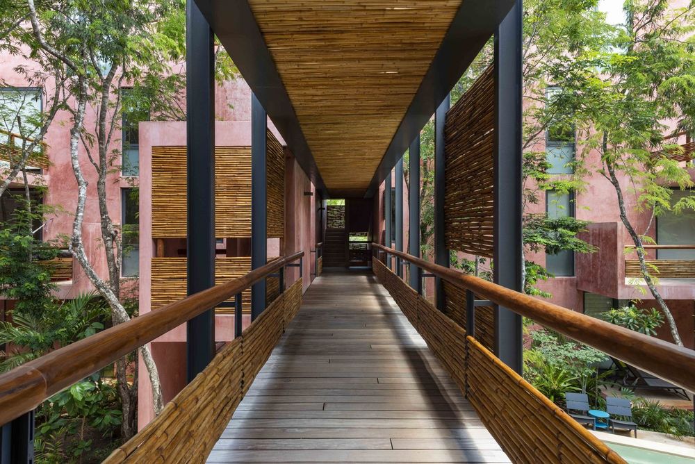
Este color fue seleccionado por su cualidad áptica de ser un fondo que permite darle profundidad de campo y resaltar el cuerpo y volumen de los elementos vegetales. Para los muros interiores de los departamentos se usó pasta dejando la libertad que cada usuario introduzca su propia paleta de color. Los materiales orgánicos son el bambú para barandales y mamparas de privacidad, piedra caliza para los pisos y baños, maderas resistentes a la humedad e insectos. En contrapunto los materiales industriales complementan el resto de las necesidades de durabilidad y resistencia estructural: Acero, aluminio y cristal templado en tres grados de opacidad con acento de color. Para nosotros este proyecto significó acometer nuevamente el reto de hacer arquitectura comercial con componentes locales y sensibilidad a las condiciones particulares del sitio, para demostrar que el buen diseño, medido en calidad de espacios reflejado en calidad de vida para los usuarios, es también un buen negocio.
▼项目更多图片
