- 项目名称:猫爪推拿店
- 设计团队:合肥宏约深美空间设计有限公司
- 主案设计:冯方宏
- 项目地址:安徽 合肥
- 项目面积:255㎡
- 设计时间:2022.05
- 完成时间:2022.09
- 项目摄影:鑫空视觉
暂停接收繁杂的信息打扰停下手上的工作给自己留下片刻宁静开启Spa治愈时光……
一省山川名胜与多元文化环抱的地理中心,没有不可撼动的传统羁绊,任由新时代的探索者开荒拓土。在乡土宁静的街边,跳动着一颗朝气蓬勃的心脏。The geographical center of a province surrounded by mountains and rivers and scenic spots and diversified cultures is free from the shackles of unshakable tradition, allowing the explorers of the new era to open up land. In the quiet local street, a vibrant heart beats.
“在这条街道上几乎找不到一家我们真正想要踏进去的推拿馆。”在与客户的多次沟通中,获取的信息是客户想要打造一年轻化,符合现代年轻人审美的推拿馆,回忆起所见过大部分的推拿馆,要么是狭小的门面、老旧的装修、昏暗的灯光,无一不是在述说着这门手艺与传承的故事;要么是晃眼的照明、传统富丽的风格,也是在表达着自己的理解。在与客户深入沟通后,我们便有了自己的方向。设计中不论是空间规划还是内容的营造全都是在为人服务,只有将空间设计与功能,灯光,细节相结合,才能更好的触及到更多的情感与表达。"We can hardly find a massage parlor we really want to enter on this street." In many communications with customers, the information obtained is that customers want to build a young massage hall that meets the aesthetic standards of modern young people. When recalling most of the massage halls they have seen, they are all telling the story of this craft and inheritance, either with narrow doors, old decoration, and dim lights; It is either dazzling lighting, traditional and rich style, but also expressing their understanding. After in-depth communication with customers, we have our own direction. Both space planning and content creation in the design are all for people. Only by combining space design with functions, lights and details can we better touch more emotions and expressions.
(室内)
(外立面) 在见到原始场地时,场地位与交通干线处,门口便是高架,尽管车来人往,但那与邻居相匹配的绿色老旧招牌和室内留下的坑洞,也是让人印象深刻。同时一层有限的面积和层高也是满足不了客户的功能需求。When you see the original site, the site is located at the traffic trunk line, and the entrance is an elevated road. Despite the traffic, the green old signboards matching the neighbors and the holes left in the room are also impressive. At the same time, the limited area and height of a floor can not meet the functional requirements of customers.
第一印象,First impression项目地点位于商业聚集地,临于交通干线,人流量大,在路人眼里,第一印象是极为重要的。简约的门头设计,大片留白,在原本各个独立统一的开窗形式下,做了加减法,凸出窗套,减少开窗面积,有横窗,有竖窗,给人明朗的视觉效果,在店铺林立的环境中一眼跳脱出来,来往的行人也会驻足。The project site is located in a commercial gathering place, adjacent to the traffic trunk line, with a large flow of people. In the eyes of passers-by, the first impression is extremely important. The simple door head design has a large area of blank space. Under the original independent and unified window opening forms, the addition and subtraction method has been made to protrude the window cover to reduce the window opening area. There are horizontal windows and vertical windows, giving a clear visual effect. When people jump out of the environment with many shops, they will stop coming and going.
空间概览,Ovrtview“空间艺术的延伸,便是生活的艺术。”随着国民经济的提升,随之而来的是消费者观念的改变,当今社会的主力消费群体已趋于年轻化,每一个年轻人都有着对美好生活的追求,对消费环境的选择,以及对高品质生活的体验。设计师笔下的极简,既是艺术的形态,亦是生活的形态。只有放松和有限的空间,才能让体验者从他们繁忙的的生活中脱离出来,慢慢的捋身体和平静的生活空间联系在一起。"The extension of space art is the art of life." With the improvement of the national economy, the change of consumer attitudes has followed. The main consumer groups in todays society have become younger. Every young person has the pursuit of a better life, the choice of consumer environment, and the experience of high-quality life. The minimalism described by the designer is not only the form of art, but also the form of life. Only relaxation and limited space can let the experiencer break away from their busy life and slowly touch their body to connect with the peaceful living space.
开场,Begin空间在序列动线上,是围合的小口入,转折,进入一个大的开放空间;视觉上入口是开放通透的,在一个矩形体块中,解决了入口,洽谈,收纳,水吧等功能,从根本上解决小空间多功能的需求,最大化辅助和提升客户服务与体验氛围的营造,帮助甲方更好的服务用户。Space on the sequence moving line is a small opening, turning, and entering a large open space; Visually, the entrance is open and transparent. In a rectangular block, it solves the entrance, negotiation, storage, water bar and other functions, fundamentally solves the needs of small space and multi-function, maximizes the assistance and improvement of customer service and experience atmosphere, and helps customers better serve users.
视觉层次,Visual hierachy设计师将空间重新排列组合,摒弃原有的空间动态,以“自由”和“秩序感”为关键词,一层整个空间在不同功能之间同时保持着开放性,吧台位于一楼空间的中心位置,恰好形成环形动线,分割出洽谈区和水吧区。以片墙作为隔段形成空间的转换,从一个空间到另一个空间,从开放到隐蔽,开敞自由,空间独立,动线流畅,消除了心理上的空间概念。The designer rearranged and combined the space, abandoned the original spatial dynamics, and took "freedom" and "sense of order" as the key words. The whole space on the first floor maintains openness between different functions at the same time. The bar is located in the center of the space on the first floor, which just forms a circular dynamic line, dividing the negotiation area and the water bar area. The transformation of space is formed by taking pieces of walls as partitions, from one space to another, from open to hidden, open and free, independent space, smooth movement, eliminating the psychological concept of space.
空间层次,Spatial level整个方形的空间,我们通过对镜面还有挑空的运用,将空间的损耗降到最小。入口处顶面采用了镜面材质,再借用门外的自然光线以及空间本身的立体造型,大大增加了视觉感受和空间层次,体现了空间冷暖,明暗以及虚实的变化。For the entire square space, we can minimize the space loss by using the mirror surface and the empty space. The top surface of the entrance is made of mirror material, and the natural light outside the door and the three-dimensional shape of the space itself are used to greatly increase the visual experience and spatial level, reflecting the changes in space temperature, light and dark, and the virtual and real.
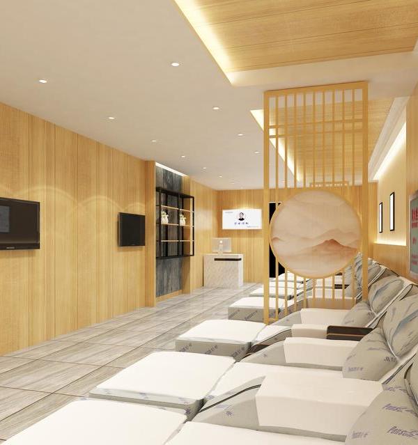
细节,Detail坐踏背后隔墙上的圆形挖空造型,透光,透景。无论是从内到外还是从外到内,每一帧都是独特的存在。悬浮的白色挑台,支撑的木色方柱,裸露的微水泥梁体,形成几何体块的排列,演化出空间鲜明的虚实和立体姿态。无论是挑台的悬浮还是方柱上的抽缝和入口隔墙上缝隙的有意为之,刻画出了丰富的细节,也营造出了舒展的氛围。The round hollowed out shape on the partition wall behind you is transparent. Whether from inside to outside or from outside to inside, each frame is unique. The suspended white cantilevered platform, the supported wood colored square columns, and the exposed micro cement beams form the arrangement of geometric blocks, evolving a distinctive virtual reality and three-dimensional posture. Whether it is the suspension of the cantilevered platform or the intentional action of the cracks on the square column and the gap on the entrance partition wall, it depicts rich details and creates a relaxed atmosphere.
贯穿,Run through馆内的空间构造,由开放到隐蔽,由转折到贯通,三角的挑空形态,上下的空间穿插,圆形的框景,悬空的挑台,干净利落几何形体协调而成的设计语言,着重打造出持续演变的空间逻辑。The space structure in the museum is from open to hidden, from transition to penetration. The triangular open shape, the space interspersed from top to bottom, the circular frame view, the overhanging platform, and the design language formed by the coordination of clean geometric forms focus on creating the space logic of continuous evolution.
连接,Connect白色楼梯作为上下空间的连接物,位于一层空间的视觉中心点,消失的两端是空间的无限延伸,赋予空间自由的想象。楼梯底端保留着原本的阶梯结构,在背后镜面的映衬以及微弱灯光的氛围下,增添了空间的通透性和神秘感。As the connection between the upper and lower space, the white staircase is located at the visual center of the first floor space. The two ends of the disappearance are the infinite extension of the space, giving the space a free imagination. The original ladder structure is retained at the bottom of the stairs, which adds the permeability and mystery of the space under the background of the mirror and the atmosphere of weak lights.
空间逻辑持续演变,意味着“场”在未来是商品售卖空间的同时,更是生活方式体验空间和潮流态度的展示空间。因此无论是空间设计规划还是空间内容的打造,都体现了以人的核心需求为出发点进行落位的思路。当项目通过空间创新触发了大众真实的情感需求,无疑也为品牌商户链接消费者提供了更好的契机。The continuous evolution of spatial logic means that "field" is not only a space for selling goods in the future, but also a space for lifestyle experience and trend attitude display. Therefore, both the space design planning and the creation of space content reflect the idea of positioning based on peoples core needs. When the project triggered the real emotional needs of the public through space innovation, it undoubtedly provided a better opportunity for brand merchants to link consumers.
平面,Plane
项目信息
项目名称|猫爪推拿店
设计团队|合肥宏约深美空间设计有限公司
主案设计|冯方宏
项目地址|安徽 合肥
项目面积|255㎡
设计时间|2022.05
完成时间|2022.09
项目摄影|鑫空视觉
{{item.text_origin}}

