© Aaron Puls
(C)亚伦·普尔
架构师提供的文本描述。SJB的Tapestry在Collingwood的一个狭小的深处,通过直接处理其周围的无数元素,在各种各样的建筑类型中独树一帜。
Text description provided by the architects. On a deep, narrow site in Collingwood, SJB’s Tapestry holds its own amid a variety of building types by directly addressing the myriad elements within its surroundings.
这座建筑由三个不同深度的体积组成,形成了一种令人联想起堆砌的建筑砖的效果,它的不同外观被一个混凝土元素包裹在建筑物周围。这是一个奇异的姿态,巩固了Tapestry的许多部分,并使其达到了较低的水平。SJB建筑师事务所的董事特里斯坦·黄(Tristan Wong)指出,这一元素也具有功能。“与地面的连接越紧密,噪音就越大,中断的次数也就越多。”因此,创造了这个奇异的,隐蔽的盒子,它给了更多的隐私,给了更低的和中央的更低的层次。“
Comprising three volumes set at varying depths, creating an effect reminiscent of stacked building blocks, the building’s diverse facades have been united by a single concrete element that wraps right around the building. It’s a singular gesture that consolidates Tapestry’s many parts, and is battened to the lower level. Tristan Wong, director of SJB Architects, notes this element is also functional. “The closer the connection with the ground level, more noise, more interruption occurs. So creating this singular, veiled box, it gives a bit more privacy and to the lower and central lower levels.”
© Nicole England
(尼科尔英格兰)
挂毯的顶层阁楼离街道很远,沿着街道的正面有着很深的阳台。大楼的中间部分有较小的阳台,带有可移动的金属屏风,可以打开和靠近,让光线和暖气进来,或者根据需要创建一个私人户外区域。地面大厅区又从街道上退了回来,为一个既实用又有雕塑功能的凸起块状的信箱留出了空间。
Tapestry’s upper-level penthouse is set well back from the street, with deep balconies along the street frontage. The building’s middle section has smaller balconies with moveable metal screens that open and close to let in light and warmth or to create a private outdoor area as required. And the ground lobby area is again set back from the street, allowing room for a jutting block-like letterbox that is at once utilitarian and sculptural.
SJB建筑公司的创始董事MichaelBialek说,Tapestry的建筑方法非常合适。“我们喜欢我们的建筑有一种雕塑的质量,我们喜欢它们有深度,我们喜欢它们有细节,我们喜欢对物质性的认识,在我们看来,这座建筑适合于其坚固的工业区的混凝土和钢的概念。”
Michael Bialek, a founding director of SJB Architects, says the architectural approach for Tapestry is very fitting. “We like our buildings to have a kind of sculptural quality, we like them to have depth, we like them to have detail, we like to have the recognition of materiality and this building, in our view, is one suited to the notion of concrete and steel in its robust industrial precinct.”
© Nicole England
(尼科尔英格兰)
Bialek还看到Tapestry与该地区景观的另一个共同特征-露台屋-联系在一起:“屏幕就像露台上的旧阳台,或者是顶部…上的冰箱。(在露台的房子里)他们可能是锻铁的,但我们的是金属屏风和玻璃栏杆的组合。“
Bialek also sees Tapestry connecting with another common feature of the area’s landscape, the terrace house: “The screens are like the old verandah on a terrace, or the frieze over the top … (in a terrace house) they may have been wrought iron but ours are a combination of the metal screens and glass balustrading.”
© Nicole England
(尼科尔英格兰)
对王来说,设计Tapestry最有趣的方面之一是找到一种方法,让光线照射到网站狭窄街区的中心,同时保留足够的地板空间,容纳21套一间和两间卧室的公寓。“当你只有10米的正面,你试图让两套公寓进入正面,你必须把卧室放在后面,所以所有的前部都是起居室,厨房和餐厅-所有活动的白天空间。”然后卧室就变得更加隐秘了,“他说。解决方案是通过开发中心下沉四口轻型水井,每一口都处于战略位置,为居民提供最大限度的照明。黄说:“这些轻型水井已经变成了地面的景观庭院,把自然光带入卧室的私人庭院。”他解释说:“把公寓卧室放在轻型井周围,意味着我们可以舒适地将住宅安置在狭小的地方,而不会影响人们的舒适程度。”
For Wong, one of the most interesting aspects of designing Tapestry was finding a way to get light into the centre of the site’s narrow block, while retaining enough floor space for 21 one and two-bedroom apartments. “When you’ve only got a 10m frontage and you’re trying to get two apartments into that frontage, you’ve got to get the bedrooms to the back so all the front portion is the living, kitchen and dining – all the active day space. And then the bedroom’s a bit more secluded,” he says. The solution was to sink four light wells through the centre of the development, each strategically placed to maximise light for residents. “The light wells have been turned into landscaped courtyards at ground, private courtyards that bring natural light into the bedrooms,” says Wong. “Placing the apartment bedrooms around the light wells meant we could comfortably fit dwellings into the narrow site, without impacting on amenity,” he explains.
轻型水井还面向公共走廊,并提供额外的自然光-并通过更多的植物瞥见绿色植物-居民进出共享电梯。
The light wells also face onto the common corridors and provide additional natural light – and glimpses of greenery via more plantings – for residents coming and going from the shared lifts.
© Nicole England
(尼科尔英格兰)
挂毯的设计也发挥了公共街道和亲密的室内关系。首先,有一些可移动的金属幕墙屏幕,让居民可以选择自己想要成为什么样的公众还是个人。其次,室内设计的概念来自于一个特定的外部元素-建筑包装的展开边缘,正如SJB内部总监兼项目负责人莱奥·泰兰多(Léo Terrando)所解释的那样:“一个尖锐的角度-灵感来自于此。”我们试着把建筑师工作的一个细节引向内部。“
Tapestry’s design also plays with the relationship between the public street and the intimate indoors. First, there are those moveable metal façade screens that give residents a choice about how public or private they want to be. Second, the interiors concept was drawn from one particular external element – the splayed edge of the building’s wrapping, as Léo Terrando, SJB Interiors director and project lead, explains: “The one sharp angle – the inspiration came from that. We tried to reference that one detail of the architect’s work to the inside.”
© Nicole England
(尼科尔英格兰)
这种“角度”的细节在整个室内都很明显,包括在厨房和浴室里几乎像细木工一样的墙壁,在那里淋浴被放置在三角形的顶端。厨房大岛凳也有一个梯形的形式,一端突出在阳台上,因此室内岛屿长椅也方便户外娱乐。
This ‘angular’ detail is evident throughout the interiors, including walls that act almost as joinery in the kitchens, and in the bathroom, where the shower is placed at the tip of a triangle. The large kitchen island bench also has a trapezoidal form, with one end jutting out onto the balcony, so the indoor island bench also facilitates outdoor entertaining.
© Nicole England
(尼科尔英格兰)
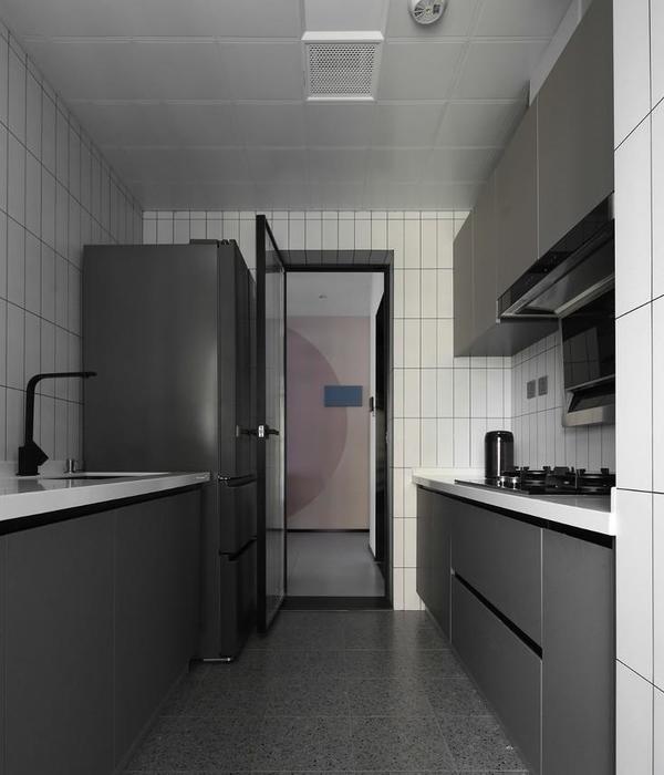
“厨房被视为雕塑物品的组合,”迈克尔说。“就像排气管是圆管一样,台面上有一个三角形的切边,呈长方形,所以总是很有趣的。”
“The kitchens are treated as a composition of sculptural objects,” Michael says. “Like the exhaust is a circular tube, the benchtop has a triangulated cut-off edge to a rectangular shape, so it’s always interesting.”
© Aaron Puls
(C)亚伦·普尔
内部细节延伸到Tapestry的大堂区域,墙上的三角形细节让位给金属屏幕,屏幕上有多个盒子形状,与大楼的外部有回声,还有突出在街景中的巨大奇异姿态(同时也是大楼的信箱。)“三角形和正方形之间总是有一个平衡的,”Terrando说。
The interior details extend into Tapestry’s lobby area, where triangular details on the wall give way to a metal screen featuring multiple box shapes that echo the building’s exterior, and the large singular gesture that juts forth into the streetscape (and also serves as the building’s letterbox.) “There’s always a balance between the triangle and the square,” says Terrando.
Architects SJB
Location Collingwood, Victoria, Australia
Category Apartment Interiors
Area 400.0 m2
Project Year 2017
Photographs Aaron Puls, Nicole England
{{item.text_origin}}

