Milwaukee Art Museum: We all know Calatrava for his unique style, for the signature he leaves in every single building he projects. This time he made a ‘Pelican’ to protect the Art in Milwaukee, Wisconsin.
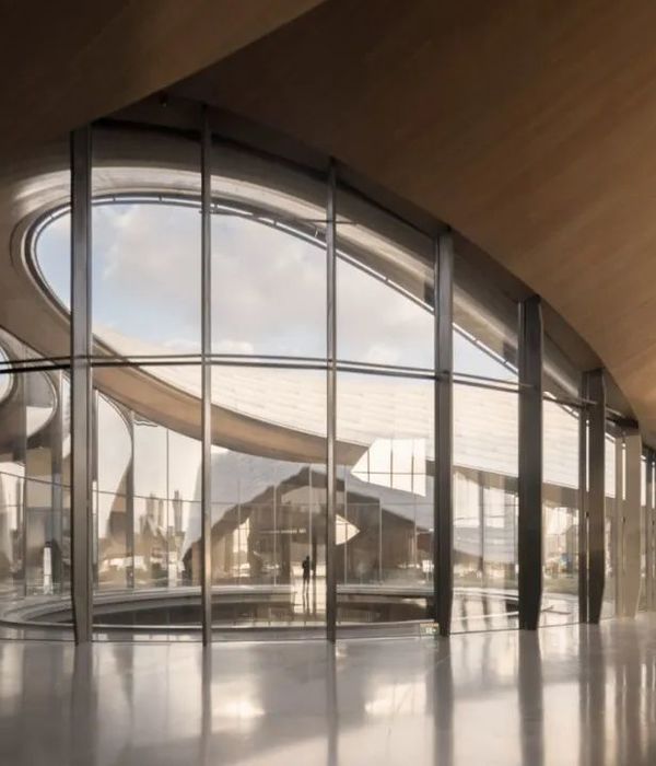
“For me, the project of expanding the Milwaukee Art Museum was an opportunity to help people make the most of an extraordinary situation. The design did not result from a sketch. It came out of a close collaboration with the clients … who truly wanted from me the best architecture that I could do. Their ambition was to create something exceptional for their community rather than just add something to the existing buildings. I also wanted to add something to the lakefront. I have, therefore, worked to infuse the building with a certain sensitivity to the culture of the lake – the boats, the sails and the always changing landscape. The extension, as such, is a kind of pavilion, transparent and light, which contrasts with the massive, compact Saarinen building. Reaching out from the Quadracci Pavilion, like an arm extended to the city, is a bridge. Besides being a link to the city, the bridge is part of a composition. Its leaning mast conveys a sense of direction, of movement, which is taken up by the roof, the cables, and the canopies that extend on each side. These strong lines culminate in the Burke Brise Soleil, which translates their dynamism into actual motion. I hope that … we have designed not a building, but a piece of the city”, parts of the speech of Calatrava in October 2001. The Quadracci Pavilion is Calatrava’s first building in the US. Its objective was not simply to increase space for the Milwaukee Art Museum, but to create a new image for the museum, an ultra-modern white structure that looks like the prow of a ship jutting out into the water. Conceived as an independent entity, the white steel and concrete form is a reminiscent of a ship and contrasts the existing ensemble in both geometry and materials. The pavilion features a spectacular kinetic structure, a brise-soleil with louvers that open and close like the wings of a great bird. When open the shape becomes a sign, set against the backdrop of the lake, to herald the inauguration of new exhibitions. The pivot line for the slats is based on the axis of a linear mast, inclined at 47 degrees, parallel to the adjacent bridge mast. The design of Milwaukee art museum allows for a future expansion, offset from but symmetrical to the exhibition facilities, on the other side of the Kahler building. At the shore level, the expansion houses the atrium, a gallery space for temporary exhibitions, an education center with a 300 seat lecture hall and a gift shop. The 100 seat restaurant, placed at the focal point of the pavilion, commands panoramic views onto the lake. Inside the entrance is nothing short of spectacular. The play of light through the glass roof panels never bores and it is inside the Pavilion, that you really start to appreciate Calatrava’s phenomenal attention to detail.
Courtesy of Santiago Calatrava
Project Information :
Location : 700 N. Art Museum Drive Milwaukee, Wisconsin, US Architect : Santiago Calatrava Project Year : 2001 Total Area : 13,196 square meters
Courtesy of Santiago Calatrava
Courtesy of Santiago Calatrava
Courtesy of Santiago Calatrava
Courtesy of Santiago Calatrava
Courtesy of Santiago Calatrava
Courtesy of Santiago Calatrava
Courtesy of Santiago Calatrava
Courtesy of Santiago Calatrava
Courtesy of Santiago Calatrava
Courtesy of Santiago Calatrava
Courtesy of Santiago Calatrava
Courtesy of Santiago Calatrava
Courtesy of Santiago Calatrava
Courtesy of Santiago Calatrava
Courtesy of Santiago Calatrava
Courtesy of Santiago Calatrava
{{item.text_origin}}


