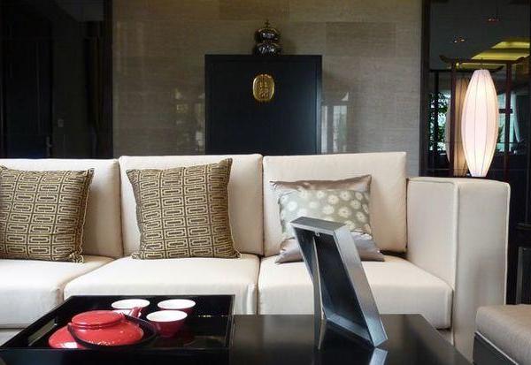
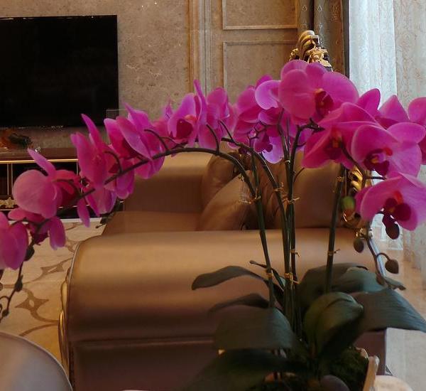
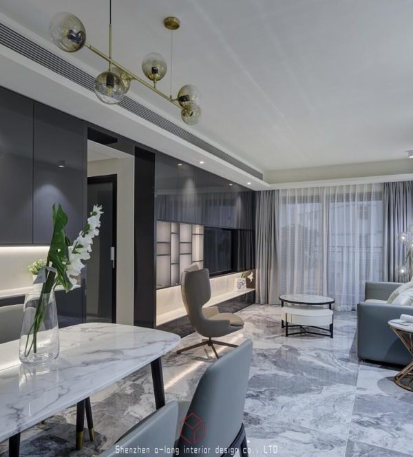
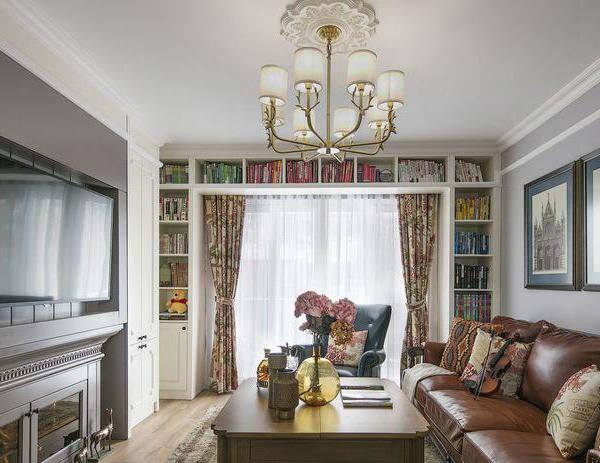
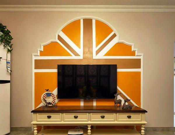
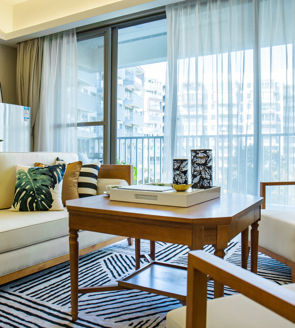
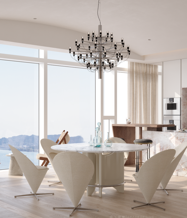
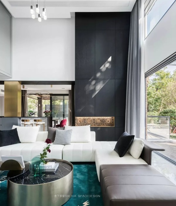
“整屋的人员构成是一家三口+老人居住,在房间需求上,整屋的规划是非常够用的,客厅没有做浇平处理,保持挑高,让客厅空间感视觉效果非常舒适。”
"The personnel composition of the whole house is a family of 3 + old people live, in the room demand, the planning of the whole house is very enough to use, the sitting room did not do poured flat processing, maintain carry high, let the visual effect of living room space feeling very comfortable。"
业主喜欢设计师之前案例的那种灰色,但是整木厂里面并没有同质感的色调,设计师多次与厂商沟通,确认颜色,一直到还原至现场的灰色,过程比较心酸,结果还是令人欣慰。
The owner likes the gray of the previous case of the designer, but there is no homogeneous tone in the whole wood factory. The designer has communicated with the manufacturer many times to confirm the color until it is restored to the gray of the site. The process is complicated and the result is gratifying.
一楼的入户门,是一个比较深的走廊,设计师运用长走廊,设计了一大排通顶柜,方便业主收纳,也能很好地将居住者纳入空间氛围;原始厨房空间较小,放不下西厨,运用楼梯下方柜体,延伸出“西厨“同时靠近餐厅位置,动线合理。
二楼的走廊正对客厅方向是一个隐藏的洗衣房,设计师运用隐形门的方式很好地规避了空间外露的尴尬,也能让整屋的视觉变得规整,大方。
The entrance door on the first floor is a deep corridor. The designer uses the long corridor to design a large row of top cabinets, which is convenient for the owners to receive and can also bring the residents into the space atmosphere; The original kitchen space is small, can not put the western kitchen, the use of the cabinet under the stairs, extend the "western kitchen" at the same time close to the restaurant location, the moving line is reasonable.
The corridor on the second floor facing the living room is a hidden laundry room. The designer uses the invisible door to hide the awkwardness of the exposed space and make the whole room's vision neat.
原有阳台纳入客厅空间,拉长了客厅的视野和开间,同时还多了一个休闲吧台;
整屋都是用的PU线条做的对称感,灰色的油漆肌理,让整屋拥有护墙板的视觉错觉,让整屋的质感进一步提升,同时也符合业主“环保省钱”的理念,营造了浓厚的法式氛围。
The original balcony into the living room space, lengthened the living room vision and bay, but also a leisure bar;
The whole house is made of PU lines with a sense of symmetry, gray paint texture, so that the whole house has wood veneer visual illusion, so that the whole house texture is further improved, but also in line with the owner's "environmental protection and money saving" inside to create a strong European and American atmosphere.
业主非常喜欢小酌,所以在餐厅位置设计师设计了一排置酒的透明柜子,方便拿取和收纳。
Owner likes to drink very much, so in dining-room position stylist designed a transparent cabinet that buy wine, convenient take take and receive.
-睡觉的仪式感-
白色 white
&
BEDROOM
PU线条在墙面勾勒出的利落线条框、比大白墙更加生动有质感;家具的选择则具有相对的包容性、追求休闲现代的感觉,这就是自在、浪漫的现代法式风格。
PU lines on the wall outline the neat line frame, more vivid than the white wall texture; The choice of furniture is relatively inclusive, the pursuit of leisure and modern feeling, which is comfortable, romantic modern American style.
每一种颜色都会说话,白色应该是生活中话语权最多的一种颜色,包容性强,且能很好地融合光线,给空间多一分明亮感。
Every kind of color can talk, white should be the speech right in the life a kind of color with the most, inclusive is strong, and can confluence light very well, give the space much one minute bright feeling.
-睡觉的仪式感-
灰色 Gray
&
BEDROOM
灰色作为整屋的背景色,会有一些“重”的感觉,设计师心机的将墙面分割,用白色和灰色分割,减少灰色带来的沉闷感。
主卧的背景墙是木饰面,并且在背景里面融入了“镜面”这是业主的需求,设计师很好地结合了镜面和对称,打造了具有光感的空间氛围。
The background wall of the master bedroom is wood veneer, and the "mirror" is integrated into the background, which is the client's demand. The designer has well combined the mirror and symmetry to create a space with light and sense of atmosphere.
业主的孩子1岁左右,所以专门设计了一个儿童区,这个区域里面,业主买了一个矮柜,供孩子成长阅读。
卫生间没有选用常规亚克力吊顶,而是运用防水漆吊顶,满足业主简洁的需求,同样在颜色上面也更符合整体氛围。
【责任编辑:Tang】
{{item.text_origin}}

