方庭书店 | 磁场设计营造多变的阅读空间
- 项目名称:方庭书店
- 设计方:A9A建筑设计事务所
- 项目设计:2019年3月
- 完成年份:2020年1月
- 主创及设计团队:李岳九,李炳均,沈欣怡
- 项目地址:成都市金牛区西华大道华侨城
- 建筑面积:840平方米
- 摄影版权:存在建筑,形在建筑
- 客户:四川方所文化创意有限公司
- 品牌:杜邦人造石,IKEA,HAY
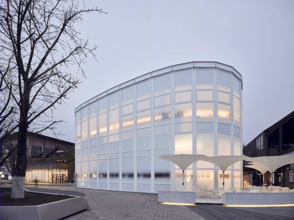
方庭书店,位于成都市金牛区华侨城欢乐里商业街,是原华侨城艺术中心建筑的翻新和重新设计项目,外立面改造中,我们被允许在不修改玻璃外立面的前提下对整个外立面的翻新,室内部分则需要整个重新设计,以满足全新的书店业态的使用。
Fangting bookstore, located in OCT Huanleli commercial street, Jinniu District, Chengdu, is a renovation and redesign project of the original OCT Art Center. In the renovation of the exterior facade, we are allowed to renovate the exterior facade without modifying the glass exterior facade, while the interior part needs to be redesigned to meet the use of the new bookstore format.
▼书店外观夜景,night view of the bookstore ©存在建筑何震环
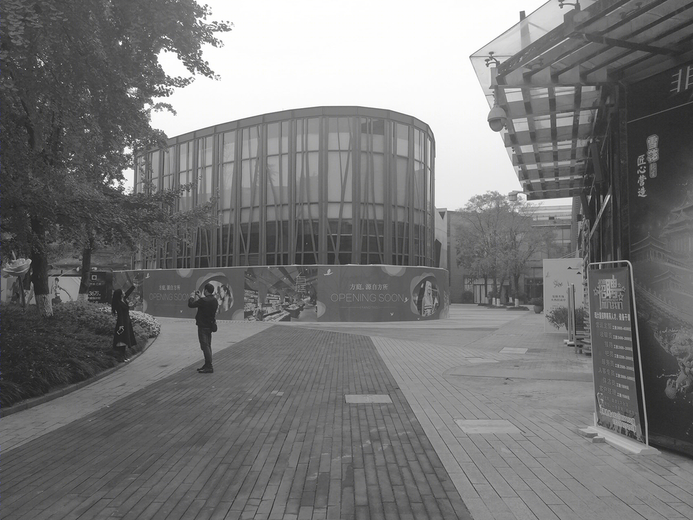
我们在整个建筑中面临的问题,除了外立面的局限性以外,还有的是室内部分众多的柱网结构,而原建筑的四面玻璃结构所带来的,关于建筑内部的私密性的考量也是这个项目的重点所在。
The problems we faced throughout the building, in addition to the limitations of the exterior facade, were also the numerous plinth structures in the interior part, and the privacy considerations brought by the four-sided glass structure of the original building were also the focus of this project.
▼建筑原貌,the original building ©A9A建筑设计事务所

该项目在华侨城商业区的东南侧,毗邻华侨城欢乐谷,在整个喧嚣的商业街区中占据了一个相对于安静的角落,紧靠着流淌过欢乐谷的河岸,沿着临水的街面走近方庭,建筑外立面覆以白色的渐变玻璃膜,在不影响采光的前提下,隔离了建筑内外的关系,在虚实之间取得一种微妙的平衡。
The project in the southeast of OCT business district, adjacent to OCT Huanlegu, in the hustle and bustle of the commercial block occupies a relatively in a quiet corner, next to Huanlegu of the river is flowing, along at the edge of the water street near yard, building facade cladding with white gradient glass membrane, on the premise of not affect daylighting, isolated building internal and external relations, achieve a delicate balance between the false or true.
▼书店外观,exterior view of the bookstore ©存在建筑何震环
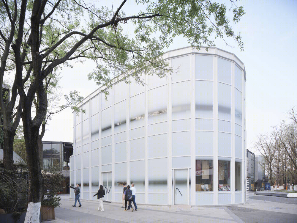
▼建筑外立面覆以白色的渐变玻璃膜,the building facade is claddedwith white gradient glass membrane ©存在建筑何震环

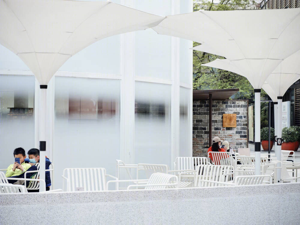
▼建筑外摆白色遮阳伞拱形,the arched white sunshades outside the building ©存在建筑何震环
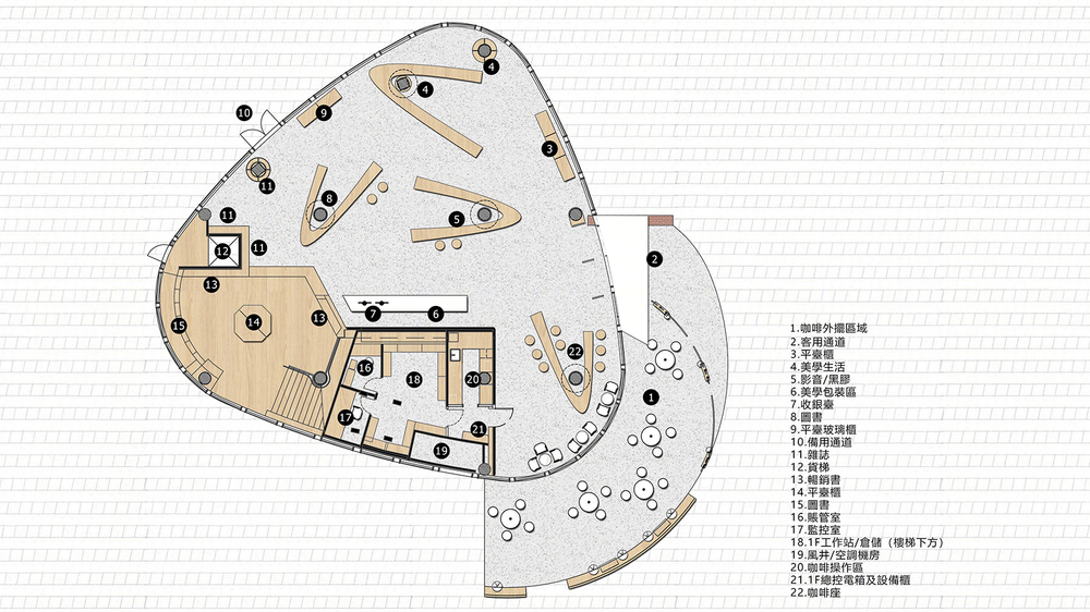
在方庭书店的设计中,由黑胶唱片螺旋的纹路变化而来的磁场概念融入了整个设计中,在一层和二层围绕柱体,设计了可移动的平台桌,形态从蹄形磁铁演变而来,整个平台可根据使用需求移动位置变更场域范围,彼此彷佛有着互相吸引的磁力而又独立存在,空间的多变使用提供了更多的可能。
▼在华侨城欢乐里商业街区内,紧邻胡桃里(左),一本“渴望之书”抵开了一片斑驳砖墙昭示的入口(右),in the joy Lane Business District of OCT, next to Walnut (left), a “Book of Longing” stands against the entrance of a mottled brick wall (right) ©A9A建筑设计事务所

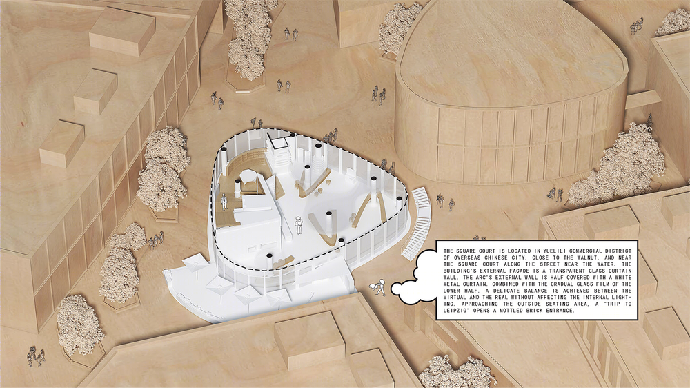
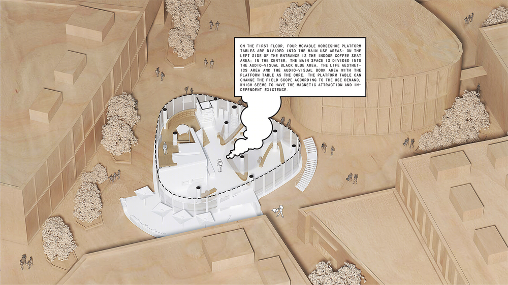
▼环形墙体和平台桌的碰撞,开辟出了员工的办公室(左),外延部分的咖啡区与阅读区(右),the collision between the circular wall and the platform table opened up the staff’s office (left), extended coffee area and reading area (right) ©A9A建筑设计事务所


In the design of Fangting bookstore, by vinyl spiral grain change concept into the whole design of magnetic field, on the first floor and second floor around a circular cylinder, designed the movable stage desk, form has evolved from the horseshoe magnet, the platform can be used according to demand of mobile location change in field, each other as a magnetic force of attracted to each other and exist independently, and space use mercurial provides more likely.
▼一层蹄形平台桌, foot shaped platform table on the first floor ©A9A建筑设计事务所

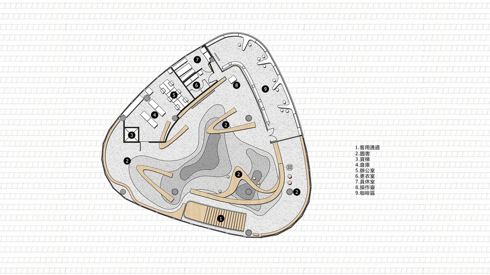
▼二层蹄形平台桌, two-story hoof platform table ©A9A建筑设计事务所

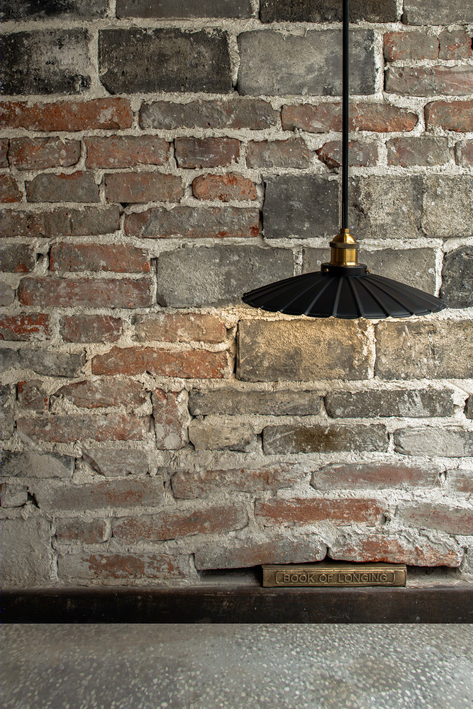
在穿过外摆区,进入书店之前,门口斑驳的砖墙下,一本科恩的《渴望之书》破开墙面,承载起书与音乐的桥梁,昭示了方庭书店的主题。
A copy of Cohen’s “the book of desire” breaks through the wall at the entrance to the bookstore, bridging the gap between books and music, before passing through the outside and entering.
▼渴望之书,Book of Longing ©形在建筑贺川
▼书店一层的吊顶由几个不同尺寸的同心圆构成,the suspended ceiling on the first floor is composed of several concentric circles of different sizes ©形在建筑贺川
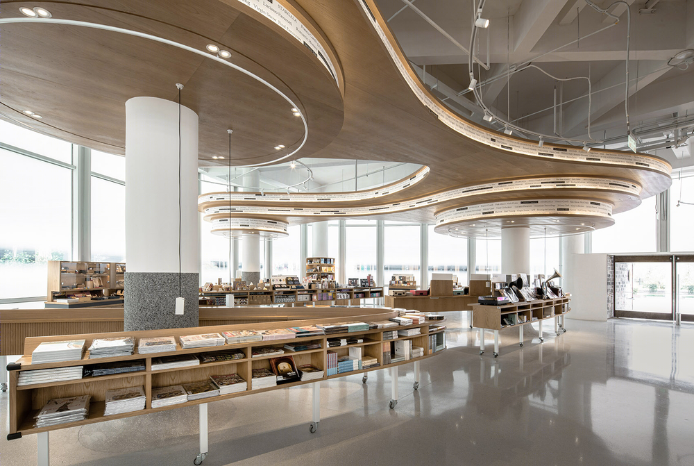
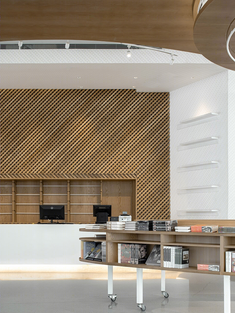
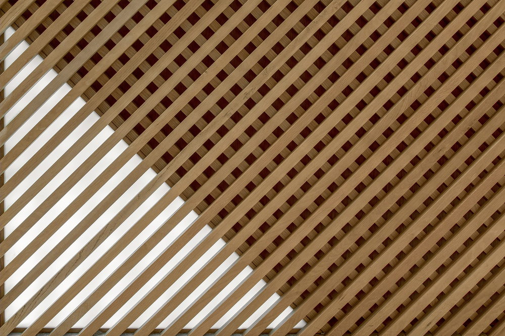
The suspended ceiling on the first floor of the bookstore combines with the cylindrical type, which is composed of several concentric circles of different sizes. The seemingly random connection shape gives people the rotating association of retro tapes. The design inspiration of the main background wall comes from the magnetic sense line imagination of the extended horseshoe magnet modeling. The main visual modeling wall is formed by the wooden splicing technique of staggered torsion. The display content can be increased flexibly by the insert board parts, and the use demand of the later period can be taken into account.
▼一层大厅的主要背景墙,用交错扭转的木条拼接手法形成主要视觉造型墙面,the main background wall in the hall on the first floor, the main visual modeling wall is formed by the wooden splicing technique of staggered torsion ©形在建筑贺川

▼主要背景墙,the main background wall ©形在建筑贺川
▼背景墙细节,details of the main background wall ©形在建筑贺川
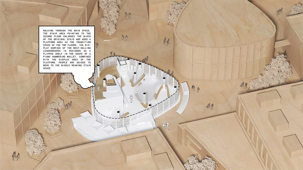
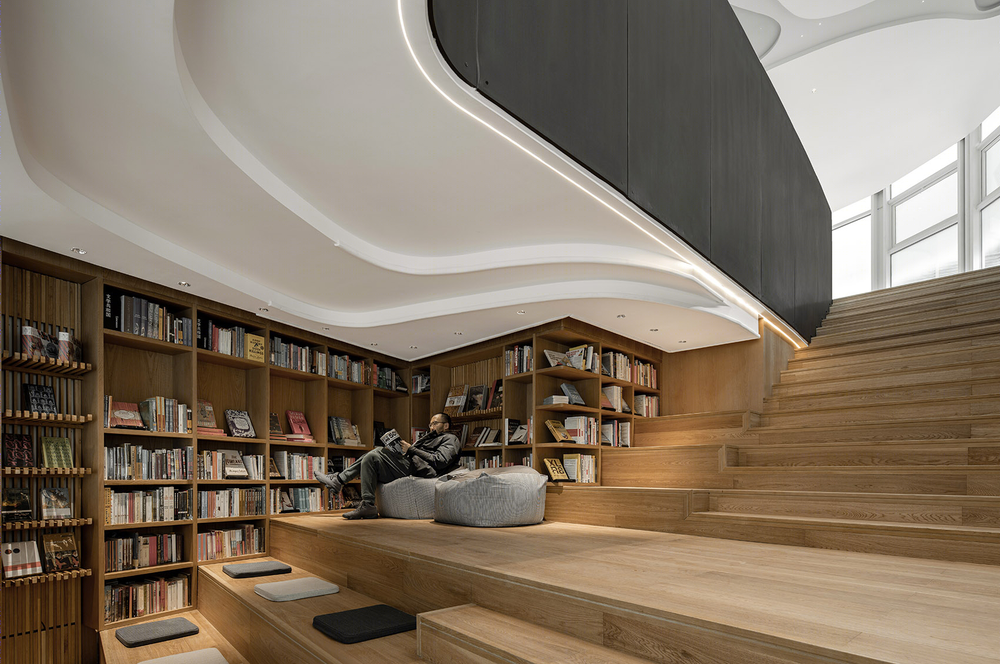
走过主要空间,指向二层的楼梯区域将原始楼梯宽度加大,并增加了一个平台区域作为两层楼的过渡空间。畅销排行榜展示面设计为一个个如钢琴击弦槌造型的翻转层架,结合平台展示区域引导人们往中层阅读楼梯空间移动。利用建筑层高以及加宽原始楼梯宽度,增加了一个楼梯阅读空间,夹层形成的偏矮高度以及环绕的书墙带来被知识包围的温暖感受。
▼楼梯平台,畅销排行榜展示面设计为一个个如钢琴击弦槌造型的翻转层架,the stairs landing, the exhibition surface of the bestselling list is designed as an inverted floor rack in the shape of a piano hammer ©形在建筑贺川

▼楼梯平台,the stairs landing ©形在建筑贺川
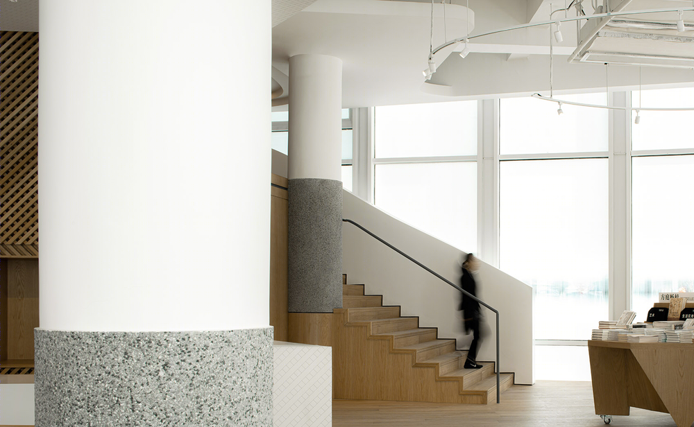
▼楼梯及其细节,stairs and their details ©形在建筑贺川
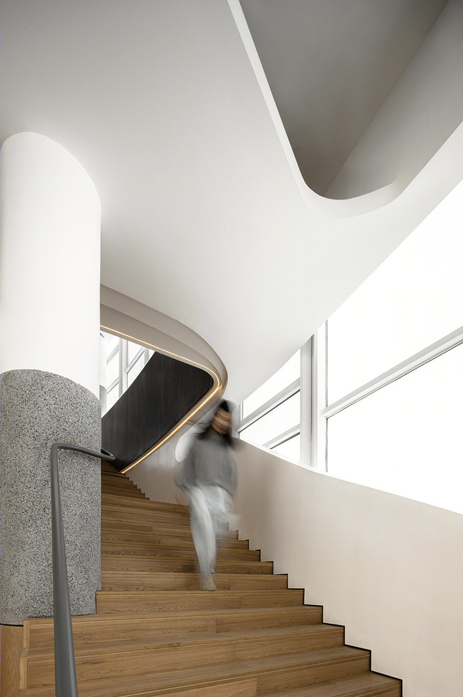
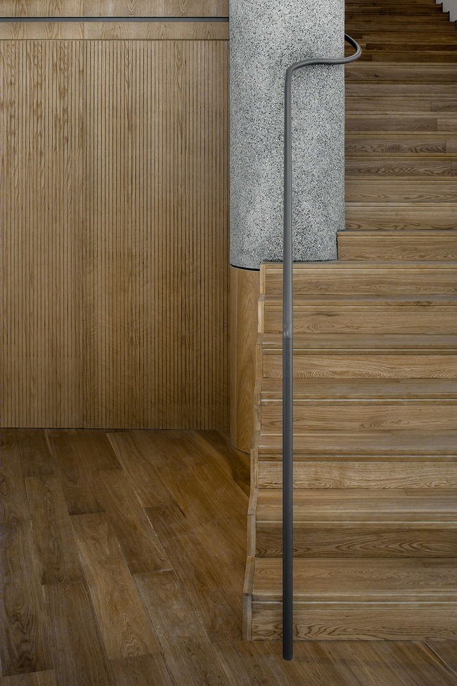
Walking through the main space, the staircase area that points to the second floor widens the original staircase and adds a terrace area that serves as a transition between the two floors. The exhibition surface of the bestselling list is designed as an inverted floor rack in the shape of a piano hammer, which, in combination with the display area of the platform, guides people to move towards the staircase space of middle level reading. A staircase reading space is added by using the height of the building and widening the width of the original staircase. The low height formed by the mezzanine and the surrounding book wall bring the warm feeling of being surrounded by knowledge.
▼夹层阅读平台,the mezzanine reading platform ©形在建筑贺川
▼二层空间可移动平台桌,the movable platform table on the second floor ©形在建筑贺川

Compared with the first floor, the second floor is dominated by art and reading. The streamline formed by magnetic induction line divides the main use area into: the two-layer circular book area, the horseshoe-shaped platform desk book area, the transformable speech area, the outdoor coffee area, the staff backstage rest and the office area.Platform desk book area can be changed into speech area according to the actual situation, increase the use function of the space.
▼二层大厅,以磁感线形成的流线,the hall on the second floor, is dominated by art and reading with the streamline formed by magnetic induction lines ©形在建筑贺川
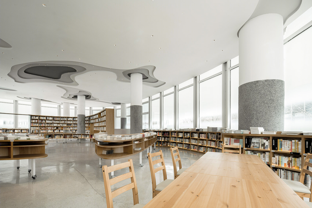
▼二层大厅,以艺术与阅读为主,the the second floor is dominated by art and reading ©形在建筑贺川

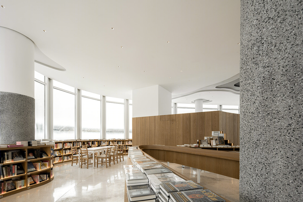
▼二层大厅局部,partial view of the hall on the second floor ©形在建筑贺川
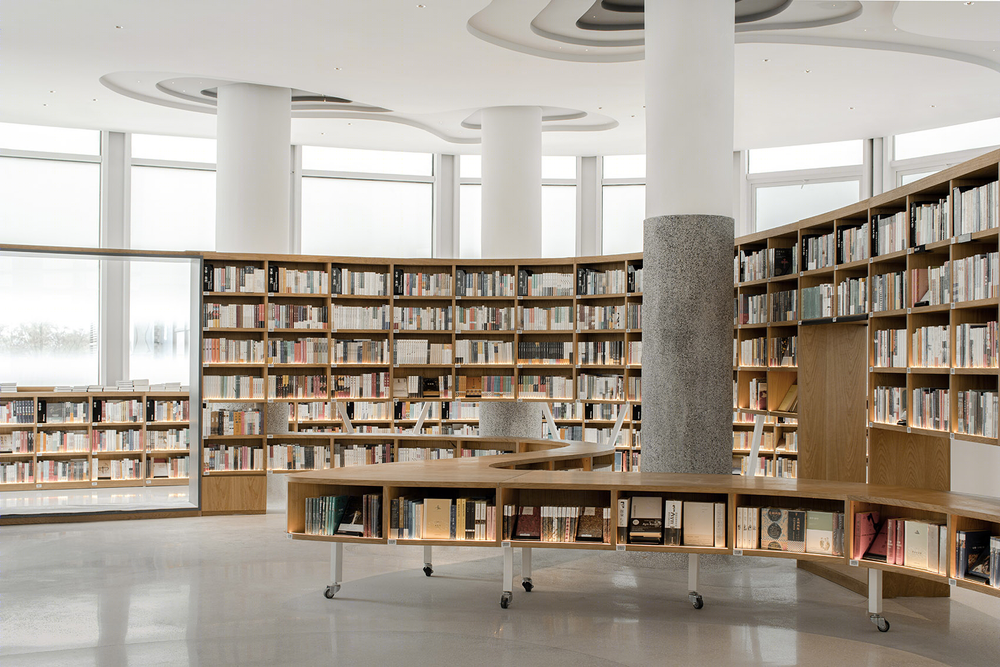
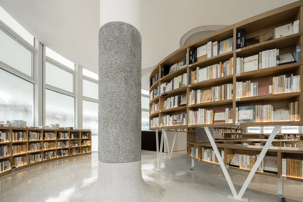
▼二层大厅书桌细节,table details of the hall on the second floor ©形在建筑贺川
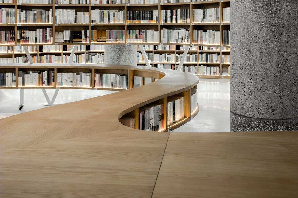
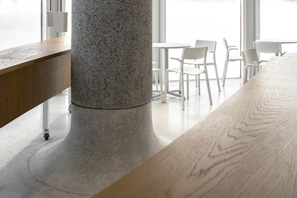
对于柱网结构的设计部分,柱子承载了整个建筑中重要的结构部分,在方庭中,我们研究了许多种柱网的处理方式,最后选择将柱子放回空间中,既不隐藏也不强调,像一棵树,伫立在空间中。
For the design part of the column net structure, the column bears the important structural part of the whole building. In the square courtyard, we studied many ways of dealing with the column net, and finally we chose to put the column back into the space, which is neither hidden nor emphasized, like a tree, standing in the space.
▼柱子被放回空间中,既不隐藏也不强调,the column is put back into the space, which is neither hidden nor emphasized ©形在建筑贺川
▼一层平面图,1F plan ©A9A建筑设计事务所
▼二层平面图,2F plan ©A9A建筑设计事务所
项目名称:方庭 设计方:A9A建筑设计事务所 项目设计:2019年3月 完成年份:2020年1月 主创及设计团队:李岳九,李炳均,沈欣怡 项目地址:成都市金牛区西华大道华侨城 建筑面积:840平方米 摄影版权:建筑摄影:存在建筑,室内摄影:形在建筑 客户:四川方所文化创意有限公司 品牌:杜邦人造石;IKEA;HAY
Project name: Fangting Design: A9A rchitects. Design year: 2019.03 Completion Year: 2020.01″ Leader designer & Team: 李岳久,李炳均,沈欣怡 Project location: Overseas Chinese town, Xihua Avenue, Jinniu District, Chengdu Gross Built Area (square meters): 840㎡ Photo credits: “architectural photography:NRCH Indoor photography:Shape in architecture” Clients: Sichuan Fangsuo cultural creativity Co., Ltd Brands / Products used in the projrct: Dupont artificial stone; IKEA; HAY


