Not so smallCreating a smart and comfortable functional zoning in a small apartment is quite complicated, but it’s also surprisingly interesting. Even though working on a design of a large areas give you tremendous amount of opportunities, small apartments still have their special ergonomic and aesthetic features that make the whole designing process extremely interesting for the architects.
Another main task for out team was to create a homelike atmosphere in apartment for the residents so they could make themselves feel at home. To make this happen we used pretty standard design solutions and added to them some minor additions. The conventional design methods in return have transform the apartment into a compact, comfortable and aesthetically-restrained place.
The entrance zone, which provides access to all the rooms of the apartment, we decided to design in one color and to leave a gap between the kitchen without doors to visually expand the space and not interfere with the spread of natural lighting throughout the whole apartment.
A separate deep-grey colored dressing room is able to store a large number of things and reduces the need to fill the apartment with unnecessary shelves, cabinets and niches. The clean and sharp bathroom is the representation of functional beauty and comfort.
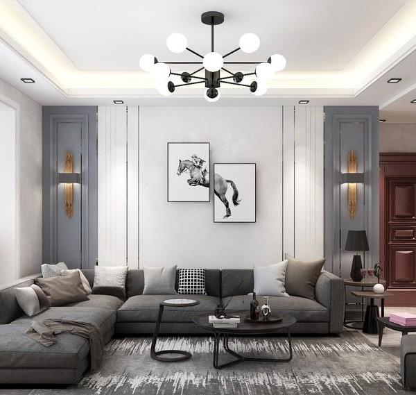
The living room is decorated in a warm pastel color scheme which combined with light veneered panels on the walls, large format ceramic tile on the floor and some color accents, in the form of a dark table and upholstery. The unusual thing about this room is that such a small area has enough space for a quite spacious kitchen, dining room, living room with a large comfortable gray sofa and even a workplace, which is visually hidden in a small alcove.
And behind the wall that separates this multifunctional room and acts as a mirror surface Bezmirno team designed a bedroom for the residents of the apartment. In this way we were able to create two accesses to the quiet area of the apartment: from the living room and from the hallway.
The master bedroom is colored in a pastel scheme, where the one wall is gray and the other is covered in veneered panels. A panoramic window gives the room the maximum percentage of natural light, which is extremely important thing in the architectural design and basic rules of human coexistence with space.
An interesting design solution of this room was the idea of delimiting the dressing area by curtains and not by a solid wall. Such an idea helps to save a lot of space and maximise the compliance with the principles of compact functional zoning.
To conclude, the design project of the apartment became the embodiment of the basic principles of compactness, functional expediency and architectural aesthetics. This is a solid proof that small apartments can and should be both ergonomic and comfortable. They’re not so small after all
{{item.text_origin}}

