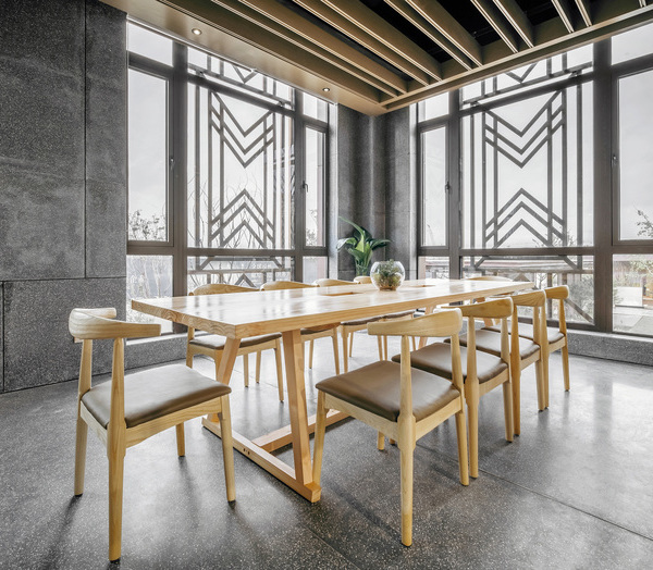
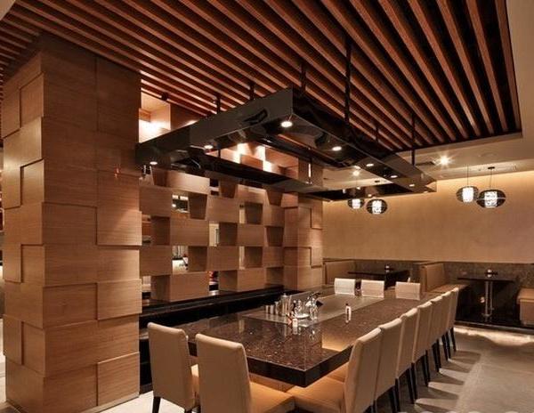
A space conceived with the intent to become a community destination in Madrid for Italian food and cuisine discovery, Pierciacere Gourmet Store interior design project was centred essentially around three main keywords: convivial mood, clean aesthetics and artisanal nature. So the retail setting turned into a rationally organized space around a central “kitchen island” table where one’s attention was focused on many specialty and gourmet craft products, within a homogeneously illuminated wooden framework that brings warmth and genuineness. Each piece of furniture was designed to create a recognizable and unique character to the brand, to make the space seem larger and to guide fluidly the clients between gourmet indulgences and everyday grocery, while offering them a relaxed and intimate environment where connect to a larger world of a food culture.
Tasked with creating a strong identity for a store that wants to offer and promote Italian food culture and products, Enio Catalano designed a complete branding image starting from a logotype and tab store inspired on the graphic design of post-war Italy, a bit unbalanced and very recognizable, where the “i” is replaced by the sign of a red pepper, which is the most popular ingredient in the traditional regional Italian cuisine. Then afterwards this sign was adapted to become the label and both items were applied to the corporate stationery, such as business cards, commercial bags and other clothing elements as the apron.
{{item.text_origin}}


