该项目位于Racó de L’Aranau餐厅的二层,旨在扩展既有的空间面积,并为之赋予更加冷静、简约且适宜的美感,从而进一步突显出餐厅的优质美食和巴伦西亚的独特传统。
Located on the first floor of the restaurant Racó de L’Aranau, our project is based on the need to gain more space as a starting point to provoke a transition towards a more sober, reasonable and simpler aesthetic that put an emphasis on the restaurant’s cuisine which is based on the quality of its products and the Valencian tradition.
▼空间概览,project overview
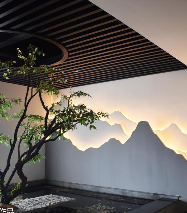
在经过对场地的深入研究之后,项目团队决定对自然光线进行大规模的控制,通过彼此相连的一系列区域来营造宁静而舒适的氛围。对自然光的利用是该项目的关键要素。不同的光照能够营造出不同类型的空间,明暗的对比和高天花板的应用也将使整个空间的层次变得更加丰富。
After studying the characteristics of the premises, the project of the new dining area poses the challenge of controlling a great quantity of natural light and succeeding in transmitting a sense of serenity and comfort through the different areas that lead you there. Undoubtedly, we try to take advantage of the natural light as the key element of this project and work on this so it can represent the different areas that appear inside a diaphanous space. The contrast between different shades of grey and the exploitation of high ceilings are the elements that give meaning to the whole composition.
▼设计的手法体现在对自然光线的大规模控制,the project of the new dining area poses the challenge of controlling a great quantity of natural light
▼高天花板的应用使空间层次变得更加丰富,the exploitation of high ceilings give meaning to the whole composition
▼天窗下的用餐空间,dining area under the skylight
▼用餐空间细部,detailed views of the dining area
▼带木制屏风的走廊空间,circulation area with a wooden screen
▼走廊光影细部,light and shadow provided by the corridor
设计团队希望寻找一种色彩上的平衡,以塑造一种具有“透明感”的空间。但是从逻辑上看,实现这一目标的前提是要让空间满足基本的功能需求,也就是满足设计的初衷。所有非主要区域的支撑结构和室内元素均采用了胡桃木作为主要材料,在为空间赋予秩序的同时也使得它本身的功能、位置和重要性变得一目了然。
We could state that we were in search of a chromatic balance capable of shaping a diaphanous space. But logically, the project conveys a program of needs and elements that must harmonize and allow this space to be functional first and foremost. This was something that we wanted to put the focus on, but at the same time it had to complement the initial concept and this is why all the supporting elements and areas that are not part of the main area are represented in walnut. Thus, everything follows an order where you can understand that all the elements have their importance and place just at a glance.
▼柔和的光线照射在温暖的木墙表面,the warm, wooden wall finish is highlighted
by the soft sunlight
▼人造光线与自然光相得益彰,the artificial lighting design is balanced with the natural light
▼走廊灯光细部,corridor detailed view
▼室内细部,interior detailed view
▼光影细部,lights and shadows
▼平面图,plan
▼剖面图,sections
Project name: RDA Restaurant
Arquitecture: Carlos Segarra | arquitectos
Website:
E-mail:
Location: Valencia, Spain
Year: 2018
Surface: (m2) 150
Photographer: David Zarzoso
Website:
{{item.text_origin}}

