Architects:Red5studio
Area :240 m²
Year :2022
Photographs :Wuyhoang Studio
Construction :Rex Interior
Design Team : Lai Chinh Truc, Nguyen Vinh Nhi, Tran Thi Kim Duyen, Pham Hoang Duy Nhan, Le Hung Thao
Client : Inn Saigon – The Running Bean
Country : Vietnam
To add the contemporary to a building that has conservation value right in the heart of Hanoi is the equation that we need to solve this time for The Running Bean - while we head North. Current condition overview - This is an ancient house located right at the center of Hanoi, after several forms of business passed through it - naturally this place no longer conserved the original design. The building is quite narrow in width a lack of natural light and an almost corrupt original structure. However, the old inherent with a few Gothic lines and the ideal height is the spotlight of the remained.
There are many ways to preserve a legacy value but the Red5 team chose to freeze it. Why do we call it FROZEN? Imagine the symbol of the iceberg, spreading cold air, freezing corners, and spaces inside the ancient house. We used the method of integrating square cubes, slanted arrays, or diagonal cuts combined with glass materials, glass bricks with a blue light tone to create a sense of movement and spread of the freezing.
The facade of the building was stripped of the old mortar layer to reveal the old bricks wall. The Gothic pattern is wrapped in stainless steel to make it more contemporary. Instead of directly entering the building from the main gate, we pushed it back a little deeper, the entrance gate is now made of a glass wall - paneled by 2 different types of transparent and translucent glass to create the image of the transparent block of ice with cuts inside. Leading the way in, there is a glass-brick floor that reveals the raw cement floor laying beneath.
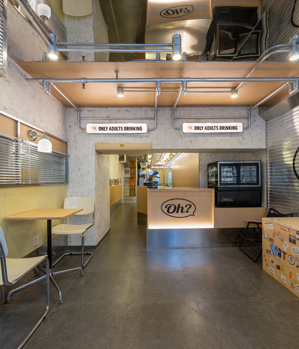
At the heart of the ground floor is the open coffee counter, which was made of transparent glass bricks and stainless steel. Above the counter, there is a diagonal rectangular block made of blue glass and stainless steel to strongly resonate with the freezing movement. We removed the finishing mortar layer on both of the sidewalls as well and put an extra layer of beveled glass to match the slanted counter ceiling. Because of the disadvantage of the width, we wanted to increase the original height of the building, which we did by placing an additional layer of mirrors to make it feel higher and airier. To finish it off, the yellow light layer was chosen to be the main light, but we added a layer of blue light inside the counter ceiling to create the color effect and the feel of the iceberg.
Next, there is a sitting area for 2-3 guests that just want to take a quick sip of coffee. This area uses concrete walls and layers of glass walls to hide the kitchen area and technical area and to make it seem larger. Highlighted with the open ceiling, the atrium is responsible for providing light during the day. The main aisle and the stairs system were made of glass and blue LED light, creating a feeling of walking inside the iceberg. On the first floor, we carefully used arrays of box shapes made from glass, mirror, painted plaster - to integrate multi-material box shape layers on top of each other, making it feel like you are inside the icebox.
As for the old brick walls, some of them are kept, while the other is combined with the off-white effect wall. In the evening, the entire space is covered with a hue of blue LED light reflecting the feel of the iceberg - the same as the ground floor. Because of the need to enlarge the area and the number of seats required, we changed the structure from two to three floors plus the interwoven mezzanines. The ceiling is pushed up to create spaces for natural light, to overcome the lack of light problem at first.
The entire furniture of this project is made of materials that resonate with the space: stainless steel, industrial leather, terrazzo, old wood, and old brick remains of the house.
▼项目更多图片
{{item.text_origin}}

