As the physical and digital worlds converge, there’s a greater appreciation for each in their own right. We found the stand-alone qualities of physical and digital space have more value not less even as they now get mixed together in many ways. That appreciation seems especially true with those who work with both mediums, like Hush, a design agency known for combining physical and digital design into integrated user experiences. Instead of using both for the interior of their new office, they decided to use purely physical elements with the idea of getting the most out of their inherent properties.
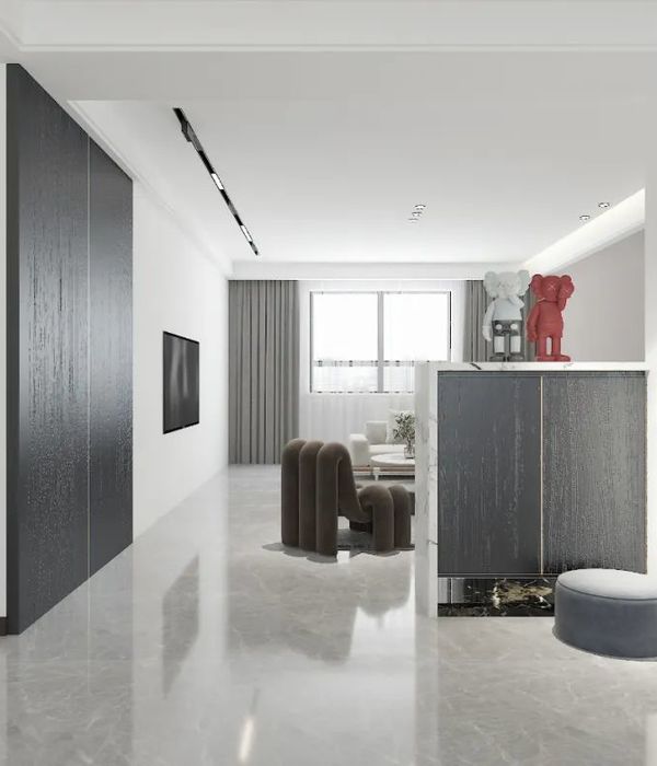
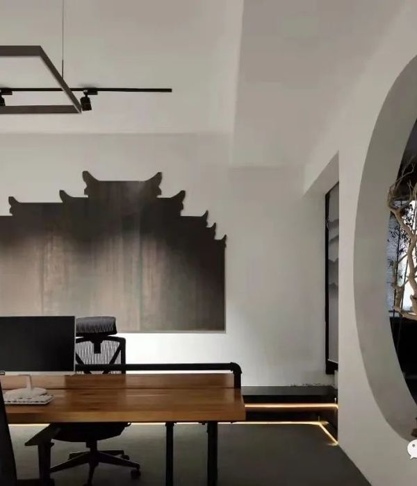
To complement Hush’s digitally intensive work, our design focuses on people’s very basic experience of architecture. In a work environment where staff construct models, code, and communicate on digital platforms and visitors view projects on flat-panel displays, we concentrated on the 3D world using movement, material, and light. The entry was relocated to one end of the 8,600SF interior to form a path across the space. Visitors enter through a 40-foot long white-walled tube. Above hangs a series of stainless steel panels that reflect motions and light.
The same edge detail runs the length of the 30-foot lounge table, which is made of smooth sanded ‘Pink Oak’ - oak planks treated with multiple layers of paint and stain. Meeting room area rugs that zig-zag around columns and walls absorb ambient sound to reduce reverberation. Other materials were chosen for their visual effects. Sheer red curtains line the large conference room to minimize daylight and screen glare while creating a translucent border around the space that’s visible throughout the office. The meeting tables’ translucent cast resin leaves transmit light and are meant to contrast the tables’ opaque Forbo tops.
{{item.text_origin}}

