- 项目名称:【静谧】
- 项目地址:温州市学院路七号
- 设计机构:中嘉国际·装饰 【原创部】
- 主案设计:谢冬军
- 参与设计:廖志豪
- 软装设计:谢冬军,廖志豪
- 施工机构:中嘉国际·装饰 【第六项目部】
- 项目面积:210平米
- 竣工时间:2020年9月
项目名称:【静谧】
项目地址:温州市学院路七号
设计机构:中嘉国际·装饰 【原创部】
主案设计: 谢冬军
参与设计:廖志豪
软装设计:谢冬军、廖志豪
施工机构:中嘉国际·装饰 【第六项目部】
项目面积:210平米
竣工时间:2020年9月
高级的住宅设计是以空间、光影和结构的韵律表现所营造出的优雅氛围,是建筑、室内、景观设计的无缝结合,而这些是靠设计的智慧创造而来。
Advanced residential design is an elegant atmosphere created by the rhythmic expression of space, light, shadow and structure. It is a seamless combination of architecture, interior and landscape design, which is created by the wisdom of design.
光 影 • 结 构 • 韵 律
韵律
rhythm
设计师以独特的理念打造一个具有韵律而不俗气,现代而不失文人气质的茶室空间。
Designers with unique ideas to create a rhythm and not vulgar, modern and not lose the literati temperament of tea room space.
白色的空间在黑色金属线条的勾勒下显得非常的现代、简洁、精致,原木的茶台穿插在飘窗茶杯柜上,采用玻璃材料当茶台支撑脚,完美的诠释着现代禅意式的品茗区,大面的采光窗,光线透过麻质纱帘渲染着整个空间,显得格外静谧。
The white space is very modern, simple and exquisite under the outline of black metal lines. The log tea table is interspersed on the tea cup cabinet with the bay window. The glass material is used as the support foot of the tea table, which perfectly interprets the modern Zen tea tasting area. The large daylighting window, through the hemp curtain, renders the whole space very quiet.
光影-空间结构的勾勒者
Light and shadow A kind of The Sketcher of spatial structure
楼梯空间,简而不减,虽白非白。极简的空间要注重调性的体现才会显得高级,调性来源于设计师对空间结构的塑造,细节的拿捏,材料色彩的控制及留白的比例,光影的运用......
Stair space, simple but not reduced, although white is not white. The minimalist space should pay attention to the embodiment of tonality, which comes from the designer's shaping of spatial structure, the manipulation of details, the control of material color and the proportion of blank space, the use of light and shadow
结构-重复、特异的构成
Structure - can be repeatedly and specifically shaped
楼梯踏步重复、特异组合的构成排布,专业的细节设计,多元的材料组合,精湛的施工工艺,塑造出自带气质的空间结构。
The composition and arrangement of stair step repetition and special combination, professional detail design, multi-element material combination and exquisite construction technology create the space structure with temperament.
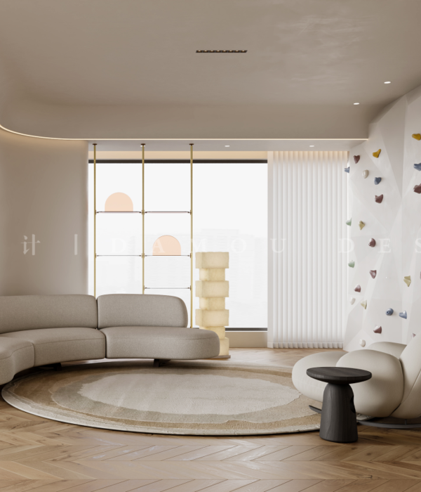
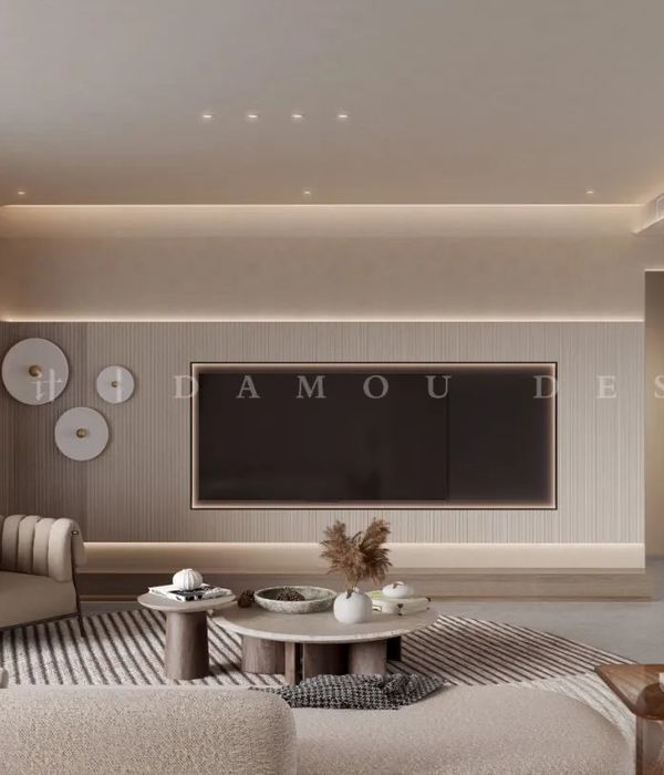
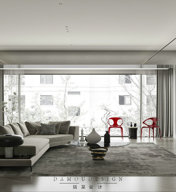
客厅中没有过于抢眼的色彩,亦没有浓墨重彩的渲染,而是以最经典的现代设计笔触,令金属、布艺、石材等所有元素协调相处,并选用带有高级感的中性色,来演绎一种“低调的奢华”。
The living room is not too eye-catching color, and there is no heavy color rendering, but with the most classic modern design brush strokes, so that all elements of metal, cloth art, stone and other elements get along in harmony, and neutral color with high-level sense is selected to deduce a kind of "low-key luxury".
客餐厅,处于一层的中心位置,是互通的空间,一侧是大面的白色石材,对立面是纯净白色柜体背景,不同材质的大块面的关系丰富了空间的层次,视觉统一在明亮简洁的色调中。餐厅居于西厨柜及窗户中央,两侧打造内嵌式置物区,客餐厅作为中心,中轴动线串联各功能区,主次关系配合得当。
The guest dining room, located in the center of the first floor, is a space for intercommunication. One side is made of large white stone, while the opposite is a pure white cabinet background. The relationship between large pieces of different materials enriches the level of space, and the vision is unified in bright and concise colors. The restaurant is located in the center of the western kitchen cabinet and window, with built-in storage areas on both sides. The guest dining room is the center, and the central axis moving line is connected with each functional area. The primary and secondary relationship is appropriate.
干区的打造上设计师用最简洁的处理手法完美的诠释此空间的美学气质,材料穿插的使用,结构高低错落比例的把控,营造出具有五星酒店氛围的干区空间。
On the construction of the dry area, the designer perfectly interprets the aesthetic temperament of the space with the most concise handling methods, the use of materials interspersed, and the control of the uneven proportion of the structure to create a dry area space with a five-star hotel atmosphere.
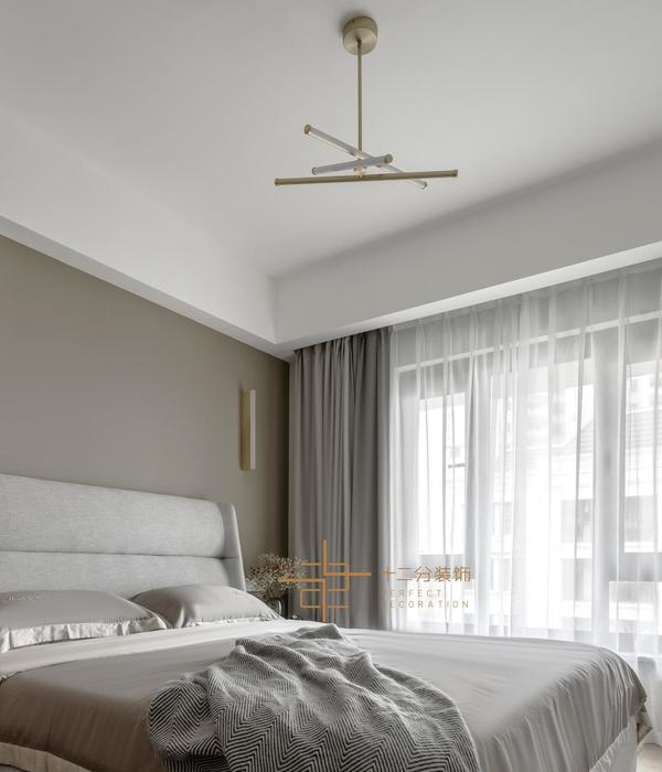
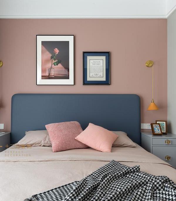
在卧室的设计上,强调的是舒展与放松,没有刻意的奢华,但流露出精致的生活情调。
In the bedroom design, the emphasis is to stretch and relax, there is no deliberate luxury, but shows exquisite life sentiment.
我们致力于打造都市生活中的心灵之所,在繁忙生活中寻找生活美学的深层意义
We are committed to building the soul of urban life, in the busy life to find the deep meaning of life aesthetics.
{{item.text_origin}}

