Architect:Gokostudio
Location:Eixample, Barcelona, Spain; | ;
Project Year:2019
Category:Private Houses
MOOD House is in a building dating from the beginning of the twentieth century located on a busy road at the entrance of Barcelona City.
The highly compartmentalized interior, the result of the construction system and lifestyles in the early twentieth century, was becoming less and less functional for the everyday lives of the residents. The areas used the most during daylight hours (kitchen, dining room, and study) had no natural light. They were all arranged around small and dark interior courtyards, so the owners of MOOD House hardly ever got to enjoy the daylight.
What is more, there was no connection between the dining and living rooms and, therefore, the latter was only used on special occasions. Since there were no guest rooms or storage spaces, and in view of the deficient lighting, the interior study was routinely used as the home help’s room and as a storeroom.
Added to this was the deficient HVAC installation; in the interior, it was installed in the false ceiling of the en-suite bathroom creating a somewhat uncomfortable main bedroom due to the noise and poor thermal insulation, which made it difficult to sleep in summer. And the HVAC circuits were housed in false ceilings in various spaces, thus depriving them of their original elegance.
Lastly, it was essential to prepare the house for the possible need to accommodate a person in a wheelchair. The conversion of the house for this purpose would turn out to be one of the greatest difficulties to be overcome in the refurbishment of the MOOD House.
The project was a huge challenge: it was a question of redefining the layout of a single-family home with specific demands in a rigid multi-family building since the load-bearing wall structure on the first floor made it impossible to remove walls.
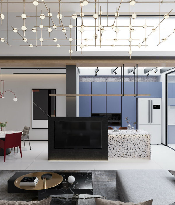
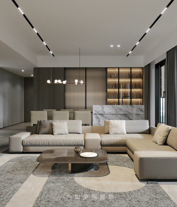
It was necessary to integrate the day-time area (kitchen, living room, and dining room) to freshen it up and open it to the main façade, without forgetting the study area.
The circulation (at least in the day-time area and en-suite room) would have to be adapted: at least 90 cm wide with no changes in level and turning radiuses of 1.20m.
In order to ensure the apartment regained its lost elegance and grace, it was necessary to recover the original high ceiling. However, the multiple installations requirements of the owners (air conditioning, heating, uninterruptible power supply, water softener, reverse osmosis, screen, projector, audio, and router with multiple internet lines) made things almost impossible. However, painstaking work, the confidence of the owners, and the helpful attitude of the installers ensured objectives were met.
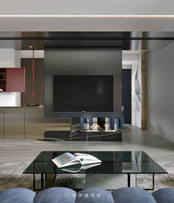
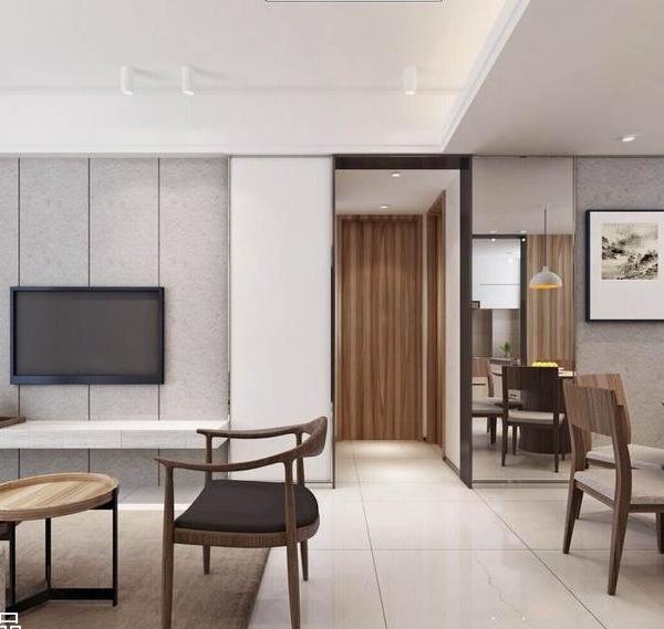
On the basis of the above, the load-bearing walls remained intact without having to surrender a functional layout of the spaces. In pursuit of an open, integrated, and well-lit day-time area, the kitchen-dining room-living room was placed facing the facade. At one end (the glass balcony), custom-made furniture was used to create an independent yet connected study for the two members of the couple, with views of the street’s leafy trees.
The table resting against the island, for the daily life of a family of four, leaving a lot of room for movement.
The extended table turned ninety degrees to meet the needs of large family gatherings, with space for up to fourteen people.
A wooden bench, a flexible lamp suspended above the table, a folding door that disappears when opened, and a sofa with a convertible back complete the functionality of this area. The correct layout of all these elements results in a very visually rich day-time area with its multiple functions, at the same time as enabling the zoning of the uses with no interior partitions apart from a steel and glass door, which can be folded to one side completely as required.
The former study was turned into a washroom and larder, in response to the request of the owner to have as much storage space as possible. The former kitchen was divided into two to turn it into an en-suite bathroom and the home help room. It was therefore possible to create an en-suite bathroom that may be converted into an adapted bathroom at a later date by just removing the shower screen.
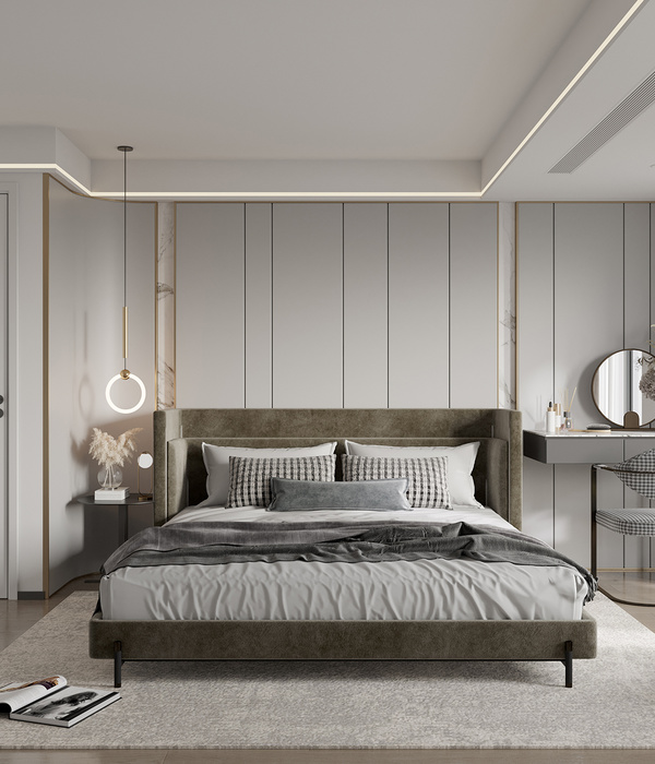
The former en-suite bathroom added extra square meters to the main bedroom thereby providing an open and adapted dressing room, structured around a bespoke piece of furniture combining the headboard of the bed and the wardrobe.
Just three materials were used: wood, micro-cement, and porcelain. This combination is present throughout the home and works as the common thread binding the project together. The colors employed were also restricted to three: tones of grey, wood, and exceptionally the use of copper. The result is a sober and serene home, in which wood (for the floor and custom-made furniture) and coppers take a leading role in the proposal.
The intervention has endowed the home with optimum thermal, acoustic and functional comfort, which makes it possible for the family owners to live their daily lives in spaces that flow together without functional or visual obstacles and that are bathed in sunlight.
▼项目更多图片
{{item.text_origin}}

