架构师提供的文本描述。适应旧金山不断增长的劳动力,Adobe发现自己需要更多的烹饪空间,他们希望为员工提供一种新的体验,与他们作为一家公司的抱负相匹配。把他们的办公室安置在历史悠久的贝克
Text description provided by the architects. Adjusting to a growing workforce in San Francisco, Adobe found itself in need of more culinary space and they wanted to provide their employees with a new experience that would match their ambitions as a company. Having their offices housed within the historic Baker & Hamilton building, expansion and structural changes were strictly prohibited by the city. The process to solve this problem began with a close collaboration between the newly hired Chef, Mirit Cohen, and Valerio Dewalt Train with their in house Media Objectives Studio. Together, they explored new ways to optimize their existing space and create a new and diverse culinary experience for Adobe employees.
Text description provided by the architects. Adjusting to a growing workforce in San Francisco, Adobe found itself in need of more culinary space and they wanted to provide their employees with a new experience that would match their ambitions as a company. Having their offices housed within the historic Baker & Hamilton building, expansion and structural changes were strictly prohibited by the city. The process to solve this problem began with a close collaboration between the newly hired Chef, Mirit Cohen, and Valerio Dewalt Train with their in house Media Objectives Studio. Together, they explored new ways to optimize their existing space and create a new and diverse culinary experience for Adobe employees.
© Jasper Sanidad
贾斯珀·萨尼德
首要任务是重组Adobe的现有设施。健康中心搬迁,主要区域被掏空,使美丽的木结构暴露在外。然后,服务站的区域被推向外围,以创造一个开放的中央座位空间。这一领域提供了一种灵活性,允许公司聚会,会议,当然,餐饮。该区域配备了柔软的座椅,欢迎在现有天窗下参观的游客。在外围设有展位,为非正式会议提供场所。
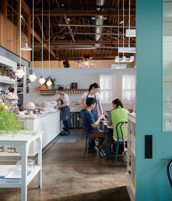
The first priority was to reorganize Adobe’s existing facilities. The wellness center was relocated and the main area was gutted to leave the beautiful timber structure exposed. Areas for serving stations were then pushed toward the periphery to create an open central seating space. This area provides a flexibility that allows for company gatherings, conferences and of course, dining. Furnished with soft seating, this area greets visitors below the existing skylight. Booths are incorporated into the periphery to provide areas for informal meetings.
The first priority was to reorganize Adobe’s existing facilities. The wellness center was relocated and the main area was gutted to leave the beautiful timber structure exposed. Areas for serving stations were then pushed toward the periphery to create an open central seating space. This area provides a flexibility that allows for company gatherings, conferences and of course, dining. Furnished with soft seating, this area greets visitors below the existing skylight. Booths are incorporated into the periphery to provide areas for informal meetings.
© Jasper Sanidad
贾斯珀·萨尼德
Adobe的新市政厅拥抱面包师
Adobe’s new Town Hall embraces the Baker & Hamilton building’s history as a tool factory by incorporating the design concept of “Tools of the Trade” throughout the architecture, branding, and the culinary experience. The main space, dubbed Landmark 193, features custom signage composed of steel structure reminiscent of the Baker & Hamilton rooftop sign. Culinary tools are also celebrated in each of the servery stations, specifically featuring the kettle, plancha, hearth, rotisserie, grill, and Filter, the space’s coffee bar adjacent to Landmark 193. Each of these instruments are used to prepare meals for employees in new and innovative ways.
Adobe’s new Town Hall embraces the Baker & Hamilton building’s history as a tool factory by incorporating the design concept of “Tools of the Trade” throughout the architecture, branding, and the culinary experience. The main space, dubbed Landmark 193, features custom signage composed of steel structure reminiscent of the Baker & Hamilton rooftop sign. Culinary tools are also celebrated in each of the servery stations, specifically featuring the kettle, plancha, hearth, rotisserie, grill, and Filter, the space’s coffee bar adjacent to Landmark 193. Each of these instruments are used to prepare meals for employees in new and innovative ways.
© Jasper Sanidad
贾斯珀·萨尼德
围绕这两个空间是大型定制铝屏幕。这些屏幕上微妙的变化模式是使用算法生成的艺术品进行数控切割,这是对空间工具概念的一种有趣和当代的看法。周围的家具使用一个静音的调色板,强调和庆祝木材和砖块从现有的建筑结构。
Surrounding these two spaces are large-scale custom fabricated aluminum screens. The subtly shifting patterns on these screens were CNC-cut using algorithmically-generated artwork, an intriguing and contemporary take on the space’s tooling concept. Surrounding furnishings use a muted color palette that accentuate and celebrate wood and brick from the existing building structure.
Surrounding these two spaces are large-scale custom fabricated aluminum screens. The subtly shifting patterns on these screens were CNC-cut using algorithmically-generated artwork, an intriguing and contemporary take on the space’s tooling concept. Surrounding furnishings use a muted color palette that accentuate and celebrate wood and brick from the existing building structure.
© Jasper Sanidad
贾斯珀·萨尼德
在服务站后面是一个由厨师桌创造的区域,这是为了提供一种独特的就餐体验。为了营造一种亲密的感觉,坐在厨房的外面,让员工观看食物的准备,并感受到这一过程的一部分。更暗的灯光在这个空间里设置了一种不同的气氛,在天花板和酒吧凳子中引入铜,为这一区域设置了一种独特的色调。
Behind the serving station is an area coined The Chef’s Table, which was designed to provide a unique dining experience. Enclosed to create a sense of intimacy, seating lines the outer part of the kitchen, allowing employees to watch the food preparation and feel part of the process. Darker lighting sets a different mood in this space, and the introduction of copper in the ceiling and bar stools sets an exclusive and unique tone to this area.
Behind the serving station is an area coined The Chef’s Table, which was designed to provide a unique dining experience. Enclosed to create a sense of intimacy, seating lines the outer part of the kitchen, allowing employees to watch the food preparation and feel part of the process. Darker lighting sets a different mood in this space, and the introduction of copper in the ceiling and bar stools sets an exclusive and unique tone to this area.
© Jasper Sanidad
贾斯珀·萨尼德
为了简化客人的就餐体验,为烹饪团队开发了一个新的交互式菜单系统。M-O与咖啡厅管理层、厨师、开发人员和建筑师合作,将咖啡馆的品牌和功能需求转化为一个交互式的数字菜单系统。通过把菜单上的所有信息都放在客人的指尖上,他们的决定点,整个烹饪体验都发生了翻天覆地的变化。这种菜单系统和烹饪体验的巨大赞誉,导致它在全球Adobe咖啡厅的扩张。
In order to streamline the guests’ dining experience, a new interactive menu system was developed for the culinary team. M-O worked with cafe management, chefs, developers, and architects to translate the cafe’s brand and support it’s functional needs into a system of interactive digital menus. By placing all of the menus’ information at guests’ fingertips at their point of decision, the entire culinary experience was transformed. The overwhelming acclaim for this menu system and culinary experience, has led to its expansion at Adobe cafes across the globe.
In order to streamline the guests’ dining experience, a new interactive menu system was developed for the culinary team. M-O worked with cafe management, chefs, developers, and architects to translate the cafe’s brand and support it’s functional needs into a system of interactive digital menus. By placing all of the menus’ information at guests’ fingertips at their point of decision, the entire culinary experience was transformed. The overwhelming acclaim for this menu system and culinary experience, has led to its expansion at Adobe cafes across the globe.
© Jasper Sanidad
贾斯珀·萨尼德
{{item.text_origin}}

