Recent years have seen established Swedish fashion label, Gina Tricot begin to shed its skin and emerge as a forward-thinking, progressive retailer. Taking new directions in its advertising campaigns, brokering collaborations with the likes of Icona Pop and earlier this year embarking on a journey to revitalise the aesthetics of its boutiques. Beginning with its flagship store on the hip Stockholm island of Södermalm, it approached Note and Open Studio for a fresh look that raises the garments on display to a new level and empowers the shopper in the process. 近年来,瑞典知名时尚品牌吉娜·特里诺开始脱皮,成为一家有远见、进步的零售商。该公司在广告活动中采取了新的方向,与Icona Pop等公司合作,并于今年早些时候开始了重振其精品店美学的旅程。从位于时髦的斯德哥尔摩岛S dermalm的旗舰店开始,该公司向Note和Open Studio寻求一种全新的外观,将展出的服装提升到一个新的水平,并赋予购物者权力。
The boutique is situated on one of Stockholm’s busiest shopping streets, with a challenging period space and features to be preserved. Another challenge is that, once completed, this space would be the seed for Gina Tricot’s other stores across Sweden—so every design decision and attribute needs to be transferable and scalable without loosing its brand consistency. 这家精品店坐落在斯德哥尔摩最繁忙的商业街之一,有一个富有挑战性的时期空间和有待保留的特色。另一个挑战是,一旦建成,这个空间将成为吉娜·特里奥(Gina Tricot)在瑞典各地的其他门店的种子-因此,每个设计决策和属性都需要在不失去品牌一致性的情况下,具有可移植性和可伸缩性。
During planning we encountered an anomaly which would leave an impression on the end design. Gina Tricot’s overall customer demographic is one which differs in the physical space to that of its online marketplace. And the label’s physical retail spaces play a significant role in the lives of its shoppers—acting as social destinations where genuine human-to-human interactions are currency. 在规划过程中,我们遇到了一个不正常的现象,这会给最终设计留下深刻的印象。吉娜·特里奥的总体客户群体在物理空间上与其在线市场有所不同。该品牌的实体零售空间在其购物者的生活中扮演着重要角色-作为社交目的地,真正的人与人之间的互动是通俗的。
As a result, the final design needed to reflect the rituals of the shopping experience and be a hangout for friends sharing time together. A juice and snack bar emerged in the design to allow for relaxed gatherings while enjoying the collections. The contrasts in shopper demographics also allowed for a broader palette of materials and colour for a vision of future retail that caters for the younger customer now, but also the way they’ll grow and develop as they get older. 因此,最终的设计需要反映购物体验的仪式,并成为朋友们一起分享时间的聚集地。在设计中出现了一个果汁和小吃店,以便在享受收藏品的同时允许轻松的聚会。购物者的人口结构形成了鲜明的对比,为未来零售业的前景提供了更广泛的材料和颜色调色板,这不仅迎合了现在的年轻顾客,也为他们随着年龄的增长和发展提供了一种方式。
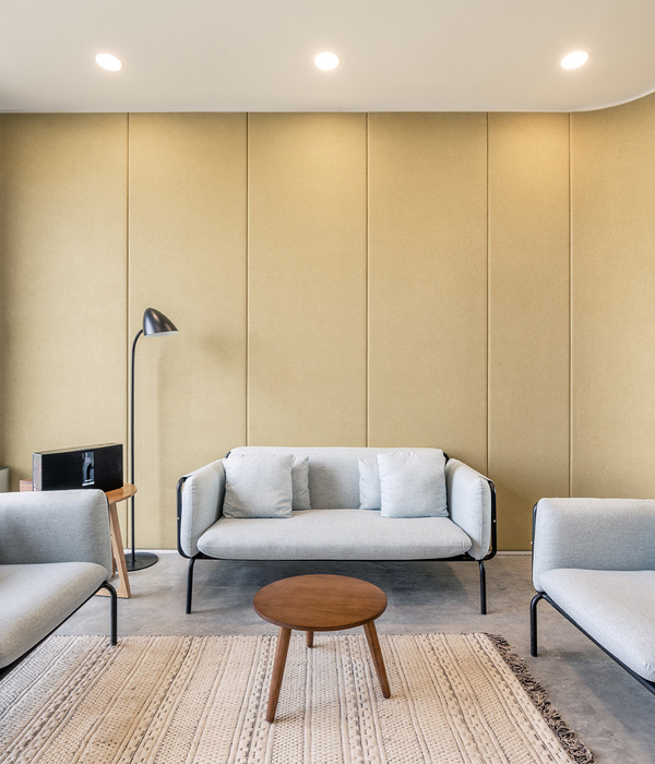
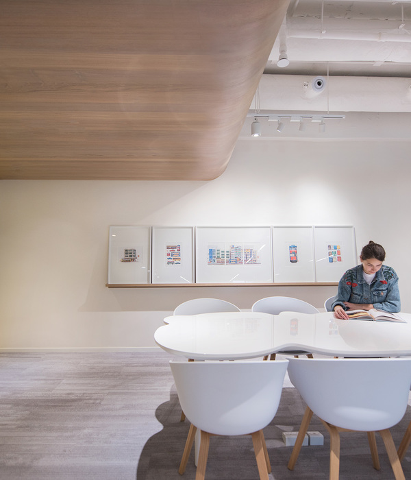
A key feature of the new space is streamlining the flow of shoppers through the aisles, of which there are relatively few. Instead of funnelling the visitor through a pre-set customer journey, the new store leaves the customer to make decisions. By using tints, transparency, mirrors and textures the interior invites exploration and generates surprise encounters with key pieces and styles. If it was felt that a material wasn’t contributing to the experience it was left out. 新的空间的一个关键特征是通过过道来简化购物者的流动,在这些通道中相对较少。新的商店不是通过预先设定的顾客行程来漏斗游客,而是让顾客做出决定。通过使用“TINTS”、“透明度”、“镜像”和“纹理”,内部会邀请探索并产生与关键零件和样式的意外接触。如果感觉到一种物质对它所经历的经历没有贡献的话。
“This has been a pretty exciting retail project. Gina Tricot needed a new Gina and chose to roll it out first at its flagship store on Södermalm. A pretty bold, provocative step for such an established retail chain—you’d perhaps do a small concept store, then test it and then roll it out across other locations. But Gina wanted a really big change, and to do it somewhere that would have a real impact,” “这是一个相当令人兴奋的零售项目。吉娜·特里奥特需要一个新的吉娜,并选择首先在S dermalm旗舰店推出。对于这样一个成熟的零售连锁店来说,这是一个相当大胆而又具有挑衅性的步骤-你可能会做一个小的概念商店,然后测试它,然后在其他地方推出它。但是吉娜想要一个很大的改变,而在一个能产生真正影响的地方做这件事。“
{{item.text_origin}}


