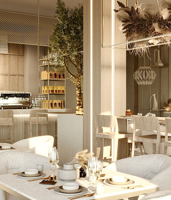
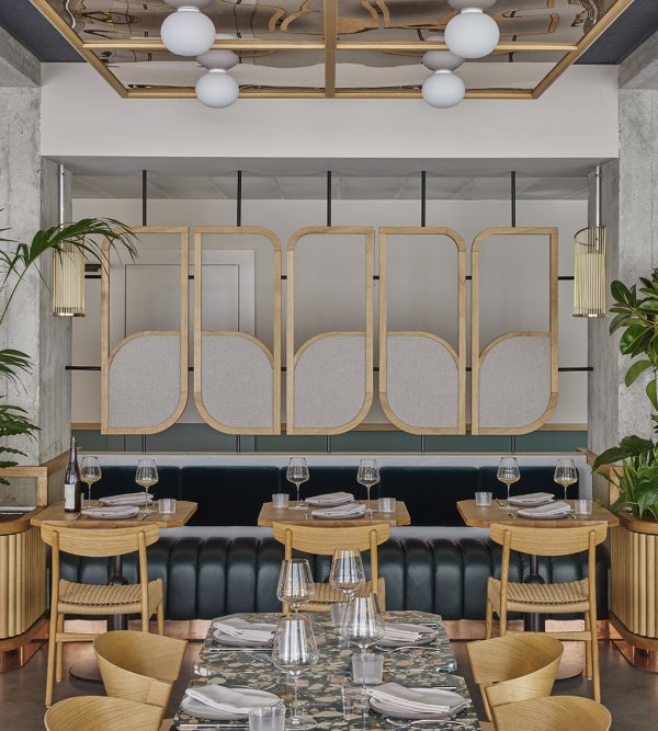
Together is a feeling, Together is more than just a word, Together one can make the world more interesting and evolve. The latest collaboration of Studio RENESA brings forward a collaborative approach of space, team, scale, culinary and bar experience to connect to the true meaning of "togetherness". In search of a meaningful integration of shape, color, texture, and design, the entire space integrates the different planes and volumes of the site at the 12th floor of Le Meridien, Gurgaon. The ideology of the space initiates from the amalgamation of a young talented chef (Vanshika Bhatia) with an experienced bar mixologist (Nitin Tewari) to form three basic parts - kitchen, bar, and a seating space.
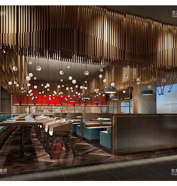
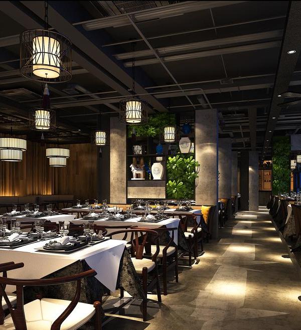
The Indigenous characterization of using locally sourced Indian Materials was one of the main expressions at Together At12th. The overlay of Indian Teak wood in contrast with the Dholpur Stone creates a juxtaposition of textures from the ceiling to the walls and floor, visually softening the project as a minimalist and elegant fine dining restaurant. The wooden lattice creates a symphony of dramatic formats of vertical and horizontal arrangements along with the minimal rose gold plated sleek lighting design which has been conceptualized as per the branding module of the different spaces at the site.
In addition to the subtle variation of Indian materiality, the same materials act like sound absorbents for the hotel below and add to the aesthetic value of the space through its grain and organic structure. Consequently, the entrance acts as a transitional space, designed to create a narrow passage from the dining area and the speakeasy bar connecting to the private dining room and lounge. Throughout the area, there is exposed concrete overlapped with wooden slats to create a sense of continuity and harmony for the visitor.
As we move further, the visitor comes across the grandness of the room in which the restaurant opens up as we move between tables up to the open terrace space which is flooded with natural light parallel to the huge spread of the bar. The backbone of the space, i.e. the kitchen was a huge challenge due to the importance of its strategic location and demand. To strike the right balance of aesthetics and services, the kitchen massing was moved to the end of the gallery space along with the hotel service unit area to get a bigger area as well as to accommodate the inflow of guests expected at the restaurant.
Similarly, the bar massing was racked up at the other end of the space to create a balance of energies and ensure that the seating space fused itself into the speakeasy and the bar seating. The design of the restaurant is in equilibrium with the culinary and bar scheme. The kitchen acts as the unifying element bringing together the bar to form a pure space which may visually seem complex but follows an ease of movement through the space. The result is an experience that encourages togetherness.
{{item.text_origin}}

