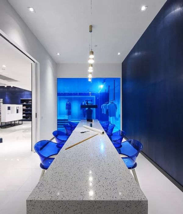
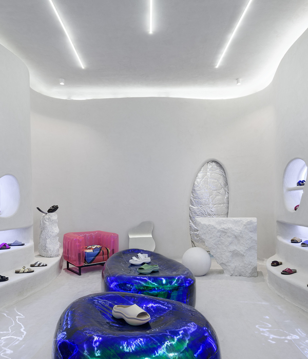
With branding and design agency Lonsdale’s help, MAIF is defining a new customer experience, with an agile concept, aimed at more urban audiences, designed as a place for advice, where the in-branch experience encourages a “return to the physical”, enabling value-added operations.
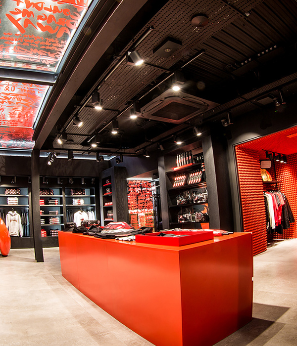
Lonsdale’s teams defined several POS formats, including a flagship adapted to large cities, with a surface area of over 200m2 and a rich program; a standard format for city centers, designed according to retail codes; and a small, local format, to get MAIF seen in high-traffic locations.
MAIF plays on its distinctive design markers. Inside the points of sales, the brand’s red triangle logo, treated in anamorphosis, highlights the advice desk and the “Café Bienvenue”, both a place and ritual of welcome, inspired by the codes of the counter. The anamorphosis was designed as a strong sign of recognition, visible from the outside. To meet the strong demands of the customer experience and the need for advice, a “MAIF gallery” was designed: a wall dedicated to the offers to embody the 4 themes of life’s moments: housing, family, travel, savings.
Design:
: :
Lonsdale
Photography : Jacques Giral
{{item.text_origin}}

