Architect:ST-buro
Location:Moscow, Russia; | ;
Project Year:2018
Category:Shops
Narrow floor plan, combined with the requirements for medical facilities didn’t leave much maneuver for the layout. There wasn’t an opportunity to hide technical and service non-client areas in the back of the clinic. Basically all doors open into a common corridor.
Therefore, the design was aimed to help visitors to orient as clearly and quickly as possible, guiding them to the right room, and not to the breakout area for the staff or the accountant’s office.
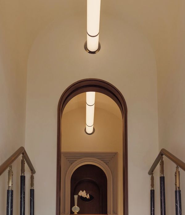
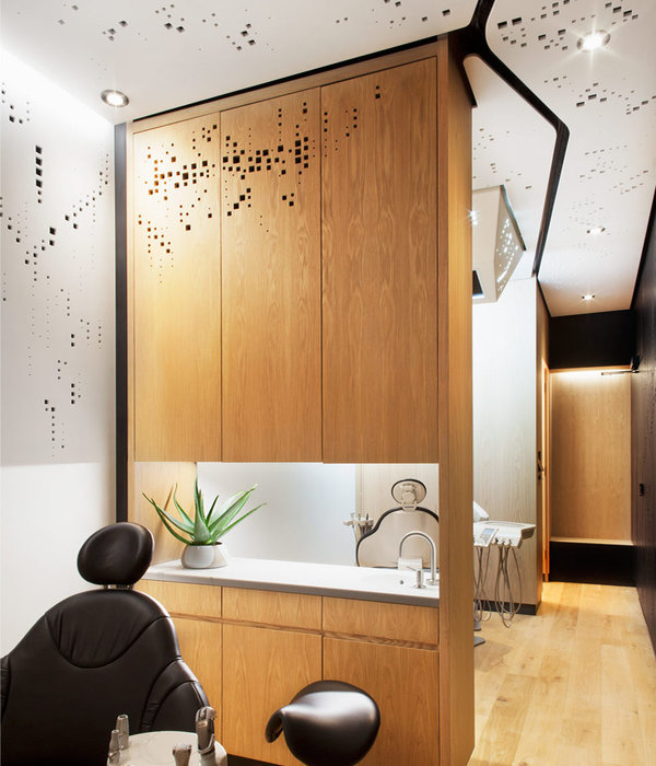
On a perception level, division exists even by the quality of the surfaces. Cold glossy white wall – for personnel access: there is a server room, laundry, sterilization room, warehouse and other technical spaces there. On the other side, a warm wood veneer wall hides customer’s area.
More detailed visual navigation is placed on the floor. Starting from the front door green lines leads you to the common public areas (reception, wardrobe, toilets, waiting areas). White ones guides to the rooms of primary care, massage and cosmetology. Gray lines are for rooms prescribed by a doctor and physiotherapy. If there is no line approaches the door, this is a room forinternaluseonly.
▼项目更多图片
{{item.text_origin}}

