非常感谢
Otxotorena Arquitectos
Appreciation towards Otxotorena Arquitectos for providing the following description:
潘普洛纳的纳瓦拉大学新经济系楼去年在西班牙完工。位于小山坡上的新大楼融入校园绿色环境中,安静的俯瞰着坡下的河流。建筑主要用材为清水混凝土,玻璃,金属,其中清水混凝土是主角。雅致的清水混凝土构建优美的分布在立面,演乐出动人的节奏。高精度的施工技术,让作品具备极高质量。
The new building is the definite headquarters of the Faculty of Economy and Business; it has a large provision of classrooms and rooms available for the increase in the teaching possibilities of the University, adapted to its evolution. It is located in the Pamplona campus and it is next to the current Law building, with which it is connected by means of different accesses in the East and South façades.
The close relationship between both is contemplated. Their offers are complemented and they will share students and spaces. In short, the maximum interconnection between both buildings is attempted, which will have a single access from the outside. The new construction appears from the beginning, marked by the new role acquired by the Postgraduate courses (Masters and Doctorate programmes).
From the point of view of the shape of the building, we can highlight the desire to respect as much as possible the well-looked after green campus which currently goes down to the river before this building and which it is part, with a special degree of protagonism, of the visual and environmental heritage of the campus.
教学楼主要为博士和硕士提供教学场所,楼层为三层,教室主要集中在地面层及其上一层,大部分教室围绕充满阳光的白色中庭布置,少量的原木色为空间调上温暖的调子。条状和圆形的天窗将光线柔和的引进这个开放的共享中庭。外立面元素主要是垂直的构件,这些构件保护建筑不受过多阳光的照射。室内设计中的天花板,楼梯间,还有演讲厅也都运用到了垂直的元素作为功能构件和装饰。最上层主要是教员办公室。
The construction is attached to the Law building, as mentioned, with a similar size and loyal to its essential alignments and the addition of a new common façade. This is justified by the solution offered for access, and acquires outstanding importance in the result given its exceptional length, and as it it’s the one providing the background to the mentioned green campus. It is designed as a façade with a serried structure and rhythmic expression, coherent with its scale. It is made up by a system of vertical concrete elements able to act as a filtering device of space and views, as a parasol for the sections of the elevation framed by their vocation of opening and transparency.
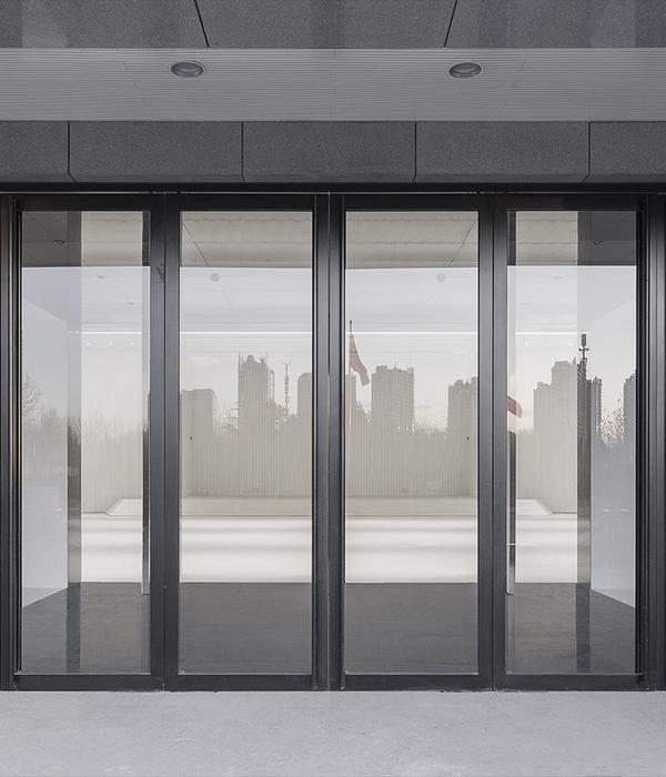
The other façades of the building are completely open to the exterior, with a continuous glass outside wall. This presents, however, a paused visual expression by the active presence of vertical elements in its structure: it is projected to the exterior in order to ensure its protection against the sun and improve the geometrical cleaning of the spaces. The last decision was also taken in view of an indication received in said respect from the entity, wishing to become as flexible as possible and prevent interferences in the event of possible future changes in the distribution of the floors.
The option for the starring role of the faced concrete, which is extended to the rest of the building, is justified by obvious reasons of consistency, stability and solidity, and links with that of the neighbouring buildings. The external image of the building, based on faced concrete and glass, is supplemented by the use of metal, opaque or more or less permeable cladding—depending on the case—, in whose design technical precision is sought, as well as expressive contrast and visual quality.
The inside layout of the building is based on elementary geometry that privileges the serration and regular repetition of elements and alignments of rooms and constructive elements. It revolved around the creation of a central covered patio called to take the pulse of its distribution and spaciousness. Everything revolves around the same: activity, space and traffic.
The project is distributed in its largest part in the ground and first floor, which are extended in the surface occupied; these storeys spatially connect as they are perforated with the large central patio, which crosses the same until it reaches the roof in search for natural light by means of skylights. The ground floor, which is the one used for access is the highest in certain points. The main volume is crowned with a lineal development of offices for the professors on the top floor, one the roof. The volume is completed with a series of back-to-back bodies amongst which we could highlight those corresponding to the deacon, chapel and ‘tower’ of offices. The later completes the provision of offices already existing on the top floor, reaching the required number, without overloading or forcing the occupation of the building on the floor plan.
Location
University of Navarre Campus, Pamplona, Navarre, SPAIN
Architect and construction management
Juan M. Otxotorena Elizegi
Collaborators architects
Gloria Herrera, Catalina Delgado, Jorge Ortega
Project quantity surveyors
Isabelino Río, Ignacio Quintana
Construction quantity surveyors
Gorka Visiers, Ignacio Quintana, Óscar Lacruz
Structure engineering
José Ignacio Etayo, arquitecto
FS Estructuras S.L. (Fernando Sarría, arquitecto)Facilities engineeringAM & asociados, ingenieros (Juan Aiciondo, Fernando Macías, José Luis Moneo)Ana MorenoNAVEN Ingenieros (José María Moro)ALS/ architectural lighting solutions (Antón Amann)Promoter
Universidad de Navarra
Construction companyVDR ConstruccionesSite managers
Paula Martinez, José Miguel Bienzobas, María Saldise
Total area15.529,60 m2Budget13.124.022,75 €Project dateabril de 2010Construction dateabril de 2012Photographs
Juan Rodríguez
Pedro Pegenaute
José Manuel Cutillas
Rubén Pérez Bescós
MORE: Otxotorena Arquitectos
,更多请至:
{{item.text_origin}}

