The clients are European and had very specific design tastes and requirements. They are musicians and have a guitar collection and piano. They are extremely contemporary. Scott combined two penthouse units to create an expansive and open floor plan which includes 5,000 square feet of living space.
The property is a penthouse in Chicago’s Streeterville neighborhood nestled amongst skyscrapers with expansive views of the Playboy building and Lake Michigan. This European couple was looking for smart storage solutions- a place for everything. In addition the clients wanted a modern and clean look maximizing views. They desired all the bells and whistles of modern day urban living.
A Room with A View: To maximize views Scott designed the layout of the bathroom so the shower faces the glass curtain wall. A European frameless shower was used with a solid surface curb the same color as the floor tile for a perfectly tailored and modern aesthetic. The shower, made of glass on two sides allows for unobstructed views in the bathroom. Even though this penthouse soars above the other buildings in the area, Scott used a frosted glass tape over the shower door from breast height down to create a sense of privacy without blocking the view.
Smart Storage: This bathroom is small for a penthouse of this scale so storage was a challenge given an entire wall is glass. Scott created a variety of storage solutions for all shapes and sizes so everything can be tucked away. Oversized drawers in the floating vanity accommodate larger items while smaller items can be stored in the built in medicine cabinets. Recessed niches in the shower accommodate bath essentials.
Finishing School: Finishes were kept modern and simple with a deep charcoal and white palette. Scott used a stacked porcelain mosaic on the vanity wall, white vanity top and cabinetry with a white lacquered finish. The flooring and shower wall tiles are the same finish but Scott varied the scale with an oversized rectangular tile. He then integrated a teak floor in the shower for a spa like feel. Lastly he took cues from the glass curtain wall and integrated chrome plumbing and trim details.
Bells and Whistles: Scott provided towel warmers, radiant heat flooring, clean lined storage solutions and designed the shower to allow for a panoramic city view while still maintaining privacy.
Scott utilized Trufig, invisible plugs mounted flush to the wall for a clean and modern look built into the base of the medicine cabinets. He also designed 12” deep medicine cabinets recessed into the wall for a clean modern look to accommodate toiletry storage and small items. He then faced the medicine cabinetry with mirrors done by Glassworks, which reflect the urban landscape and lake views.
A floating vanity was designed for a light and airy aesthetic with a solid surface vanity with a chunky top mitering edges for a seamless look.
Store It: Scott designed stainless steel countertops for durability with a ledge for spices and recessed canisters for knives and accouterments. The cabinetry was designed with an American cabinet company, which Scott customized to feel European in design. The cabinet company was not capable of making doors that flip up and over so Scott used the base cabinets and had another company, Element Design fabricate the large 54’w x 30”h doors. They also handled the sliding doors at the pantry. The island accommodates storage on both sides for larger items. Scott purposely designed the cabinetry to not extend to the ceiling so everything is within reach.
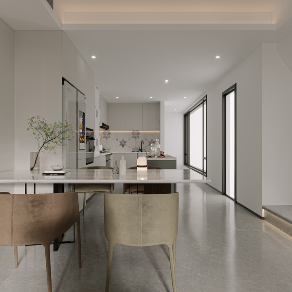
Mastering Modern: The design of the kitchen needed to be minimal so to not distract from the urban landscape and lake views. Scott designed clean modern white lacquered cabinetry with metal trim. At the island he used an 800-pound butcher-block top and stained it ebony. He then designed a Parsons leg detail to create a volumetric shape for the island. He integrated appliances and used a stainless backsplash and prep area to complete the look. He also utilized a Gaggenau cooktop that appears seamless with the rest of the stainless countertop and when not in use can be used as prep space.
On Display: The couple travels and has family heirlooms that were important for them to showcase. Scott created a shelving tower to display small items in the transition between the living room and the kitchen. He also created open wood shelving for larger items and cookbooks
Scott laid out the space to maximize views with the dining area at the glass curtain wall. Cabinetry was designed around the perimeter to not obstruct the views. It is difficult to make c-channels work for tall cabinetry. He sourced stainless steel channels that were thin in size and long through German manufacturer Hafele.
Small square recessed lighting was designed and meant to disappear while providing adequate task lighting. Under cabinet lighting was also integrated. A variety of storage solutions were integrated and space was maximized using a double-sided island, open shelving, drawers, flip up cabinetry and a sliding door for the pantry.
{{item.text_origin}}

