The large farmhouse sits on a vast property on the outskirts of a village. It had recently undergone a clumsy renovation, which deformed the classic farmhouse archetype and the owners did not feel at home.
The living spaces were poorly proportioned and the many small windows sadly did not allow the access to the expansive lawns.
The relative lack of transparency to the outdoors caused a shortness of breath. The living space was long and narrow, typical of the farmhouse layout with significantly low ceilings. Scale and proportions of the building required readjustment.
The necessary addition of two extensions has offered a new utilitarian function to the pre-existing space and justified the creation of a central courtyard. The two extensions - the living room and the kitchen - highlight spaces and improve the purpose of each room. Their large glazing windows help the house blend with the surrounding garden revealing more greenery. The contemplative central patio faces the house entry. Intentionally set "in-between" - between the kitchen and the living room, between indoors and outdoors - it unites the two and maximizes in light and scale.
The newly added spaces reinterpret the interior volume in creating height and capture better views of the vast surrounding landscape or indoor courtyard.
As for materiality, the art of dry-stone walling was used for the two extensions, according to the South of France traditional technique so as to preserve the local architecture, avoiding standard materials too commonly utilized. This one-of-a-kind construction work is a sleek take on a classic vernacular form totally reinvented with sophistication and finely crafted masonry: a true gem sitting on a compact base.
Large façade openings have been designed. However, the south side requires shading devices. The metal-clad shutters and pergolas and their graphic design are an essential part of the project identity. The design and density of the repeating pattern provide thermal performance to the metal sunshades and allow for natural ventilation.
Besides, the decorative value of the perforated metal pattern constantly creates different and vibrant shadows.
All these metallic elements are of a deliberately neutral shade for a tone on tone effect with the dry stone of the facades. This neutral colour palette unveils an extraordinary architecture, both elegant and impressive.
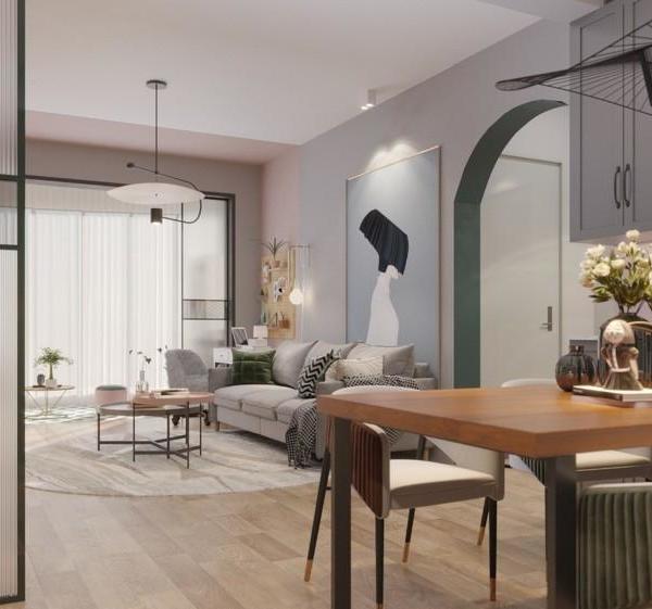
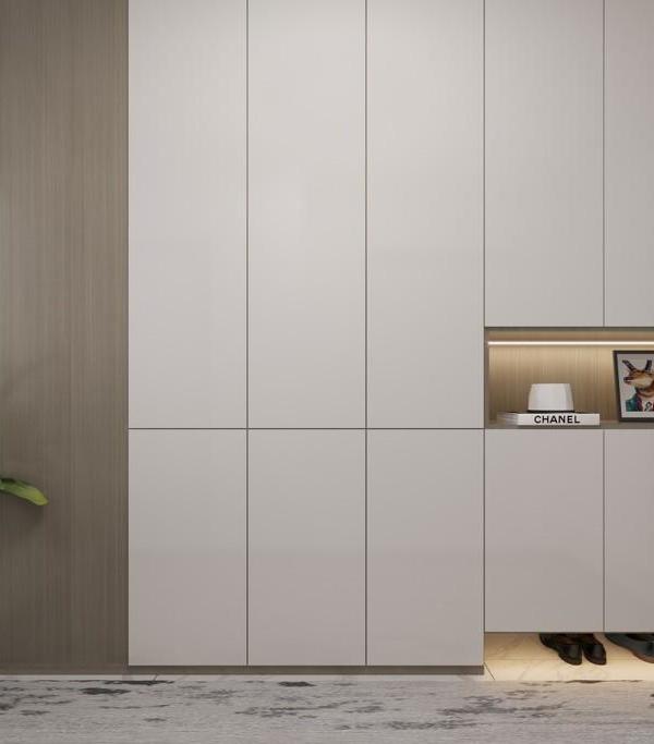
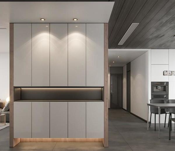
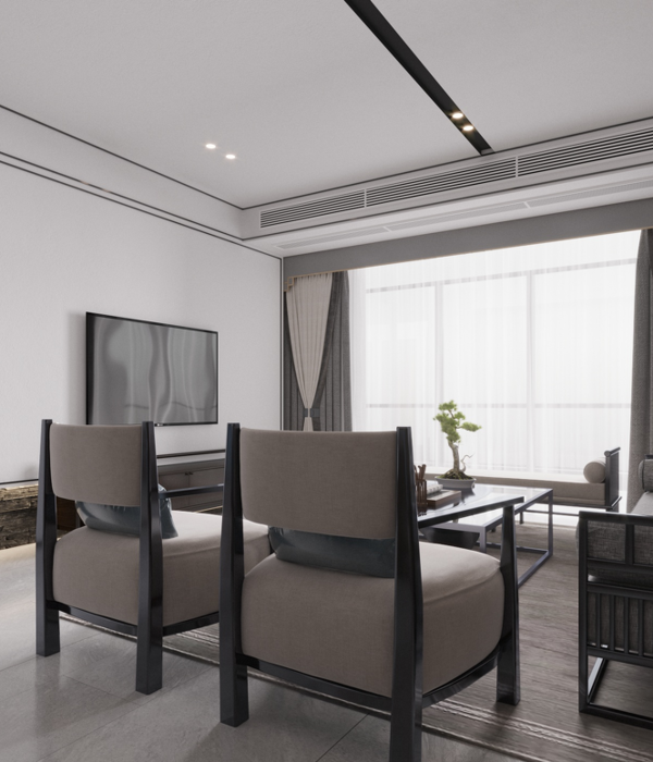
The custom-made furniture is arranged in the minimalist living space. The utilitarian items are tucked away; only to reveal what needs to be seen. The original staircase adorns a light wooden surface which encompasses the clever use of under-stair space with wisely hidden storage for the entry section.
The space as a whole has been imagined and designed to find homogeneity where aesthetics and utility harmoniously coexist.
{{item.text_origin}}

