A four-storey townhouse in Dalston re-imagined and transformed into a bold and colourful bohemian party house.
The client
We were approached by Zoe, actor, and Benedict, Cinematographer, to extend and transform their newly purchased townhouse in Dalston. We had worked with Zoe before on a renovation of her Hampstead apartment and we were very excited when she wanted to work with us again for the house that she had bought together with Benedict.
The original house
Already knowing the clients well, we had the opportunity to view the house before they placed an offer, and this enabled us to provide some initial advice and ideas. We also knew that whatever we were going to embark on together was going to be fun.
The existing house was divided into two dwellings, a small flat with fronts steps leading down on the lower ground floor and a family maisonette on the upper three floors, accessed up a flight of external stairs. What struck us about the building was its grand urban Brooklyn townhouse feel and the generous proportions of the main living areas and beautiful bay windows.
The brief
The brief was to combine the two separate dwellings into one home and restore the grand townhouse to its former glory. Zoe and Benedict wanted to change the basement flat into the main kitchen and living space, so that it could open onto the generous garden. They also wanted to keep the original through-lounge on the upper floor as well as providing a main bedroom with en-suite, a family bathroom, and further rooms to be used as bedrooms and study space but able to adapt over time.
“Having lived in predominantly white spaces for the past few years, I found myself thirsty for colour! I wanted a space that was vibrant and uplifting.” Zoe
Design Ideas
Developing the designs was exciting, as we had so much to work with. Their collection of artwork and furniture was already a great starting point for the home, and we knew from early discussions that colour was going to be key. Also, with Benedict being a Cinematographer, his technical interest and knowledge, meant we had to be on our A game when it came to lighting and designing for natural daylight.
Early discussions for the new construction elements of the project kept returning to mid-century Los Angeles style and we liked the idea of entering the house on a Brooklyn feel and switching from East Coast to West Coast by discovering a brightly lit, mid-century Californian style living space inside.
For the upper floors there were definite nods towards mid-century Italian colours and fittings, a particular favourite style of Zoe’s.
The Design Solution
The design solution was simple. The basement level was cramped, damp and in need of total transformation, but the upper three floors had beautiful proportions and we could save on structural and re-building works by focusing on celebrating the existing rooms without the need for major structural change.
On the basement level we fully opened it up by removing all the internal walls and we extended out into the garden with a simple and small infill single-storey extension. This created a fully open plan, long, linear space, with the kitchen at the front of the house, next to the beautiful bay window, the dining space and new stair in the middle of the plan and the lounge area at the back, benefitting from natural light from above and fully glazed onto the garden.
On the upper ground floor (with the main entrance to the house) the existing through-lounge was retained and celebrated. In the small rear outrigger, which was formerly a small kitchen, we converted it into the yellow shower room – that helps bring a beacon of daylight into the corridor and stair. The main structural adaptations were made under the existing staircase, where we brought up the new stair from the basement. We created a glass wall and door in this location using Crittal glazing, to create a fire separation between levels, but to still allowing light to flow in from the ground floor windows
On the upper two floors, bar undoing a few unoriginal changes that had occurred over the years, most walls and doors remained, and we created a main bedroom with walk-through wardrobe and family bathroom adjacent on the first floor and three smaller rooms on the top floor used as a guest bedroom, study, and a Peloton room but able to adapt over time.
“It’s a big house for two people, but we find we use every inch of it already. Each room has a different function, but also a different atmosphere, so I find myself settling in different corners of the house depending on my mood.” Zoe
Colour
Discussions on colour started early in the project, particularly between Zoe and the Jessica, as the design started to develop and the feel for the property and each individual room started to emerge. Zoe’s bold and excellent eye for colour meant the whole house got to become part of an immersive palette, with each room a different but complementing collection of shades.
The lower ground floor was kept bright, white, and textured. It pursued a clean LA vibe with an almost technical feel, assisted by the white lighting, appliances and painted, exposed structural steels and timber. The white backdrop was contrasted by the rich patterned Ash parquet, the stone blue ‘wormhole’ stair that slides into the middle of the room and the deep burgundy kitchen.
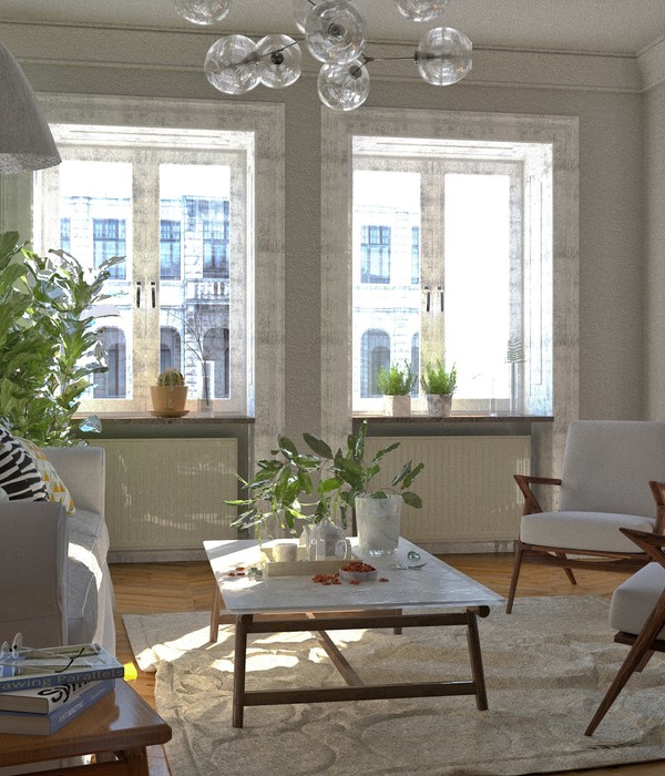
The ground floor got accents of bright emperor yellow that are softened by the more neutral French grey front room and deep green floors. The yellows of the bathroom and rear reception are positioned on the South side of the house to make the most of the daylight and brightness, meaning you are always looking at the back of the house via a sunny frame.
The existing stair was kept neutral, except for the citrine runner that spirals all the way to the top floor. On the way up, the master bedroom is kept moody and dark in an all-encompassing downpipe grey, relieved by a soft rusty orange carpet. The master walk in wardrobe continues the moody darkness, this time in a deep green, preparing for the pop of ‘euphorbia’ green that is the South facing master bathroom.
The top floor is a beautiful collection of shades, particularly the strong rusty study and the Chinese blue bedroom. This was an exercise in contrasting warm and cool with neutral and bold.
The one key area we could address and manipulate natural light coming into the building was at the back of the house on the basement level. As this façade was also South facing, we knew we had to find a careful balance between creating light and view but also controlling overheating. We opened up the back of this space with new full width sliding doors with white metal frames. This area of the façade was quite well shaded by the tall trees at the back of the garden and being able to open them fully was a great opportunity for providing cross-ventilation to the open plan living space.
The flat roof area of the new extension, which was relatively small (approx. 3x2 metres) was a great opportunity to bring in natural light from a different direction but equally this area was less shaded. Our solution was to place a large glass rooflight with high sides internally to minimise direct light coming into the space. We also designed the roof to be supported by slender timber joists, which we left exposed under the roof window. We oriented these perpendicular to the garden so that they would allow view of the sky from inside but also provide further shading and surfaces for the daylight to reflect off.
Texture also plays a really important role in the main living spaces. Influenced by one well-known mid-century Californian property we liked the idea of rotating the direction of exposed structural timbers in the ceiling to create variation and rhythm in the ceiling.
The same play of rhythm and texture extends to the vertical plane, the floor to ceiling balustrade to the new staircase. Also made from white painted timber, varies in rhythm to allow light into the stair and also conceal doors for under stair storage spaces.
{{item.text_origin}}


