- 项目名称:三亚艾迪逊酒店-星合·生活美学社区设计亮点解析
- 设计公司:万社设计
- 完成时间:2022
- 业主:三亚晋合置业有限公司
©️三亚艾迪逊酒店
The Sanya EDITION
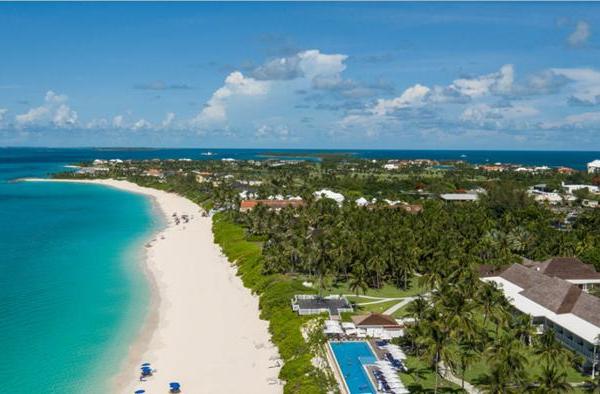
三亚艾迪逊酒店位于风光旖旎的海棠湾,这是继伦敦、迈阿密、纽约之后开设的全球第四家、也是中国首家EDITION酒店。
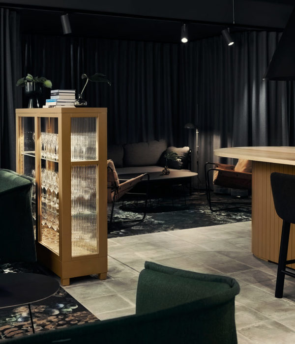
此次携手万社设计完成酒店新增空间-星合·生活美学社区整体的设计工作,其中包含商业公区、商业店铺立面、艺术中心、艺术商店、零售商店、书屋和咖啡厅区域。基于商业逻辑的考量,在满足酒店方、业主方、零售品牌方三者需求的基础上,实现了商业和时尚的平衡。该项目落地后便受到了业主和众多旅行者的青睐。
Located at the picturesque Haitang Bay, The Sanya EDITION is the first EDITION hotel in China and the fourth one in the world, following its opening in London, Miami, and New York. As a new addition to the hotel, Jinghope · Life Aesthetics Community is a project jointly completed by the hotel and Various Associates. The design scope includes public commercial space, shopfronts, the Art Center, art shop, retail stores, bookstore, and cafe area. The Life Aesthetics Community was designed in a way that balances commerce and fashion while catering to the needs of the hotel, the client, and retail brands. Since its launch, it has been highly appreciated by the client and tourists.
01
新动线的引入:环绕而上
A new circulation spiraling upwards
作为年轻的生活时尚类酒店品牌,三亚EDITION自带万豪基因,为全球的度假爱好者们打造一处避世的休闲天堂。这里是海洋运动文化的集合地,湿热的海岛气候为冲浪、帆船、日光浴、篝火晚会等娱乐活动创造了天然的环境,游客可享受曼丽的海滩风景以及酒店提供的各种活动设施。
The Sanya EDITION, a vibrant luxury boutique hotelaffiliated to MARRIOTT, embraces its Marriott heritage while creating a haven for global travel enthusiasts. The hotel is nestled in a thrivinghub of marine sports culture, and the localtropical island climate has endowed it witha superior natural environment for a myriad of entertainment activities such as surfing, sailing, sunbathing, and bonfireparties. Here is a place where theguests immerse themselves in the breathtaking beach scenery and enjoya diverse range of hotel amenities.
颇受好评的海滩俱乐部
The popular Beach Club at The Sanya EDITION
此前同样由万社设计打造的海滩俱乐部在落地后即收到了多方的好评。与这个充斥着热带风情的竹编构筑物不同的地方是,此次的星合·生活美学社区连通着主入口并且是处于主要客房区的必经动线;设计团队需要更多的考虑新增设计区域与酒店本身风格的融合以及平衡酒店和商业者的需求。新的动线引入,为公共空间创造全新的生命力。项目增设的旋转楼梯连接地面层和二层,引导旅客从G层直通商业空间。开放的植被环绕四周,露天沉思和休闲区域与室内巧妙融合。
The Jinghope·LAC adopts a design direction different from the popular Beach Club at The Sanya EDITION, which features bamboo-woven structures designed by Various Associates earlier. In this project, the focus is on creating a seamless connection with the hotel’s overall vibe and balancing the needs of the hotel and the new businesses. The Jinghope·LAC connects with the main entrance of the hotel and stands in the circulation route leading to the guest room area, injecting vitality into the public space through the addition of a new circulation. The newly built spiral staircase connects the ground floor to the second floor, directing visitors from the ground floor to the commercial space. Nestled amidst lush vegetation, the open-air contemplation and relaxation areas seamlessly integrate with the indoors.
"雕塑感"的楼梯
Sculpturalstairs
旋转楼梯通过柔和的设计语言勾勒出优雅的线条,以纯粹的形态与美术馆相呼应。游走在素净的纯白楼梯上,绝美的热带景观尽收眼底,此处也成为旅客们来到酒店后拍照打卡的热门“景点”之一。
The spiral staircase is crafted with an elegant curved design language, echoing the flair of an art gallery with its pure form. When ascending the pure white steps, visitors are treated to a breathtaking panoramic view of the stunning tropical landscape, making this spot one of the sought-after instagrammable attractions for tourists.
02
商业与时尚的平衡:穿梭环游
A balance between commerce and fashion: roaming experience
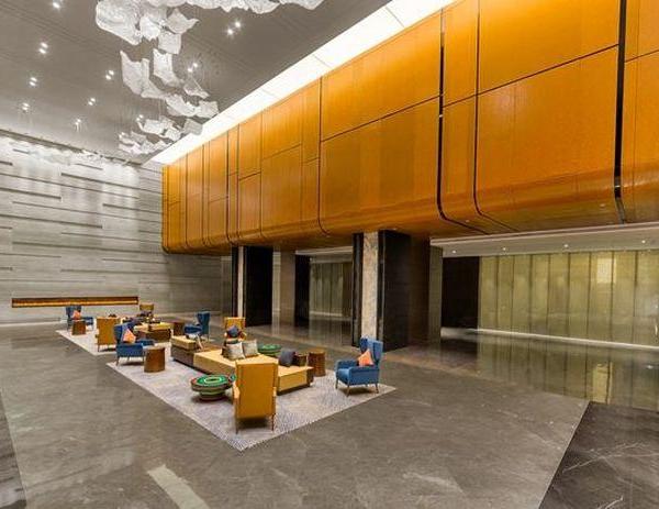
“商业空间跟酒店空间本质上对氛围及需求不太一样,所以我们希望在这个项目中以自然舒服的方式来衔接这两个板块。”场地公区层高达六米,将客人的视线控制在适合的高度是万社希望解决的首要问题。为凸显原场地的优势,设计团队将靠近自然光的商铺外立面使用上下玻璃幕墙的设计,并且每个商铺套上了新的立面设计。自然光线的引入使室内空间更加通透轻盈,大面积的对外橱窗成为艺术品或产品的展示区域,为顾客创造舒适的购物体验。
"Fully considering the distinct atmospheres and requirements of both commercial and hotel spaces, Various Associates worked to integrate these two functions naturally and organically."
The existing 6-meter-high floor height of the public area posed a challenge in controlling the guests’ sightlines at an appropriate level. Taking advantage of the floor height, the design team incorporated glass curtain walls into the upper and lower levels of store facades combined with new shopfront designs. The introduction of natural daylight enhances transparency and brightness in the indoor area, while the large show windows act as a platform to display artworks or products, creating a pleasant shopping experience for customers.
走廊地面材料延伸至商铺,材质和色彩的一致性扩大了内部的空间感。顶部灯带温和地渲染建筑边框,可根据不同时段的商业需求调节光度。
The floorings at the passageway are extended into the shops, creating a feeling of spaciousness via the consistent material texture and color. The top strip lights softly illuminate the building frame, with the brightness flexibly adjustable to meet commercial and operational needs at different times.
渲染的灯光引导动线
Lighting guides the circulation route
开放观景区穿插在商铺之间,面向自然景观,空旷简朴的空间氛围塑造一处安静、舒适且令人放松的场所。曲折蜿蜒的通道空间通过块体关系的错开,消除顾客经过长走廊时的无聊和疲惫感。
The open viewing areas are strategically placed in the gaps between the shops, providing a delightful view of the outdoor natural landscape. The openness and simplicity of the space create a serene, cozy, and relaxing atmosphere. The clever arrangement of structural blocks resulted in a meandering passageway, which helps to eliminate the monotony and exhaustion that can arise from traversing a long passageway.
开放的观景区
Open viewing area
03
以艺术品充盈空间:多维感知
Aspace filled with artworks: creating multiple perceptions
在整体规划中,美术馆与商铺立面设计结合的橱窗,用以展览各类更新的海报和艺术品,为公区增加了视觉惊喜及活跃度,给度假出游的顾客带来全新的体验。
The show window design of the art gallery and stores allows for the display of a wide range of posters and artworks, which not only adds visual fun and liveliness to the public area but also offers tourists a fresh and one-of-a-kind experience.
橱窗是外立面重要的建筑语言之一
Show window is one of the crucial architectural expressions of the facade
美术馆作为艺术传递的窗口,是完成艺术通道和氛围提升的重要区域。设计团队结合场地空间形态的高低关系,自然地规划成不同的功能区。前台接待处天花以十字形构建出极具辨识度的空间,地面则使用深色拼缝地板区隔。
The Art Center is a vital area to convey the artistic sense and enhance the overall ambiance. The design team tactfully arranged the layout of the Art Center based on the existing spatial forms and floor heights. The reception area features a distinctive cross-shaped ceiling, establishing a visually striking and distinguishable space, further defined by the black floor.
极简的空间体块
Minimalist spatial blocks
细块的洞石材质拼贴
Slender travertine tiling
美术馆内部为全开敞的空间,高低尺度的空间给予了展览自然地的边界,将充满活力的艺术感知拓展到另一维度,VA的原创沙发系列也成了艺术家延展的作品之一。
Inside the Art Center is a spacious and open display area, where spaces of different levels and scales add a sense of depth and dimension, enhancing the overall artistic experience. The art exhibition is complemented by original sofa collections designed by Various Associates, which becomes an extension of the art displays.
美术馆内部
Interior of the art gallery
艺术家二次创作的家具
Furniture re-creation by artists
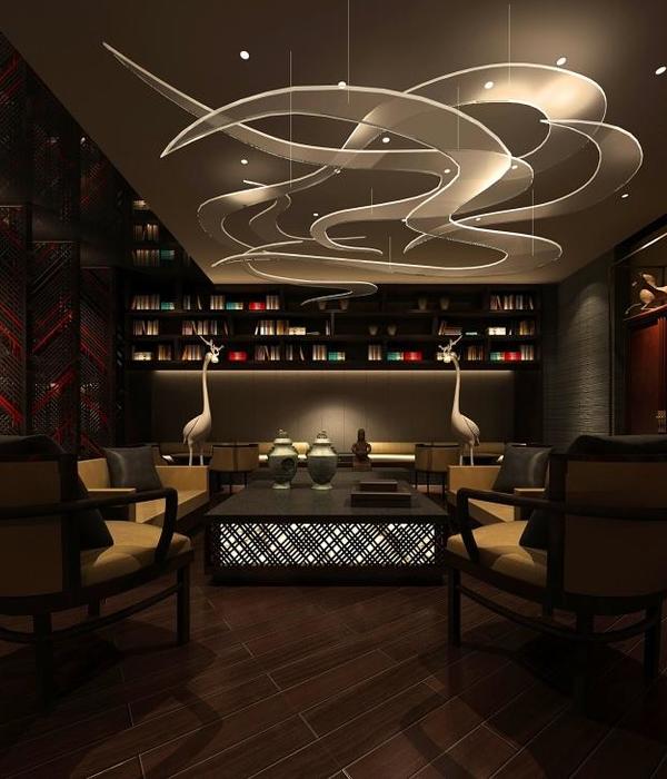
一体化的设计语言应用于艺术商店及二楼阅读室区域,光线的强弱引导着人们的情绪变化和不同维度的观览体验。
The art shop and reading room on the second floor are designed with a unified design language in which the changing brightness of lighting plays a crucial role in evoking visitors’ emotions and enhancing their viewing experience in various dimensions.
艺术商店及阅读室
Art shop and reading room
04
室外延展进室内的零售
Interior retail extended from the exterior
新的商业空间里,其中一家入驻的品牌是SND买手店,这家拥有上百个品牌的三亚概念店亦是由万社团队一起打造。设计团队提取巨浪作为设计概念,纯粹素净的空间体快与层层递进的高低关系,为顾客创造一种穿梭于巨浪中的环游动线。
Fashion boutique store SND is one of the brands that has settled in this new commercial space. This SND concept store in Sanya, also designed by Various Associates, features a collection of fashion products from hundreds of brands. Taking "waves" as the design concept, the design team crafted clean and minimalist spatial blocks that feature rhythmically varying heights, inviting customers to explore throughout the store as if they were surfing through the waves.
地面材料的延续
Extension of the floorings
通道尽头设置为沙发区、电梯间以及艺术家驻留客房的动线交叉区域,该空间通过不同的高差自然地完成动线上的引导。
The end of the passageway serves as an intersection of the circulations for the lounge area, elevator hall, and artist-in-residence rooms. The circulations guide the way naturally through height variations, creating a harmonious transition.
以高低差的空间划分功能板块
Height differences divide the functions
材料以其原始肌理和自然的状态呈现,设计团队将洞石瓷砖切分成小块铺设于整个空间,以简约的质感和舒展的形态塑造具有文化感的场地氛围。
The materials present the natural and authentic textures. The design team cut the travertine tiles into smaller pieces and applied them throughout the space, producing a cultural ambiance and a sense of place through the simple texture and its extending form.
自然肌理
Naturaltextures
令旅行者惊叹的酒店不仅在于精致奢华的住宿环境,还应包含独特的公共空间体验。万社呼应酒店原有调性,完成了从外立面到室内的一体化设计,创造出一幅艺术、自然与城市度假生活相互交融的图景。
A truly remarkable hotel offers more than just luxurious accommodations. It should also provide a unique experience in its public spaces. In this project, Various Associates captured the hotel’s essence and seamlessly integrated the design from the exterior to the interior, realizing a harmonious blend of art, nature, and the vibrant urban resort lifestyle.
摄影
Photo by SFAP
三亚艾迪逊酒店-星合•生活美学社区
地点:中国三亚
完成时间:2022
业主:三亚晋合置业有限公司
项目类型:外立面/室内设计/小型建筑体设计
设计公司:万社设计
主持设计:林倩怡,杨东子
设计团队:刘建鹏、潘百真、李泽兵、蒋美昱
LAC at The Sanya EDITION
Location:Sanya,China
Completion:2022
Client:Jinghope SANYA
Project type:Facade Design/Interior Design/Pavilion Design
Design company:Various Associates
Project leader :Qianyi Lin,Dongzi Yang
Design Team:Jianpeng Liu,Baizhen Pan,Zebing Li,Meiyu Jiang
{{item.text_origin}}


