Firm: Abscis Architecten
Type: Commercial › Office Government + Health › Court/Post Office Transport + Infrastructure › Parking
YEAR: 2012
The former post office site in Aalst was a mixture of industrial buildings of the former ‘Filature du Canal’. The “Filatures & Urban Fabric(s): Masterplan stationsomgeving Aalst” masterplan, designed by the Christian Kieckens Architects, started from a site conversion, whilst keeping the main building of the former mill in the Manchester building along the Vaartstraat. The modifications to this building have been kept to a minimum because of organisational and programmatic interpretation, which corresponds with the scale of the building. The facades have been cleaned and re-pointed and equipped with new outside joinery work after its historical model. The building has been renovated on the inside also, in order for it to comply with current regulations, without however interfering with the warehouse’s authenticity.
The new office blocks are strip shaped units, inserted in a north-south direction, guaranteeing the best east-west direction for the offices. The buildings are built perpendicularly onto the linear infrastructure elements (such as the river Dender, the railway line and the roads), strengthening its kinetic perception and resulting in a dynamic image of new buildings in an attractive, modern architecture against a backdrop of old factory units. The building is cut in two using a public internal road, which creates a shortcut to the train and bus station. It is on this public internal road that the main entrances to the buildings are located.
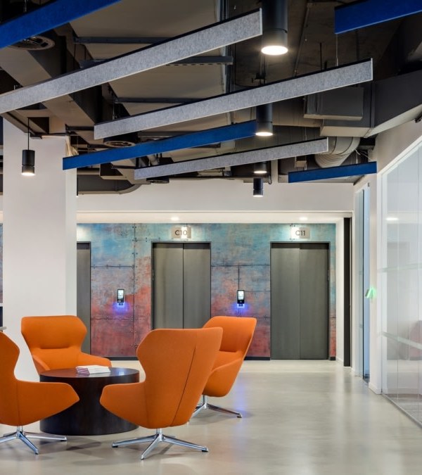
The office strips can be divided into smaller entities of ca 500 m², guaranteeing the very best flexibility and the possibility to lease office space to several public and/or private office users. The raised computer floors and lowered, activated ceilings enable different uses of its office space, from meeting rooms and cockpits to open plan offices.
Whereas the existing Manchester building is characterised by its weight and solidity, the new office strips are light, full of dynamism and transparency. They were interpreted as mostly glass units, equipped with blinds with coloured slats. These slats are kind of a second façade around the layer of buildings, patches of coloured textile as it were, referencing at the same time to the industrial past of this site as a mill. The Werfplein facade is the only facade which can be seen from the front. Here the coloured slats are intensified and only sporadically interrupted by big windows with a view on the Werfplein.
{{item.text_origin}}

