By naming the project Burgatoi we make our own a term from the nautical world that refers to a piece of curved wood used in the construction of a ship. The idea is to make a simile with the curved construction of the living space in this house.
. The former office and subsequent dwelling is part of the Ensanche Bilbaíno, and is located on the top floor of a building from the 60s of little architectural interest. The primary structure is composed of the typical grid of reinforced concrete porticos, although the roof structure is made up of wooden load-bearing elements with a Marseillaise flat tile covering. This roof seems to have been added later.
The state of the space we found was a narrow and elongated L-shaped floor plan. In addition, it was interrupted by the vertical elements of the structure that kept order and by a series of "patiejos" (1m*1m) of disordered ventilation that seemed to distort future distributions. Before the approach of the final proposal, it was agreed with the adjoining neighbor, the adhesion of an area to the project with the aim of having a facade to the street and an outdoor terrace space. The starting floor plan is the result of this operation.
. The owner is a young couple and their young son. The development of the functional program was defined with the classic daytime space of kitchen-dining-living and the private night area of two bedrooms, one of which, should also integrate a full bathroom.
In the formal proposal that ultimately determines and articulates the relationship between public and private rooms, we sought to give the house its personality, so that customers could feel identified with the unconventional design proposed. To this end, an artificial element was introduced, with a geometry that would move away from the compartmentalized and straight form, favoring more fluid daily relations.
This is an interior renovation project in which the expressive character is enhanced through the continuous gesture linked to the outline of a curve. A concept that recalls the architectural promenade, Le Corbusier's "promenade", discovering the dwelling as it moves through, sequencing the program from the spaces for daytime use to those for nighttime use like a ribbon that runs along its longitudinal axis.
This operation pursued two objectives: the first, was to understand the house as a sequence of continuous spaces that allow flexibility in their use, thus avoiding corridors in the day area while becoming fluid rooms. The second is to hide the scattered ventilation "patiejos", taking advantage of the interstices to house the necessary services and storage.
The sum of these concepts together with the personality, confidence, and courage provided by the clients engendered the outline of a soft curve capable of being form and function simultaneously working as a backbone and organizer of the required program of uses.
The next key point of the commission became to delimit the sequence of events that would be located within the curved space as the day services (kitchen, laundry, and bathroom), as well as the secondary room at night area.
Light is another fundamental aspect of the curved concept, since its incidence causes a variation of intensity in its reflection, giving a sense of flexibility and elasticity of the element that spatially transforms the volume.
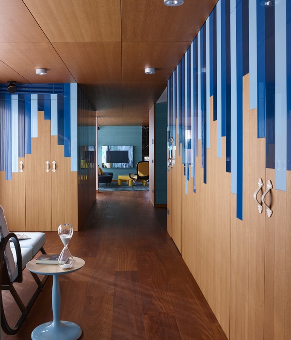
The materiality of Burgatoi was also chosen in terms of elegance and comfort. The cladding of this facing focused the attention of the performance. On the one hand, its markedly vertical design stylizes the curved element, its geometry of triangular pieces of wood texturizes the skin of the curve, which in relation to the light emphasizes its effect, creating a rhythmic movement of light-darkness.
On the other hand, wood as the main cladding increases the feeling of warmth, a characteristic that we understand should always be linked to the design of a home. This skin of triangular pieces lacquered in blue expresses the cheerful character that the clients wanted to give to the house. The volume effect produced by the texture on the curve makes it stand out from the rest of the spatial volume. This solution allowed all the elements that surround this wall, such as doors, kitchen, bench, etc. to be integrated and veiled with the same language.
The floor that runs through the reform is a continuous floor of gray epoxy resins, intending to accompany and accentuate spatial continuity. The rest of the finishes are limited to being simple and neutral, taking meticulous care in the choice of furniture to complete with unique and singular pieces that provide personality. This is how we contribute to the character that we want to give to the project.
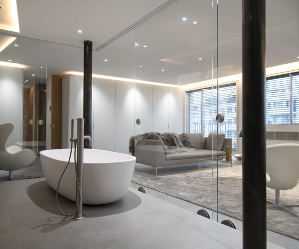
Special mention should be made of the master bedroom as the culmination of the architectural promenade of the house, which is accentuated in the small stretch of corridor that connects the fluid and expansive area by day with the private area by night. This passage is conceived as a narrow curve, emphasized by a slope that leads to the highest and most open space in the house. This last room maintains the main guidelines of the project, combining the different elements, such as a bathtub, table, dressing room, and bed, to create a single, visually integrated space.
In short, a resounding design has been conceived through an artificial element that vertebrates the house in terms of its spatial organization, while at the same time being able to contain all the services and imprint character to the intervention. Because of this, neutrality and the reduction of variety in the selection and use of materials in the house as a whole has been considered, respecting the backdrop.
{{item.text_origin}}

