Verge House is a project which celebrates the threshold between two differing architectural styles to highlight the homes history and original charm. The addition aims to recede form and complement the original architecture and propel the home into modernity.
When proposing that a traditional Edwardian style home would sit next to a metal clad extension with a flat roof, it was crucial that importance was placed on the threshold of where the styles converged. This was where the project name emerged. The moment of transition between old and new had to be obvious but not overbearing. Therefore, it seemed natural that this transitional space was a double volume glass atrium which aided in adding much needed light to a now tight corner site. The threshold of the building doesn’t only work as a transitional space from old to new but also as vertical circulation in the new addition and as the landing for the new entrance, making this space the physical and metaphorical heart of the home. It was an important decision in this regard that the transition space wasn’t just a single height narrow hallway connection but a prominent and key element of the home. The brief asked for open plan indoor/outdoor living and increased amenities to all bedrooms without losing on both outdoor and indoor living spaces. One of the successes of this project was being able to capture the city and bay views which until now was inaccessible to the client, reestablishing the sites close connection to both. One of the most influential aspects of the brief was that the client wanted both an outdoor area for entertainment on the ground floor but also wanted to add a pool. With the large increase in amenities this was a challenge which paved the way for rooftop terrace and pool area.
A visual balance and harmony of the differing architectural styles on the two-street elevation and ensuring the new addition didn’t overwhelm the existing street frontage by controlling height and form aiding in contextualizing the home. With a large amount of glazing, light can penetrate deep into the ground plan into the living and kitchen area and adding glimpses of sky as you move through the home.
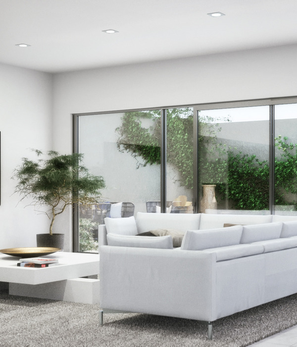
The integration of a rooftop terrace and pool in combination with the ground floor terrace provided the client with more than enough outdoor living without having to miss out on added amenities. For a growing family it was important to design different zones throughout the home to create areas which can accommodate family and friends but also smaller private spaces where you can get an all-important moments peace. A successful integration and collaboration of interior design and architecture with Mim Design enabled a high quality of finish which didn’t feel disconnected to the external architecture and the homes underlying principles. A restrained colour palette features several curves throughout the design (notably in steel doors and openings) which gives a subtle nod to forms seen in the original dwelling.
{{item.text_origin}}

