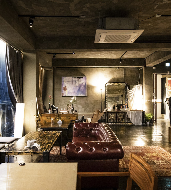
▼室内空间一览, overall view of the interior © STUDIO 715
设计师会员回访
Studio 715
1. 您在项目对接平台一年一共和多少个甲方有相当程度的接触沟通,最终接到了几个项目?
每年大概有联系的七八个,最后合作成功的至今一共有三个。
2. 接到的项目是什么类型,设计费是多少?项目进展到了什么程度?该项目完成后除了设计费还给你带来了哪些你认为有价值的事情。
零售和民宿项目,都已完工。兰熊这个项目设计费最终是6万,和业主最开始的预期也一致。积累了一些很好的供应商资源,也合作的很愉快。
3. 从网络平台对接项目,在和甲方沟通的过程中是否遇到了一些不一样的问题?是如何克服的?
因为我们与业主同在北京,离得也不远,所以面谈过2次,沟通起来方便。没有遇到太多的问题。
4. 您认为能够从网络平台接到项目,您自身的优势有哪些?
作品集以及设计师背景都比较过硬。
6. 您认为平台还可以在哪些方面有所改善?
推送的项目数量感觉不是特别多,而且最近遇到的几个项目都给过初步意向方案后,项目却因场地没确定停滞。希望平台在每年服务费涨价的情况下也能增加项目数,并与业主确认好项目情况。
业主回访
1.请问在决定设计公司之前您与多少家公司进行过比较深入的沟通?
大概五六家左右
2.请问选中的设计公司的哪些优点或者特点是您中意的?
设计师的履历、作品、以及初步沟通的专业性,初步草稿提案很不错
没什么缺点,优点很多,信息系统,方案完善,使用方便,对接细致
项目展示 Project Description
兰熊鲜奶是一家在品质上追求极致的新兴牛奶品牌。兰熊鲜奶将新鲜的奶源和创新的口味结合起来,以一种非常健康的奶饮品形式,更多的参与大众的生活,让更多年轻人爱上喝奶。STUDIO 715为BLUE BEAR 兰熊鲜奶打造了位于北京望京地区的全新门店。纯粹的暖白色与温柔的曲线结合,姿态各异的绿植为这里又增添一份诗意。
Blue Bear is an emerging milk brand pursuing the ultimate in quality. It combines fresh milk with innovative tastes, in the form of a very healthy milk drink, aiming at playing a more important role in the lives of the public, and making young people fall in love with milk. STUDIO 715 created a brand new flagship store for BLUE BEAR in the Wangjing area of Beijing. The combination of pure warm white, shapes in gentle curves and green plants give a poetic touch to this retail place.
▼入口空间, entrance area © STUDIO 715
入口处使用整面无框的玻璃立面使店铺格外通透,店内的白色延伸至外部,使整体显得更加明亮和纯净。步入店内,右手边为点餐取餐吧台。整面的松木元素带来一种天然、洁净的感觉,体现新鲜食材与健康生活的主题理念。
The entire frameless glass facade at the entrance makes the entire shop extra clear, while the white inside the shop extends to the outside, making the whole look brighter and purer. Step into the store, on the right side there is the bar table. The pine wood planks in the whole background wall on the whole surface bring a natural and clean feeling.
▼吧台, the bar table © STUDIO 715
进门左手边为不规则弧线形式的坐台,米白色的人造石材质带着些许光泽,在优美的弧线造型下显得朦胧又温暖,犹如牛奶在空间中流动。柱子和墙角的边缘都以弧形相接,使整个空间在纯粹的白色中浑然一体。店铺尽头则为整面银镜,反射整个店铺的景象,使室内空间在视觉上得以延伸的同时,又增加了店铺内部的光线,明亮且舒畅。
On the left side of the entrance are irregular wave-shaped seating stairs. The white glossy stone gives the graceful arc shape a hazy and warm look, just like the milk flowing in the space. The edges of the pillars and the ceiling corners are all connected in an arc shape, making the entire space integrated in pure white. The wall at the end of the shop is covered by mirror that reflects the whole shop in order to make the interior space expanded visually and also invites more natural light into the shop, making the whole environment bright and comfortable.
▼米白色的不规则弧线形式的坐台, irregular wave-shaped seating stairs made in white glossy stone © STUDIO 715
▼店铺尽头则为整面银镜, The wall at the end of the shop is covered by mirror © STUDIO 715
▼柱子和墙角的边缘都以弧形相接, The edges of the pillars and corners are in an arc shape © STUDIO 715
▼俯视坐台, overlooking the seating stairs © STUDIO 715
坐台上的绿植点缀在这一纯白空间里,随着一天内时间的变化,在环境中形成不同的光影,仿佛这一棵棵小树在吟唱一首关于自然的诗歌。
The green plants on the sitting stairs are dotted in this pure white space. As the time of the day changes, different light and shadows are formed in the environment, as if the small trees are singing a poem about the nature.
▼坐台上的绿植, The green plants on the sitting stairs © STUDIO 715
▼绿植与坐台细部, details of the green plants and the sitting stairs © STUDIO 715
© STUDIO 715
{{item.text_origin}}

