- 项目名称:北京云朵白科技疗肤中心
- 项目地址:北京市朝阳区双井街道
- 设计时间:2022.12
- 完成时间:2023.4
- 项目面积:155㎡
- 主案设计师:卜天静 陈亮
- 摄影师:吕博
- 品牌:云朵白
“用数据见证理想肌” – Beauty π 云朵白主张柔软、深效、有机、透明、极简的疗肤理念。
“Witness the Ideal Skin with Data”,Beauty π Cloud White advocates a skincare concept that is gentle, deep, organic, transparent, and minimalistic.
01.序
Intro
为品牌树立过目不忘的识别度,和谐的融入社区;并将“有机自然”与“科学专业” 这两个概念在视觉上达到平衡是设计需要面对的挑战。
Designers face the challenges of establishing a memorable brand identity, seamlessly integrating the brand into the community, and achieving visual balance between the concepts of “organic nature” and “scientific professionalism”.
▼店铺外观,Exterior view
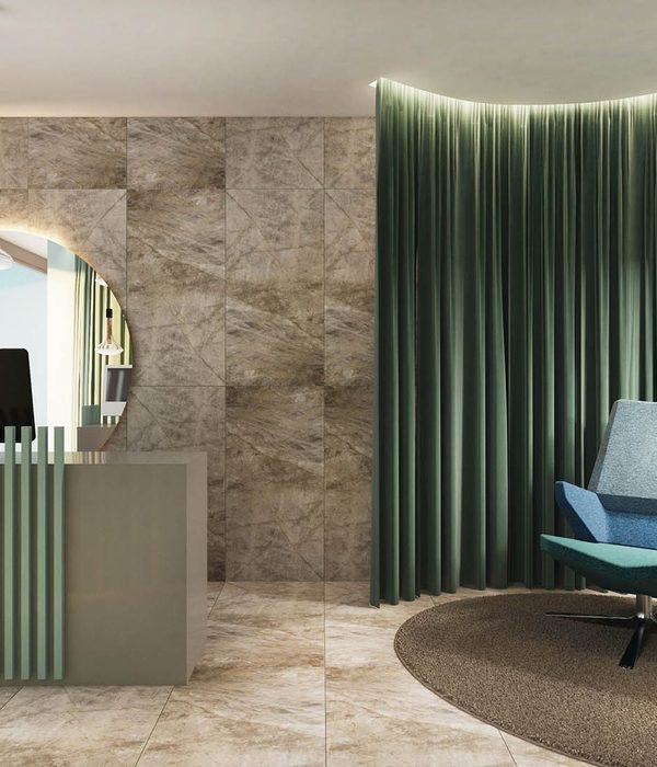
目前市面上大部分的美业空间都以米白、木色,黑白为主,国内尚无美业品牌占有强烈的空间色彩IP。因此我们决定大胆运用Beauty π 云朵白的VI色以抢占第一个空间色彩IP。主VI色应用于外立面及小部分室内空间,给人以绿色的第一品牌印象。辅助色蓝色大面积应用于室内公共空间,与绿色中和,达到自然、清爽、安静的感受。
Currently, most beauty salons are dominated by neutral colors such as beige, wood, and black and white. There are no domestic beauty brands that adopt strong spatial color. Therefore, we decided to boldly use Beauty π Cloud White’s VI color to seize the opportunity to become the first color IP. The main VI color is applied to the exterior facade and small interior spaces, instantly impressing people that the color of the brand is green. Blue, as the auxiliary color, is extensively used in the indoor public areas to balance the green and achieve a natural, refreshing, and tranquil feeling in the space.
▼以云朵为灵感,inspired by cloud
02. Beauty π
Beauty π LAB
公开透明的调配是Beauty π 云朵白的体验特色,我们将前台、收银、调配间整合,并连接后勤空间,以LAB的形式成为大厅区域的主视觉。顾客可以从窗口看到疗肤精华调配的全过程,并在美容体验结束后,将未用完的精华带回家,或将空瓶投入吧台正面的投放口。动态灯箱播放的光影画面与户外阳光洒下的斑驳树影相呼应,并可以更换素材。
▼空间概念手稿,sketch
The special experience of Beauty π Cloud White is that the whole formulation process is transparent and open. We connect the front desk, cash register, and formulation room with the logistics space, making LAB-like space as the main vision in the lobby. Customers can see the entire process of skincare essence formulation through the window. They can either take the unused essence home or put the empty bottle into the collection box on the bar counter after the experience of beauty products. The dynamic lightbox displays light and shadow images that correspond to the dappled tree shadows cast by the sunlight, and the material can be changed.
▼入口处前台,Reception at the entrance
▼从入口处看向室外,Looking outside from the entrance
场地层高较高,但受原始结构的限制无法搭建二层, 因此我们通过局部体块穿插打造视觉上的假二层,丰富空间层次。局部可上人用于存放物料,空调口检修等功能。入口处的展示区用于品牌文化的及部分产品的展示。
The original ceiling is too high to accommodate a second floor. Therefore, we created a faux second floor visually by interweaving local blocks to enrich the spatial hierarchy. The functions of the partially accessible area include storing materials, air conditioning duct maintenance, etc. The entrance display area is used for showcasing brand culture and some of the products.
▼前台休息处,Waiting area
▼前台细部,Details of reception
03.走廊
Hallway
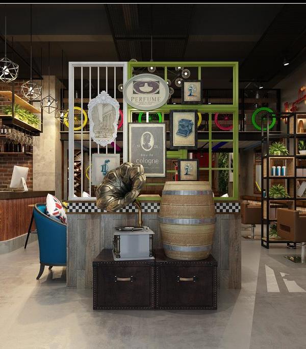
为最大化的争取经营面积,隔出皮肤护理间后走廊呈现迂回曲折的状态。利用弧线造型避免过于尖锐的角落产生,结合柔和的灯光和镜面延展空间感。并借助原有的混凝土浇筑结构体,形成端景,断开行走路线的冗长。并保留混凝土原始的状态,与空间形成粗糙与细腻的对比。软装和小细节凸显复古工业感。通过每个房间上方的门牌发光或关闭的状态,可以判断房间内是否有顾客正在体验服务。
To maximize the business area, the corridor after the skin care room is arranged in a winding manner. The use of curved shapes avoids sharp corners and enhances the sense of space by accommodating with soft lighting and mirrored surface. The end view that breaks up the lengthy walking route is created by using the original concrete structure. The contrast between the rough and delicate is formed by preserving the original state of the concrete. The soft furnishings and small details highlight the feeling of retro industrial. The lighted or closed status of the signboards above each room indicates whether a customer is experiencing a service or not.
▼迂回曲折的走廊,The hallway
▼材质细部,Details of materials
04.洗头区
Headspa
洗头区提供头部护理及化妆间服务,结合星空顶营造静谧舒适的氛围。
The headspa area is furnished with starry sky ceiling that creates a quiet and comfortable atmosphere which is prefect for head care and makeup services.
▼洗头区,Headspa area
05.单人间
Skincare
单人护理间格局呈矩形,顶部的弧形弱化空间棱角。纯净的空间点缀蓝绿色渐变玻璃立显清透,镜面从视觉上扩大空间。每个房间都配有香薰,并隐藏在衣柜内,只留一个释放香味的小孔。衣柜内部和小型梳妆台提供顾客所需的衣物存放、梳子皮筋等配套用品。
The single-person treatment room has a rectangular layout, and the curved top weakens the corners. The pure space is embellished with blue-green gradient glass, which shows us a clean and transparent space. Visually, the space has been enlarged because of the mirror. Each room is equipped with aromatherapy, hidden in the wardrobe, leaving only a small hole to release the fragrance. The interior of the wardrobe and the small dressing table provide customers with the necessary clothing storage and other necessary things such as combs and hair ties.
▼单人间,Single room
06.双人间
Skincare
利用色彩和材质强化功能分区,增大房间视觉格局。智能控制模块设计了准备、体验中、体验结束等不同模式的灯光亮度,并可以对音乐、投影、空调等进行调节。
Designer uses color and material to strengthen the functional zoning and increase the layout of the room visually. The intelligent control module is designed with different modes of light brightness such as preparation, in-experience, and post-experience, and can adjust music, projection, air conditioning, etc.
▼双人间,Double room
▼品牌视觉展示,Brand visual display
▼平面图,plan
项目内容:云朵白科技疗肤中心
品牌方:云朵白
项目地址:北京市朝阳区双井街道
设计时间:2022.12
完成时间:2023.4
项目面积:155㎡
主案设计师:卜天静 陈亮
摄影师:吕博
Project: Beauty π technology skin care center
Brand: Cloud White
Project location: Beijing, Chaoyang distract, shuangjing street
Starting time: 2022.12
Completion time: 2023.4
Area: 155㎡
Designing team: ISENSE DESIGN
Chief designers: Sissi Bu, Chen Liang
Photographer: Lv Bo
{{item.text_origin}}


