这个十层高的学生公寓位于丹麦第五大城市艾斯比约,希望被打造成一个生动,多样具有吸引力的多文化,现代化,灵活和可持续,具备吸引力的住房中心。
这里地势平坦,也没什么高层建筑,所以这个30米高项目必定会成为当地一个地标。所以建筑师力图保证房屋质量同时还要让项目具有标示性,同时要为用户实现最佳功能。这里的平缓海岸和被海风吹拂得倾斜的植被给予建筑师灵感,建筑有着平展的,斜边的窗户,即纳入风景,又有着海风般的活力。
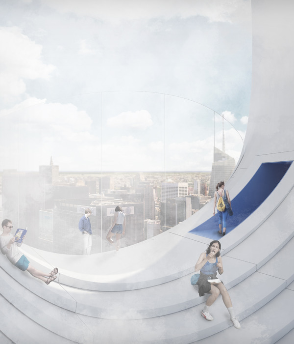
建筑下部分的公共空间为动态空间,与户外动态活动场所联系,顶层公共空间为静态空间,人们可以在这里安享周围风光,尽情放松和享受宁静。公寓倾斜了一定的角度,这样就没有用户单元完全朝北。同时内部的单元可以灵活的改变,适应未来各种需求。这是一个显眼的建筑,内部功能直白的反映在建筑外观上。这里是非常有特色的一个社区中心。
SHAPED BY WESTERN WINDS AND THE HORIZON
The winning proposal Tovværksgrunden by Danish practice CEBRA consists of 48 new student housings and common areas in Denmark’s 5th largest city, Esbjerg. The eye-catching proposal includes 26.910 ft2 of apartments spread across ten floors as well as outdoor areas with terraces and activity zones such as a street basket field. The first students are expected to move in by January 2014.
The proposal for the new residential tower is based on a master plan that envisions the creation of a vivid, diverse and attractive neighbourhood harbouring education, youth culture and a variety of leisure and sports activities. With its central location within the planning area the project aims at establishing a modern, flexible and sustainable housing complex, thus attracting students and young elitist sports practitioners to the city.
The visual landmark
Like most Danish cities, Esbjerg is characterized by a very flat topography and general city structure without high-rise buildings. With a height of over 30 the project consequently becomes a new landmark that is visible from practically anywhere in the local area.
Having these underlying conditions in mind, the architects worked with two overall focal points: On the one hand to design an eye-catching icon that expresses energy and vitality without being visually importunate or impairing the housing’s qualities. On the other hand to organize the building’s functions in such a way that they meet the demands of varying user groups and utilise the qualities of the tower’s volume optimally.
The horizon and the cross winds are characteristic of the Wadden Sea region on the Danish west coast. The flat landscape draws a horizontal line across the field of vision, and the low vegetation mimic this direction – shaped by the wind coming from the sea. By angling the building’s windows into elongated parallelograms the horizontal lines are accentuated – creating an illusion of dynamism and cross winds. The arrow-like windows are pointing eastwards and together they create a rotating, ascending motion on the façade; almost as if the entire volume is twisting upwards, thus transforming into a large coherent sculpture.
It may appears to be a trivial insight, but as our eyes and field of view are aligned horizontally – combined with access to an exceptional view – the oblong bands of windows emerged as the obvious design choice. They grant the best view possible as well as optimal lighting conditions for the individual apartments, where daylight is spread evenly throughout the interior. One might say that they create a panoramic impact in interaction with the flat landscape, the sea and the horizon. The building is more than just a tower with four facades – the windows form a harmonic link between the surroundings, the housings and the human scale.
The tall hamburger
By stretching the apartments between the two common areas the building provides a high degree of flexibility, where the housing units can be re-planed freely, if the functional requirements should change in the future. Figuratively speaking, one can look at the organisational layout as a tall hamburger, where the buns (= common rooms) hold together the filling (=apartments), which can be composed and assembled as desired.
The common areas are emphasized in the façade as distinctive cuts, which constitute the dominant elements that transform the sharp silhouette into a significant landmark. They visualize a logical connection between the building’s internal functionality and its exterior appearance. These notable “eyes” accentuate the hubs of social life within the tower and become its characteristic feature.
Facts
Name: Tovværksgrunden
Commission: Private
Type: Project competition
Category: Housing
Client: Boligforeningen Ungdomsbo (housing association)
Location: Esbjerg, DK
Year: 2012 – 2014
Purpose: 48 student housings including common areas
Size: 2.500 m2 new building
Budget: ca. DKK 36 mio. / EUR 4,84 mio. excl. VAT
Award: 1st prize in competition
Service: Architectural services including landscape
Energy class: Low energy class standard 2020
Collaboration: LB Consult
{{item.text_origin}}


