Openness in constraints: House in the backyard. ‘House in the backyard’- The name comes from its disposition with the client’s own homestead next to the site. The client approached us with the requirement of a 4-bedroom house and conducive amenities on a wedge-shaped site that tapered towards one side. The main challenge here was to design the spaces in such a way that they didn’t feel restricted by space while at the same time ensuring privacy for both families in the residence and in the homestead.
It was intimidating yet unwaveringly interesting to design on a site that has such strict constraints by means of its shape. The site has a wedge-like shape, tapering towards one side. Despite being on a narrow plot, The House in the Backyard defies spatial constraints through the meticulous planning that has been worked out on the design. It was a quintessential part of the planning process to replicate the shape of the site to that of the building form itself. Being confined to the unique shape of the site, it’s made sure that every inch of the site is a deliberate choice.
The foremost and substantial decision in the design approach was to extend the whole feel of the interior towards the exterior. We have seamlessly integrated the interior spaces with the exterior by strategically placing openings that feel expansive and connected to the outdoors. The design approach revolves around maximizing every inch of the plot, at the same time ensuring a flawless blend of indoor and outdoor spaces. The architects carefully arranged functional zones along the length of the residence, creating a harmonious flow from one space to the next.
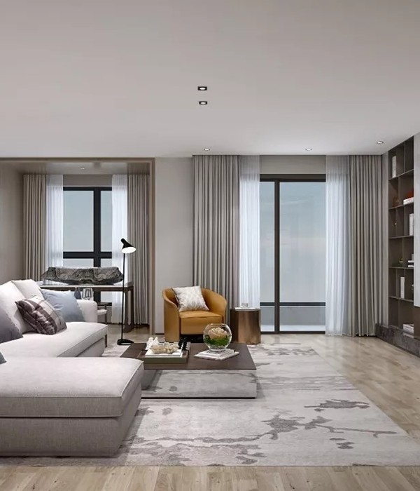
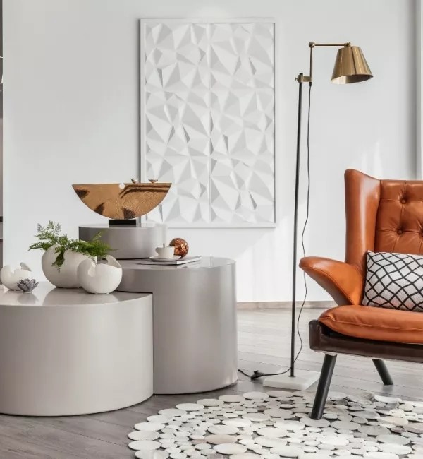
The foliage in the small patch between the living and the bedrooms arrests all your senses as you go through the passage. Almost all the individual spaces in the residence are open to the exterior; this allowed us to guarantee seemingly spacious interiors by extending the space beyond its physical boundaries. The interiors are kept minimal but have a unique language of their own. We’ve intentionally avoided unnecessary embellishments and kept a neutral color palette. Shades of white and grey set the tone that is contrasted well with popping colors, emphasizing the focal points. This has accentuated the whole design language of the interiors. The deliberate curation of elements in the spaces fosters a sense of tranquility and calmness throughout the house.
{{item.text_origin}}


