The house before renovation was not spatially decent. This was due to the fact that the previous owner had renovated the original state of the house. Originally the house layout was shaped exactly like the other houses within the housing complex. However, because of the unplanned design of the previous owner, the house layout then became spatially awkward with many partitions, little natural lighting and poor air circulation. The house also had a very awkward spatial program that can be seen from how the bathroom was oddly located in the center of the house.
Initial Idea - It was a great challenge for the architect to start designing since the client demanded a small house clean and simple whereas the existing condition of the house was unquestionably complicated. The initial idea was to demolish all existing partitions and maximize the existing structures that can be used then freshly start to design a new spatial program for the house. Structure - Most of the main structures of existing buildings are maintained for budget efficiency. However, after the start of construction, there were some main columns and beams that were unnecessary as the structure was strong enough to withstand the load. The removal of those columns and beams were of course very helpful in making the existing space more spacious. The main structure of the roof was not changed much.
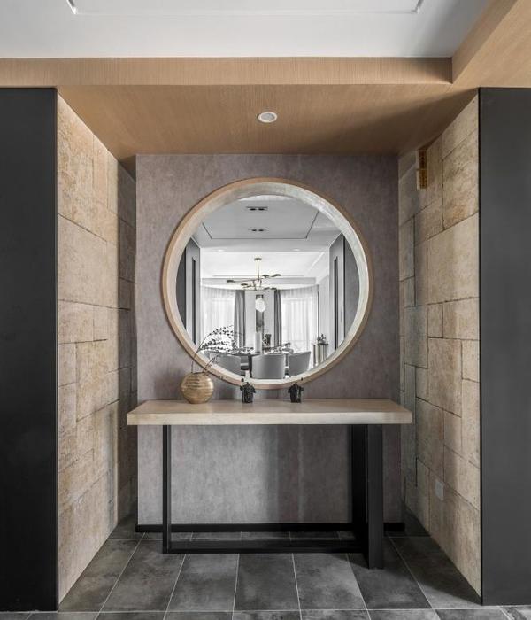
Material - Unlike the structure, many materials and components from the existing house were no longer used, especially for cost suppression. A lot were no longer suitable for use while some that were still suitable to use were not too significant in reducing costs. One that was quite significant and had a large enough volume was the roof, therefore the existing tiles were maintained. All window sills materials were replaced by steel and all doors were made with pivot openings without jambs, making it visually cleaner.
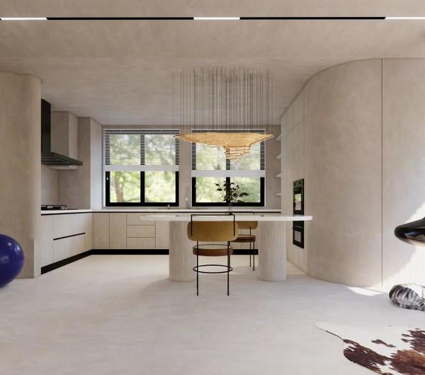
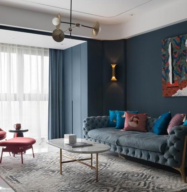
Layout - By reconstructing all existing walls, the new spatial program produces even more space than the original one; adding 1 bedroom, 1 bathroom, 1 warehouse, 1 sun room, and 1 mihrab. The addition of the space did not make the room more narrow but it created an even more spacious feeling than before. The main key to the spacious feeling of the house is in the back area where the kitchen, dining room and family room is located with no partition, so that activities can be done more freely. Finally, the Mihrab becomes the center orientation of this house, replacing what used to be a bathroom, thus any activity undertaken by homeowners from all corners of the house will be easy to reach for worship.
Light and Air Circulation - Another thing that is a no less important aspect of the design is air and lighting. The existing condition of the house practically did not have good air circulation, firstly because of the many existing barriers/partitions/walls, secondly due to the absence of cross ventilation. To allow a better air and light flow the architect created a back garden with several functions. First, to make sure that the inside areas of the house obtains good air and lighting in the morning, second to allow different nuances, created from the flow of sunlight that constantly changes, in the house. There are also some rooms that are illuminated naturally with skylights such as the living room.
{{item.text_origin}}


