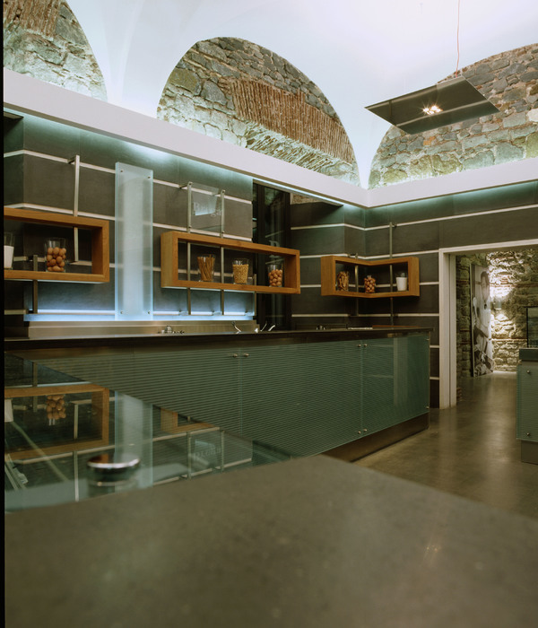
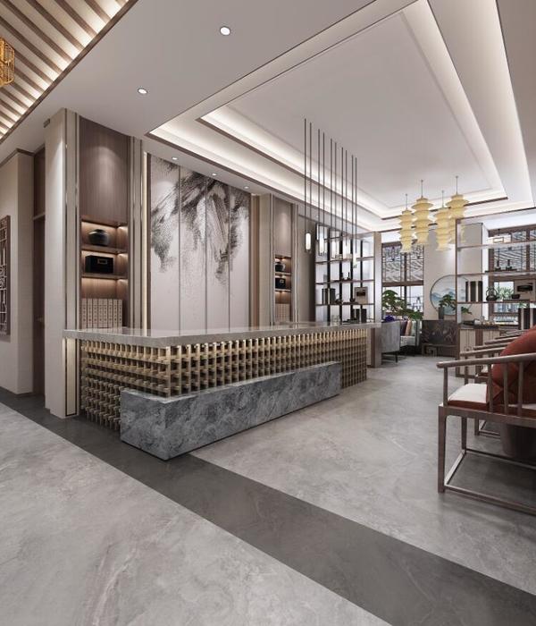
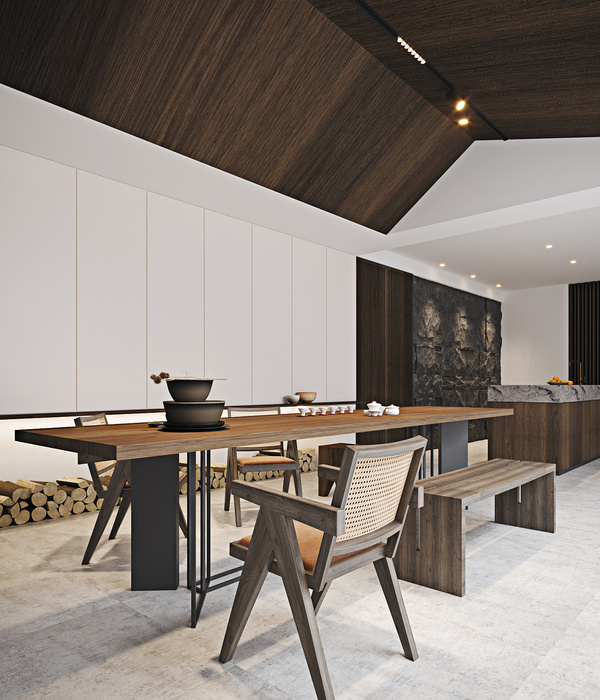
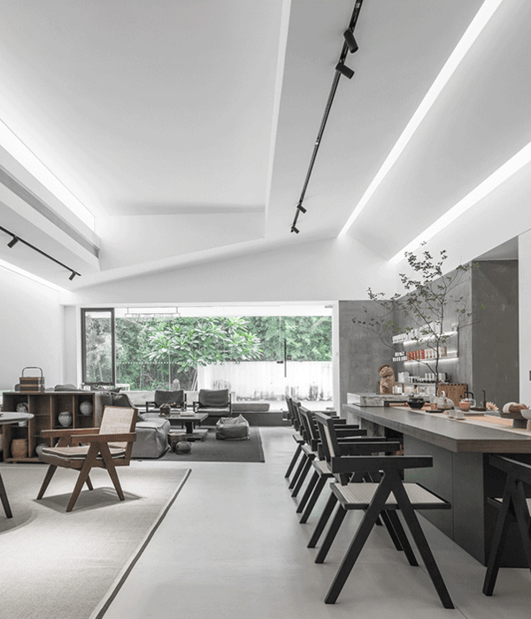
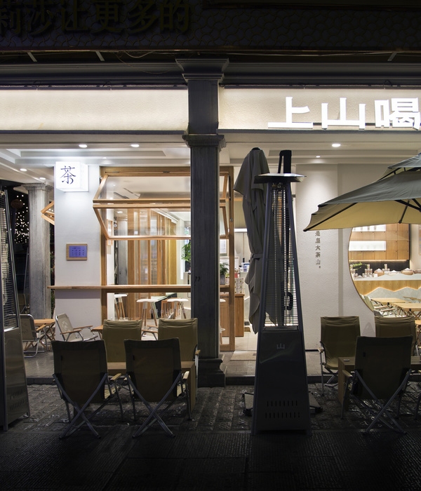
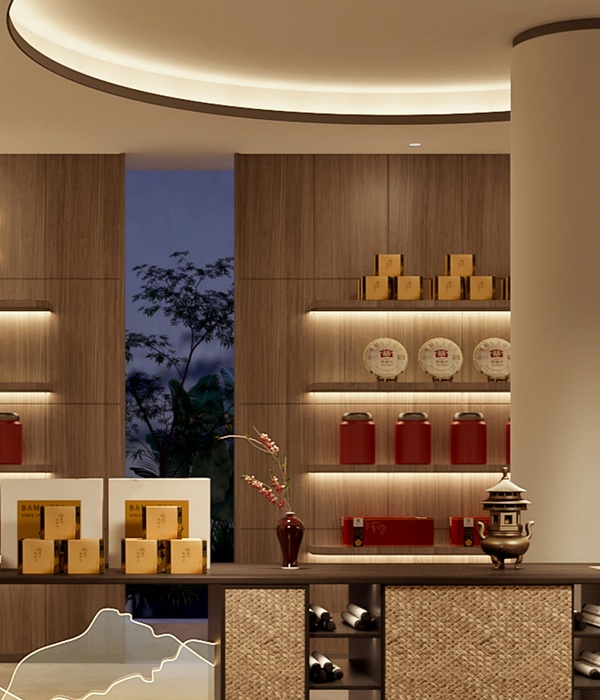
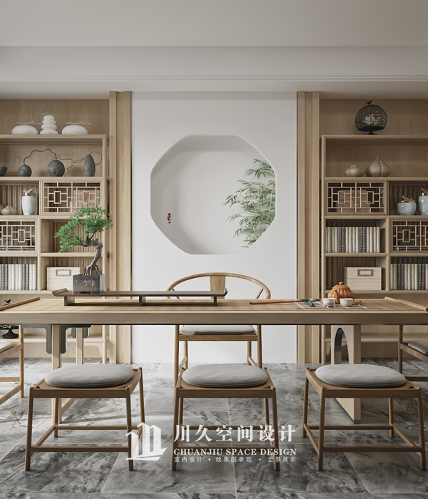
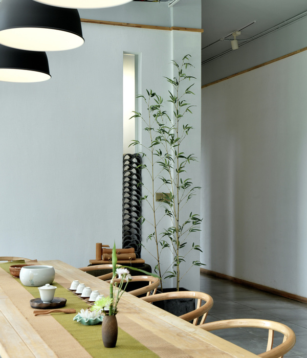
The concept of this F&B space is slightly different from general cafes or art galleries concept, which is more likely presented by an artistic way. Fundamentally the lengthy narrow shaped shop lot is hidden between buildings and alleys which is not given much natural sunlight. Thus, we tried to break through the ordinary narrow layout with more curvy and variable elements. We also do believe that a minimalist environment does not equal to simple and dull.
On the contrary, it is definitely including certain aesthetically elements, alongside with flexibility space, flexibility pathways, and variable interactions possibilities. Viewing from the entrance, both sides of the lengthy walls given the opportunities to organized as display areas. Hanging rails are installed in the flat white wall which can be hanging variable size of art paintings. On the opposite wall, we created a large grid frame which is able to place and connect with the portable racks, and hanging art works.
On the other hand, the curvy-look coffee bar physically given out more space for the display area, as well as to enlarge the look of the narrow-like shop house. Apparently, there is no certain title nor adjective to describe a certain artwork. Thus, instead of labeling areas or spaces with designated titles, we believe that areas can be labeling itself by various behaviors and objects, with different arrangements by movable steel poles which are designed with track and wheels.
{{item.text_origin}}


