所有的人,起初都只是空心人。所谓自我,只是一个模糊的影子,全靠书籍绘画音乐电影里他人的生命体验唤出方向,并用自己的精力去充填,渐渐成为实心人。
At first, all people were just hollow people.
The so-called self is just a vague shadow, relying on the life experience of others in books, paintings, music and movies to evoke the direction, and fill it with your own energy, and gradually become a solid person.
居所也正如此一般。从毛坯框架到可称之为家,每一座沙发,每一块地砖,每一把椅子,每一张桌子,都承载了人们对生活的憧憬。是居住者的热爱对空间进行了定义,使之渐渐成为有温度的家。
Homes are just that average. From the rough frame to what can be called home, every sofa, every floor tile, every chair, every table bears people’s longing for life. It is the love of the occupants that defines the space and gradually makes it a home with temperature.
业主偏爱简洁干净的氛围,因此在对空间进行设计布局时,设计师从人的行为习惯和空间属性出发,将不同的区域适当分开,满足不一样的需求。在保证动线流畅的同时,将空间平面的构成轮廓清晰地描绘了出来。
The owner prefers a clean and simple atmosphere. Therefore, when designing the layout of the space, the designer starts from human behavior and space attributes, and appropriately separates different areas to meet different needs. While ensuring smooth movement lines, the contours of the spatial plane are clearly drawn.
Living Room客厅
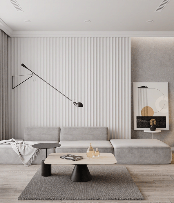
客厅作为活动的公共区域,减少小件家具的数量,保持了一个简洁的空间环境。通过增大采光的面积将自然光引入室内,在材质上摈弃了厚重的遮光窗帘,而是使用白色的百叶片,轻盈感与明亮感呼之欲出。
The living room serves as a public area for activities, reducing the number of small pieces of furniture and maintaining a simple space environment. By increasing the area of daylight to introduce natural light into the room, the heavy blackout curtains are discarded in the material, but the white louver is used, and the lightness and brightness are expressed.
客厅的色彩简单,用中性的灰色营造高级的质感,温和的木色调和冷淡,大面积的纯色容易显得寡淡,千鸟格的抱枕与斑马纹的地毯出现得恰逢其时,将沉闷一下打破。
The color of the living room is simple. Use neutral gray to create a high-quality texture. Mild wood tones and coldness. Large areas of pure colors are easy to show.
Too weak, the houndstooth pillows and the zebra-patterned rug appeared at the right time, and they would be dull and broken.
Dinning Room
餐厅作为家人们一起吃饭、闲聊家常的地方,餐厅在人们的情感交流上起着举足轻重的作用。蓝色的皮质座椅在浅淡的色彩中脱颖而出,几盏金色吊灯呈现的是精致的生活态度,暖色的灯光则是营造温馨的视感,让人倍感温暖。
As a place for families to eat and chat, the restaurant plays a pivotal role in people’s emotional communication. The blue leather seats stand out in light colors. Several golden chandeliers present a refined attitude to life, while the warm lights create a warm vision and make people feel warm.
同为公共活动区域,餐厅与客厅紧邻,因此在视觉上没有做很明显的隔断,而是通过天花的起伏与灯具的不同来进行区分。
It is also a public activity area, and the dining room is close to the living room. Therefore, there is no obvious partition visually. Instead, it is distinguished by the fluctuation of the ceiling and the difference in lighting.
Kitchen厨房
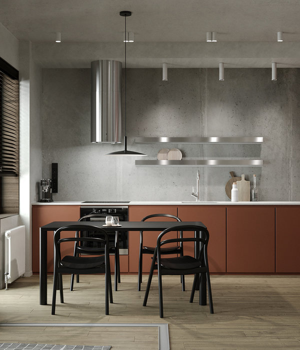
厨房极致简洁。由下及上,灰-原木-白色的颜色层次,在视觉上维持了一贯的清浅。但平行的原木肌理和散漫的瓷砖花纹,让厨房在纹理和材质上有了丰富的层次。明亮干净的灶台带来舒适的视觉感受。
The kitchen is extremely simple. From bottom to top, the gray-log-white color gradation maintains a consistent lightness visually. But the parallel wood texture and loose tile pattern give the kitchen a rich level of texture and material. The bright and clean cooktop provides a comfortable visual experience.
Bedroom
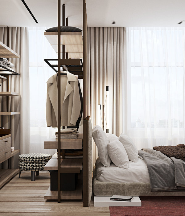
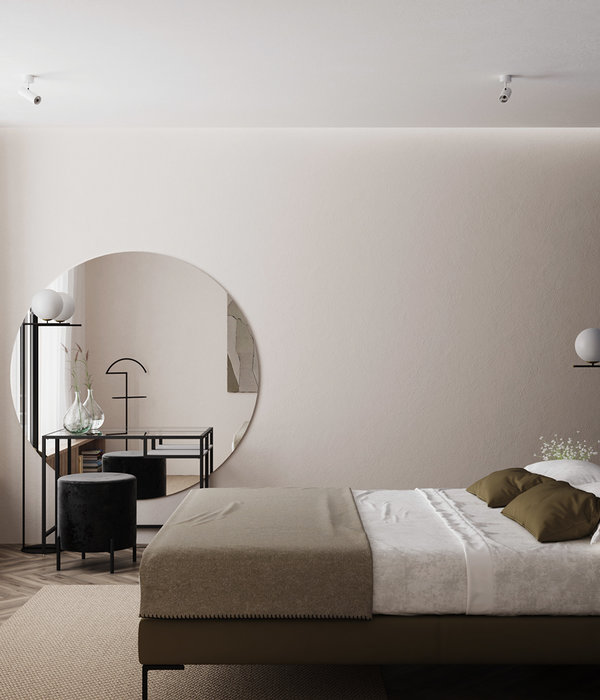
卧室承载着休憩的功能,有着安静、沉稳、舒适的诉求。充分考虑休憩和舒适度的需要,沉稳的基调,搭配温润的木色,灰色床品独具质感,色调自然舒缓。设计师将设计融于人性,将家居带入悠闲自在的情境,在人与空间的互动中,徜徉柔和的生命力。
The bedroom bears the function of rest and has a demand for quietness, stability and comfort. Fully consider the needs of rest and comfort, a calm tone, with a warm wood color, the gray bedding has a unique texture, and the color is naturally soothing. The designer integrates design into human nature, bringing the home into a leisurely and comfortable situation, and softening the vitality in the interaction between people and space.
Bathroom
卫生间
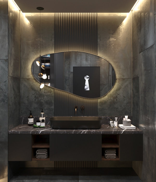
卫生间延续一贯的简洁质感,没有过多跳跃的色彩,用干净的手笔呈现清爽的气质。
The bathroom continues to have a concise texture, without too much jumping colors, with a refreshing temperament with a clean pen.
Study书房
书房内的书桌靠窗放置,空间氛围跟着自然光线的变化持续,保持某种思想持续沉浸的状态。
The desk in the study is placed by the window, and the atmosphere of the space continues with the change of natural light, maintaining a certain state of continuous immersion.
由一个空荡荡的框架落成一个有温度、有气蕴的家,而在这个由无至满的过程里,最具决定性的力量,全是因为居住者的内心。从功能属性对空间划分,并将居住者的热爱填满,经由此设计出来的空间不是千篇一律的,而是具有居住者的个人名片标识的「家」。
From an empty frame to a home with temperature and energy, the most decisive force in this process of incompleteness is all because of the resident’s heart. The space is divided from the functional attributes and filled with the love of the occupants. The space designed through this is not the same but the "home" with the resident’s personal business card.
Project Information
项目信息
项目名称:格调
项目地址:格调绮园
项目面积:140㎡
主创设计:张勇
设计公司:触觉设计
项目施工:触觉工程
材料应用:石材、涂装板、不锈钢板
项目摄影:寇宇华
Project name: Style
Project address: Style garden
Project project area: 140㎡
Design director: Zhang Yong
Project design: Touch design
Project construction: Touch engineering
Material applications: Stone, Painted plate, Stainless steel plate.
Photography: Kou Yuhua
T O U C H D E S I G N
张勇(左)|马鑫(右)联合创始人触觉空间设计机构创立于2008年,专注高端私宅、商业及办公空间的设计及施工服务。公司具备设计及施工双资质,是将空间设计以工作室形态引入天津的创始品牌,网络媒体热推品牌。我们主张设计的独立与原创性及空间的品质与舒适性,力求将设计的科学性与视觉的艺术性完美结合,为精英客户提供高品质的各类空间设计及施工服务,并始终以匠心精神去重塑空间设计美学。
022-27278811 | 13102000300
联系地址
天津市河西区黑牛城道13号双迎大厦701
{{item.text_origin}}

