The Clients: a young couple + 2 girls
The apartment: a 135 sq.m. apartment in a building that was in the process of a complete renovation in the Yad Eliyahu neighborhood in Tel Aviv.
Originally, the apartment consisted of four bedrooms, two bathrooms, and a guest toilet. A new interior division was required to adapt to the lifestyle of the young family, which wanted an open space with a light atmosphere and an airy, modern and bright look. The kitchen area and dining area were enlarged at the expense of the canceled guest restroom. In addition, the entrance to the laundry room was relocated to the kitchen area, and another bedroom that served as an office was reduced so that the master suite could be enlarged.
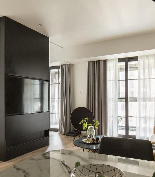
The public space of the apartment is revealed from the entrance, which opens into the living room and has a large window facing the trees next to the building. A white iron minimalist library with thin shelves is installed on the TV wall, providing room for a TV and shelving for displays of books and ornaments. The entire space is paved with natural oak hardwood floors. A graphite gray corner sofa was placed with a black-and-white photo by Israeli photographer Ailon Glitzenstein above it. Above the deep red carpet with its geometric ethnic pattern are two solid wood tables with different finishes, one with a natural oak finish and one with a blackened finish. Two white tracking lights were installed along with the library and the sofa. Incorporating black and mustard rattan armchairs with walnut wood added delicate touches of color to the space. The cushions were selected in natural shades and in different fabrics and textures.
On the right side of the entrance is a kitchen, designed in an L shape, with a side of low cabinets, a sink, a dishwasher, and a stove, and a long side with a high cabinet unit with a refrigerator, oven, and microwave. A peninsula provides additional storage as well as seating for light meals. The finish of the kitchen cabinets are smoky gray, and the countertop is white with delicate tendrils in shades of gray. For the backsplash, hand-painted bricks were chosen in the same shade as the surface with a glossy finish and placed vertically to create a sense of higher space. A strong L-shaped recessed lighting was chosen, as well as recessed spots lights above the peninsula to compensate there is no window in the kitchen area.
Next to the kitchen, the dining area is set up in a way that makes the best use of the space. A delicate oak dining table was chosen surrounded by chairs in a natural color, and above it, an asymmetrical light fixture in black and brass. Large artwork with red and green colors by the Israeli artist Tamar Branitzky was chosen for the dining area.
For the master bedroom, the back wall of the bed is painted in a gray-stone shade, which emphasizes the delicate color of the bed. A wooden bed with a braided back in natural color; next to it are designed two metal chests of drawers that are painted in deep red color and serve as a replacement for standard night-stand incorporated with brass wall lamps. In front of the bed was designed a wide wall cabinet with white facades. Here, too, a white tracking light was installed parallel to the cabinet, and geometric art hung on the vertical wall. A rope rug was chosen, and a white mesh curtain was chosen for the window.
The bathroom of the master suite has an urban look: covered in concrete gray tiles combined with black faucets and a cabinet from a natural oak veneer finish and a white ceramic surface. Above it is a mirror cabinet that provides additional storage.
The children's room is located next to the master bedroom. White furniture combined with oak was chosen for it. The back wall was painted smoky green, and a white Roman curtain was chosen for the window. Pink touches come in the textile, and a black and white carpet was placed in the center of the space.
The 3rd bedroom serves as a home office: a wooden table with a natural-colored chair next to it. A geometric patterned rug in natural shades of beige and brown adds color and texture to the room.
The main bathroom floor is covered with gray tiles, the walls are covered with rectangular white tiles that were placed vertically, and for the sink wall, rhombus-patterned tiles in a smoky light blue color were chosen, creating an interesting and elegant look. Taps with a brushed finish and wall light fixtures with a brass finish were also selected. A clean-looking oak veneer sink cabinet with an integral sink surface with a glossy white finish. Finally, a mirror with a matching oak frame hung above.
{{item.text_origin}}

