Architect:YUDIN Design
Location:Kyiv, Ukraine; | ;
Project Year:2019
Category:Restaurants
“California has something which not every place in the world has: It has what I would call a sunny side, and I don't mean just physically, but the sunny side is a future. -
That’s why the logo of CALIFORNIA restaurant is based on the image of the rising sun, greeting guests at the entrance of the establishment. The Ukrainian designers Vladimir and Aleksandr Yudin are the authors of the interior design and brand identity of CALIFORNIA American style Asian restaurant.
Fantasizing about the sunny State of California, the founders of the studio YUDIN Design decided to combine the restaurant brand with the image of the sun, that’s why the ”O" is the center of the inscription and, at the same time, looks like a hot sun.
The Brothers Yudin decided to use a simple font that, due to the split letters, looks slightly archaic like rock hieroglyphs. Looking at this logo, any person, even without reading the word, sees the sun, no matter what language he speaks.
The design of the restaurant is made in the European style with elements of Japanese minimalism, eclecticism and interspersed with classics. For example, pay attention to the common table: a clear appeal to the Chinese restaurant culture. Moreover, it is placed between two massive columns with typical ornamentation.
The narrow common table by the bar, illuminated with yellow and turquoise lighting, suggests the idea of expensive Asian bars from James Bond movies.
A friendly atmosphere is provided by open structures: buffets, cupboards and a display case with grilled ducks. Everything is in sight, open, accessible, understandable! The twins Aleksandr and Vladimir Yudin designed the shelves, “office” chairs, tables and sofas with leather inserts, while the KATANA chairs were ordered from the studio of the famous Ukrainian interior designer Pavel Vetrov.
In general, the materials used for the interior remind both empires: Asian, which is based on the energy of nature, and American, a country of colonialists who were not afraid to master new lands and build their own well-being on their own.
The interiors are filled with symbolic elements typical of the American and Asian cultures. In terms of reflecting the Asian one, the color of the interior is close to the ethnic wabi-sabi (use of natural materials): stone, marble, onyx! A flooded floor with stains resembles wet sand.
The same associations are suggested by round tables with the effect of circles embedded one into the other.
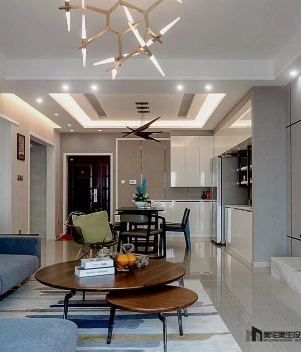
There are also symbols of the American culture in the interior that are understandable to anyone: for example, the design of the ceiling symbolizes the Californian skyscrapers while, at the same time, this decor resembles the Japanese screens! Plus, this entire ceiling glows, providing extraordinary luxury lighting to match a five-star casino.
The central chandelier is a volumetric repetition of the same motif that decorates the entire ceiling. It is easily associated with the Chinese lanterns or, again, skyscrapers. The lamp above the bar is shaped like a surfboard and decorated with wooden shark fins. The result is an unusual, stylish and symbolic form.
A wall covered with greenery in one of the main rooms resembles the atmosphere and conveys the warmth of the Californian villas (half open to let in the sun and so life and beauty of nature right into the courtyard!)
The interior decor is characterized by a surfboard shelf above the bar, a panel made of reels from spinning rods and portholes in the doors, as echoes of the ocean image which brings to mind about sushi rolls and seafood in general.
The bathrooms are decorated in onyx, with unusual tiles and the effect of mirrors reflecting in each others. The columns in the corridor and the WC are decorated with a vertical logo - not an usual ornament that resembles either hieroglyphs, or the sun and the trail that it leaves on the surface of the ocean, setting below the horizon.
This spring, the founders of the studio YUDIN Design, Vladimir and Aleksandr Yudin, started decorating the restaurant's summer terrace in order to comply with COVID safety standards and to ensure the restaurant's smooth operation in any conditions. The site is made in the form of a straight gallery, which is closed on one side by Japanese screens (so as not to look at the roadway). The floor is covered with a grid, under which there are radiators, as designers drew this idea from the popular cinema images of streets in American metropolitan areas: mesh, asphalt. Finally, the designers combined it with a red table, symbol of the Chinese Empire.
▼项目更多图片
{{item.text_origin}}

