项目位于北京
CBD
区
WFC
大厦,面积
288
平米。专为外商投资公司设计。
空间设计方案
这个项目中,我们在设计内部空间与我们设计城市的方式相同,从建立开放空间和封闭空间之间的关系开始。
Architecture from inside.
设计师认为建筑物的外部形状是内部空间的结果,反之亦然。建筑物内部和外部是有必然的关系。在设计师眼里,设计室内空间和建筑有一样的态度。方法是一样的,这才是最重要的。
“
流动性
”
和
“
渗透性
”
重要的两个特征。公共部分不是单独的走廊,是有功能性的。在空间里每个房间都有自己独特的特征。
人们在建立一所新的城市的时候,首先是规划道路,建立一个城市交通网络。道路是相互交错的,人们可以方便的去想去的地方,而且是有不同的选择,这是“流动性”的特征。城市的道路不只是人和车通行的地方,道路是有功能性的,它和公共服务部分相连。在道路旁边有加油站,有广场,人们集聚在公共区。
同样我们在这个项目中,先规划了人行走的流线。在流线上,我们有茶水区,是员工的
“
加油站
”
。休闲区是整个办公室的“广场”。这里可以接待客户,隐藏式玻璃隔断也可以变为一个单独的区域。
城市在规划好道路以后,人们在空地上规划建筑。这些建筑师不同形状,不同大小,不同功能的。每一个都有它自己的特征。这些建筑有不止一个门。人们可以方便的进出。这体现出
“
通透性
”
的概念。
我们在设计每个单独房间的时候,根据不同的功能设计成不同颜色,不同大小。房间有的不到顶,而且房间没有门的概念。我们将其中的一面墙设计成全玻璃,加上有的房间不止一个出入口,
“
通透性
”
的特征体现出来。
设计风格
我们将实木地板用起源于
17
世纪法国的鱼骨拼(
Chevron Floor
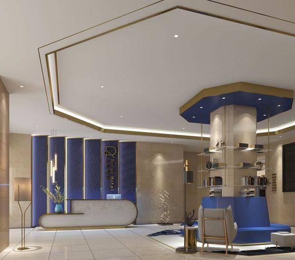
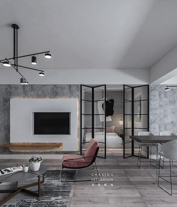
)的方式铺设在公共区。在办公环境中带了一些家的感觉。暖色的竖条木饰面,通透的玻璃隔断,沉稳的水磨石形成对比。在融入酒店的设计元素的同时也体现出客户是投资公司稳重的特征。
项目中所以的灯光均为暖光,长条灯光系统和不锈钢灯具都是为本项目设计的。暖色的乳胶漆墙面和柔和的灯光,营造安静舒适的办公环境。员工进入到办公室可以静下心来高效的工作。
客户很喜欢工作居住在酒店,他喜欢酒店柔和的灯光,温暖的环境。酒店有满足日常接待客户和开会的条件。酒店的装修风格也有家的感觉,可以放松的投入的工作中。
客户非常喜欢酒店的氛围。他喜欢酒店柔和温暖的环境,从他的角度来看,酒店风格的地方是满足客户,工作和开会的理想场所。整个氛围应该是高端但非常舒适的感觉,在家里而不是在工作,放松可以融入工作。
Located in Beijing CBD district, WFC tower, the project covers an area of 288 square meters designed for an foreigner investment company.
About the space
Architecture from inside.
External shape of the building is somehow the result of the interior space and vice versa. In a building interiors and exteriors must be strictly connected. Fromk our point of view, designing interior spaces has no differences from designing a whole building or a city or a product. The approach is the same and this is what matters. "Fluidity" and "permeability" are two of the most important characteristics of the space no matter if it's indoor or outdoor space. The common parts are not separate corridors, but functional areas where each room is individually placed with its own characteristics.
In this project we have designed this interior as same as way we would have designed a city, starting from the flows, building a relationsbetween open and enclosed spaces.
Building a new city, the first thing to do is to plan the roads and build a transportation network. The roads are interlaced witheach other, and people can chose their more convenient way to go where they needto go, and there are different choices, which is the characteristic of urban mobility. "Fluidity" is the main characteristic of urban space. Urban roads are not just places where people and cars travel together. Roads are functional and connected to public services. There are gas stations along the road, there are squares, there are resting areas, public gardens, stores, coffee places and areas where people gather.
Similarly, in this project, we first started planning the flows. Sticking to the metaphor we can see that along the walking path, you can find for example the pantry, or you can find a place to make a phone call or stop at the resting area which is the "square" of the entire office. This square can be used to receive clients.
After the city has planned its roads, then comes the design of the buildings on vacant lots. These architectures vary in shape, size and function. Each has its own characteristics. People should have easy access to any building in the city. This reflects the concept of "permeability".
When we designed each individual room of this office, we did in different colors and sizes according to different functions. Some roo
ms don't reach the ceiling, and rooms has no a specific classic door frame. Rooms are seen as boxes with one of the walls fully glazed to be better part of the outside space, some rooms have even more than one entrance and exit, reflecting exactly the idea of "permeability".
About the style
The client likes hotels atmosphere very much. He likes the soft light and warm
environment of a hotel and from his point of view a hotel-style place is the ideal place to meet customers, work and to have meetings. The whole atmosphere should be high-end but very cozy kind of feeling to be at home and not at work, where relax can blend into work.
We chose to use a classic French style Chevron wood floor in thepublic area typically used in residential spaces, giving immediately some senseof home. The rooms boxes on their outside are covered with vertical wood stripesveneer, transparent glass partition, composed terrazzo directly put in contrastwith each other. This wall finishes while integrating the hotel-feeling designelements, also increase customers perception that they are in a reliable investmentcompany.
All the lights in the project are warm spotlight, pending blackstainless steel lamps are designed for this project. Warm color paint on wallsand soft lighting create a quiet and comfortable office environment. Whenemployees enter the office, they can work efficiently in a no stressingenvironment.
项目信息:
位置:北京环球金融中心
面积:288平方米
施工:上海杰邸装饰工程有限公司
拍摄:夏至
家具:Haworth
地毯:Interface
灯具:Flos,Luceplan
意大利设计师
Fabrizio Gurrado
{{item.text_origin}}

