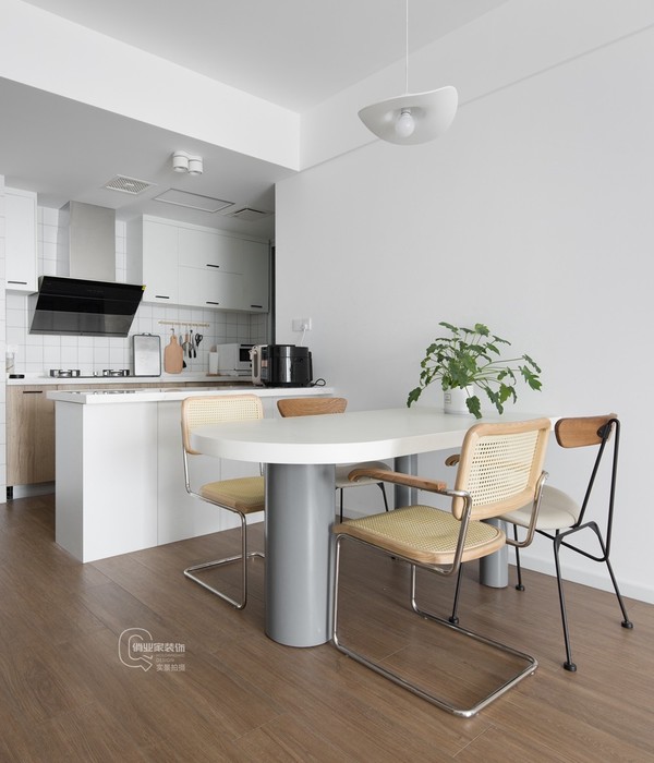
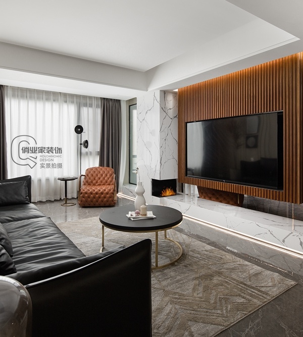
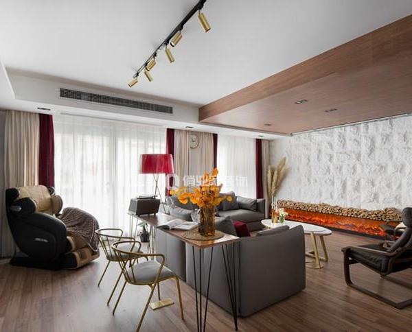
该项目坐拥中体城的一栋办公楼,共有十二层,以设计生产款式简约时尚的视听机架产品为主。设计师将空间风格定位为现代、人文与年轻化特点的办公区。
The project is located in an office building in the China Sports City, with a total of 12 floors. It mainly designs and produces audio-visual rack products with simple and fashionable styles. The designer positions the space style as the project’s modern, humanistic and youthful office area.
1层接待厅,1thfloorReception Hall
用弧形分隔区域将尖锐化为圆润,同时局部构建建筑造型打破规整砌墙的办公格局套路。
The arc-shaped separation area will be sharpened into a rounded shape, and at the same time, the building shape will be partially constructed to break the office pattern routine of regular wall-laying.
这栋建筑呈现狭长的菱形,有尖角,如一艘船。中间没有墙,设计师用弧形分隔区域,将尖锐化为圆润,同时局部构建建筑造型,打破规整砌墙的办公格局套路,布局疏密得当,动线灵活流畅。
The building has a long and narrow rhombus shape with sharp corners, like a ship. There is no wall in the middle. The designer uses an arc to separate the area, which will be sharpened into a rounded shape. At the same time, the building shape is partially constructed to break the routine of the office pattern of regular wall-laying. The layout is properly dense and the moving line is flexible and smooth.
5层会议室,5th
floor meeting room
6-7层办公区,6-7th
floorOffice Area
一个办公层就是一个品牌事业部,色彩是表现空间特点的重笔。设计师以白色、浅灰、深灰为背景色,根据每个品牌的Logo色彩进行拓展,有红、黄、蓝、土红、橙等各种色彩,来刻画该层的个性腔调。
An office floor is a brand department, and color is the key to expressing the characteristics of the space. The designer uses white, light gray, and dark gray as the background colors, and expands according to the logo color of each brand, including red, yellow, blue, earth red, orange and other colors, to describe the individual tone of this layer.
除了墙面,地坪也十分花心思。深灰、白色、浅灰的地坪呼应着顶部圆形或弧形造型,在开放式的空间因色彩不同被自然地划分了区域。
In addition to the walls, the floor is also very thoughtful. The dark gray, white and light gray floors echo the round or arc shape at the top, and the open space is naturally divided into areas due to different colors.
8层办公区,8th floor office area
特别是普货地毯经过设计师的精心配色,呼应着标志的主色调与相邻色间有暗花,用直铺、对角铺或大块面拼铺。在渐变中形成对比与明暗,仿佛是为这一层的量身定制。
In particular, ordinary carpets have been carefully matched by the designer, echoing the main color of the logo and the dark flowers between adjacent colors, and are paved with straight, diagonal or large surfaces. Contrast and light and shade are created in the gradient, as if tailor-made for this layer.
9层
办公区,9th floor office area
地毯的好看是该区域的一大特色。办公家具选用时尚轻巧的款式,选配与每一层相关的相邻色,色彩缤纷,强化了该层的空间特制性。因设计师的精心参与搭配,十分常见的家具也出彩,与空间相得益彰。玻璃、铝板,集成强体板,彩色乳胶漆、成品木饰面、铝合金格栅,这些普通材料经设计展现出不平凡的风采。
The good looks of the rugs are a major feature of this area. The office furniture adopts fashionable and lightweight styles, and the adjacent colors related to each floor are selected. Due to the careful participation of the designer, the very common furniture is also brilliant, complementing the space.
Glass, aluminum plate, integrated strong body plate, colored latex paint, finished wood veneer, aluminum alloy grille, these ordinary materials are designed to show extraordinary style.
10层
办公区,10th floor office area
设计师设计过许多办公空间,一直与时俱进。除了考虑企业特点、建筑条件,关切“人和”,公司的办公人员以八零后、九零后为主,这一代人的工作心态是工作并快乐着,并强调自我。所以设计师将个人的办公空间放大。他们可以在自己的办公区办公,可以在带景观的休息区办公,
Designers have designed many office spaces and have always kept pace with the times. In addition to considering the characteristics of the company, building conditions, and concern for "people and people", the company’s office staff are mainly those born in the 1980s and 1990s. The working mentality of this generation is to work and be happy, and to emphasize self. So the designer enlarges the personal office space. They can work in their own office area, in a lounge area with a view, or in a completely independent phone booth if they have private calls or important clients, which is very casual.
11层
办公区,11th floor office area
办公区的通道留得比较宽敞,满足同事之间的头脑风暴,研发、线上定制产品、跟工厂之间的交流,各部门走动,因交通四通八达而十分方便,使工作效率高且精神环境自由。
The passages in the office area are relatively spacious, which is suitable for brainstorming among colleagues, research and development, online customization of products, and communication with factories. It is very convenient for various departments to move around. Because of the convenient transportation, the work efficiency is high and the spiritual environment is free.
冷静中有跳跃的色彩,奇妙的造型恰如其份地安排了各种功能,使空间各处都洋溢着青春的欢乐。设计师为空间考虑更多的是灵活性与前瞻性,家具可以随意组合,以适应未来的使用变化。
There are jumping colors in the calmness, and the wonderful shape appropriately arranges various functions, making the space full of youthful joy. Designers consider more flexibility and forward-looking for space, and furniture can be combined at will to adapt to future changes in use.
行政区的茶水间和会议室,Pantry and meeting rooms in the administrative district
董事长室,会客室
Chairman’s room, reception room
项目名称:索迈视听科技公司
项目地点:宁波
建筑面积:7000平方米
设计公司:高得设计
设计师:范江
参与设计:丁伟哲、陈旭
撰文:洪堃
摄影:一川黑水
{{item.text_origin}}

