- 项目名称:南横步行街
- 项目地点:中国贵阳
- 项目面积:6892平方米
- 设计公司:木月建筑事务所
- 主持建筑师:毛颖,张书航
- 设计团队:付艺彬,李元涛,曾玮
- 设计内容:建筑设计,室内设计,景观设计,导视设计
- 设计周期:2018.04-2019.01
- 建设周期:2018.11-2019.06
- 项目业主:贵州全林集团
- 摄影师:Peter Dixie
南横步行街位于贵州省贵阳市南明区的核心地带,当地政府与企业合作希望创造一个有活力、有影响力、有凝聚力的创新街区, 打造贵阳城市形象的新名片,木月建筑事务所(MOON Architects)受邀成为南横步行街的一体化城市更新改造设计方。木月建筑事务所研究城市中的各种问题, 分析使用者的行为需求与问题,通过创新性的研究与设计提供得以推广和普及的综合性解决方案, 把一系列的问题和麻烦转换成空间趣味,通过城市更新唤醒城市记忆与活力。
我们将南横步行街,这条原本是小吃街的步行街进行全面改造升级。从宏观出发,将整片街区看作一个整体,把步行街、建筑、室内、景观、导视的关系整体系统化考虑,相互呼应。在改造中,新的业态引入这个街区,我们追寻原本属于大众的积累多年的充满人文风情的市井空间记忆,创造一个结合文化展示、体验、生产和经营为一体化的综合性步行街,一个流动着的贵州文化体验馆。
Nanheng Pedestrian Street is located in the core area of Nanming District, Guiyang City, Guizhou Province. The local government hopes to work together with enterprises to create an influential and cohesive innovative neighborhood, making it a new name card for Guiyang City. MOON Architects was commissioned to be the integrated designer for the urban renewal of the Nanheng Pedestrian Street. MOON Architects studies various problems in the city, analyzes the behavioral needs and problems of users, and provides comprehensive solutions that can be promoted and popularized through innovative research and design, converting a series of problems and troubles into Fun, and awaken city memories and vitality through urban renewal.
MOON Architects will make a comprehensive renovation and upgrade of Nanheng Pedestrian Street, which is originally a pedestrian street in Snack Street. Starting from the macroscopic perspective, the whole block is regarded as a whole, and the relationship between the pedestrian street, the building, the interior and the landscape is systematically considered and echoed. In the transformation, a new business model is introduced into this neighborhood. We pursue the memory of the city and the space that has been accumulated for many years and is full of humanities. We create a comprehensive pedestrian street that integrates cultural display, experience, production and management. It is a place where visitors experience Guizhou local culture.
▼改造后步行街外观远景,distant exterior view of the pedestrian street after the renovation
首先,我们的设计从功能需求出发,根据场地里既有的限制因素,解决现有核心问题: 1:原建筑入口标示性不强,导致难以引入人流至内街; 2:原商业内街内部环境较差,通风和采光不好、阴暗潮湿,脏乱现象严重,在暴雨天气倒灌雨水至室内; 3:业态分布不合理,导致商业内街利用率不高,常年处于荒废状态; 4:整个街道长约128米,原建筑外立面单一冗长,步行体验感不好。
First, starting from the functional requirements, solve the existing core problems according to the existing constraints in the site: 1: The original building entrance is not marked, making it difficult to introduce people to the inner street; 2: The internal environment of the original commercial inner street is poor, the ventilation and lighting are not good, and the rainwater is poured into the indoors during heavy rain. Overall speaking, it is dark, humid, dirty and messy; 3: The distribution of the business is unreasonable, resulting in a low utilization rate of commercial interior streets, which is in a state of ruin; 4: The whole street is about 128 meters long. The original building facade is single and long, and the walking experience is not good.
▼步行街爆炸轴测图,exploded axon of the pedestrian street
外立面的设计考虑新秩序商业空间与步行街商业广场交接和互动的关系,保证外立面在现有场地中保持独立,同时建立周边传统风貌区有直接或间接的联系。周边建筑物高度、广场空间、室内空间、行人步行体验、天气、视野是建筑外立面形成的主要影响因素。建筑外立面通过原始的柱间距进行最开始原型的分隔,每个柱间距形成一个独立的立面元素,之后,相同功能合并为同一单元,不同的使用功能形成独立的构成单元。不同的构成单元,依据功能和步行街的影响,形成前后错落的组合关系。前侧步行街广场较为开阔的位置,外立面体块向前较多推进,前侧步行街广场较为狭窄的位置,外立面体块较少推进,形成丰富的步行街立面节奏。外立面与对面底层商业及居民楼形成或开阔或狭窄的步行街,影响到外立面体块的上升或下降。前部较开阔的广场位置,适当抬高外立面体块,达到醒目,形成广场中视觉聚集的焦点的目的;前部步行街较窄的位置,外立面适当下降,避免因步行街两侧都较高带来的感知压迫。
The design of the facade considers the relationship between the new order commercial space and the pedestrian street commercial plaza, ensuring that the facade both remains independent in the existing site, and interacts directly or indirectly with the surrounding traditional style area. The height of the surrounding buildings, the space of the square, the indoor space, the walking experience of pedestrians, the weather, and the visual field are the main influencing factors for the formation of the facade of the building. The facade of the building is separated by the original column spacing, and each column spacing forms a separate facade element. After that, the same functions are combined into the same unit, and different functions are used to form separate building blocks. Different constituent units are organized in a logical manner based on the main functions of the pedestrian street. The front side pedestrian street square is relatively open, the facade body block is pushed forward more, the front side pedestrian street square is relatively narrow, and the facade body block is pushed forward less, forming a rich pedestrian street facade rhythm. The facade and the opposite pedestrian commercial and residential buildings form an open or narrow pedestrian street that determines the rise or fall of the facade block. The front part of the open square is appropriately elevated, and the facade body block is raised to achieve an eye-catching effect and the focus of the visual gathering in the square. The narrow position of the front pedestrian street and the facade are appropriately lowered so that people wouldn’t feel uncomfortable.
▼改造后步行街外观近景,close exterior view of the pedestrian street after the renovation
在立面的形式处理与材料选择上,屋顶形式采用中国传统双坡屋顶,外立面选用传统青砖;除传统材料外,佛碳烤漆金属边框,玻璃门窗等现代材料为主。不规则外砌砖墙,丰富建筑外立面的视觉感受。整体外立面,依托材料变化,形成反应内部空间节奏的虚实外立面节奏。商业店铺位置以砖墙为主,形成实体外立面视觉效果;内部休闲广场,美食广场以及入口位置通过幕墙玻璃以及穿孔金属板的材料使用形成虚体的外立面节奏。
In terms of form processing and material selection of the facade, a traditional Chinese double-sloping roof style is chosen, and traditional bricks are used in the facade. In addition to traditional materials, Buddha carbon paint metal frame, glass doors and windows and other modern materials are used. Instead of conventional practices, irregularly builds brick walls are constructed to enrich the visual experience of the facade of the building. The overall facade, built by various construction materials, is a vivid display of whatever is going on in the other side of the wall. Most commercial stores have brick walls, enabling visitors to see through. As for leisure plaza, food court and entrance, curtain wall glass and perforated metal sheets are used to create an imaginary facade rhythm.
▼改造后步行街局部,建筑采用中国传统双坡屋顶,商业店铺外立面选用传统青砖,内部休闲广场采用幕墙玻璃以及穿孔金属板,partial view of the pedestrian street after the renovation, a traditional Chinese double-sloping roof style is chosen, and traditional bricks are used in the facade of commercial stores, while the curtain wall glass and perforated metal sheets are used in the facade of the leisure plaza
地面铺装设计也通过独特的地面铺装连接不同的建筑物与周边的社区,在下雨天地面铺装会形成不同的风貌。地铺秩序采用一种有统一感的主色调铺装强化街道景观的连续性和整体性。而细部色彩设计亮丽、富于变化、生动活泼,以体现商业街生机勃勃的繁华景象;根据流动空间、集散空间和停留空间不同的空间属性,结合建筑外立面和室内虚实空间进行了五块区域划分,以给人方位感与方向感,以及空间性格;地面与街道整体环境气氛相协调,强化街道的个性形象,用不同色彩、质感的材料经过设计、按一定的规则逻辑拼接、组合呈现不同的感受。
The pavement design also connects different buildings and surrounding communities through unique ground pavements, which will create special views on rainy days. The ground floor order uses a unified main tone pavement to enhance the continuity and integrity of the streets-cape. The detailed color design is bright, rich and varied, vivid and lively, to reflect the vibrant and prosperous scene of the commercial street. The space is separated into five areas according to their functions, i.e. walk by, assemble or stay, giving each area a distinct feature and helping visitors to find directions more easily. The ground and the overall atmosphere of the street are coordinated, strengthening the individual image of the street. Different colors and textures of materials are applied and coordinated, making up this unique pedestrian street.
▼步行街外观局部,地铺秩序采用一种有统一感的主色调铺装强化街道景观的连续性和整体性,partial view of the pedestrian street, the ground floor order uses a unified main tone pavement to enhance the continuity and integrity of the streets-cape
▼步行街外观局部,地面与街道整体环境气氛相协调,partial view of the pedestrian street, the ground and the overall atmosphere of the street are coordinated
针对原有入口标示性不强,仪式感不足等问题,采取在外立面置入不规则穿孔金属板的几何形体主入口,与外立面在材料和形体上产生较大的冲突,产生视觉刺激。利用穿孔金属板后部灯光布置,使不规则穿孔金属板入口在夜晚形成视觉焦点。创造性的打通南横街的商业动线,根据场地地形、周边建筑物高度、街道形成的小型广场空间等分析人流、视野与天际线,确定三个主入口的位置与形式。
In view of the problem that the original entrance is not conspicuous and the sense of ritual is insufficient, a geometrical body with irregular perforated metal plates placed on the facade is used as the main entrance, which creates a large conflict between the material and the form of facade, resulting in visual stimulation. Using the rear light arrangement of the perforated sheet metal, the irregular perforated sheet metal inlet creates a visual focus at night. The new design creatively opens the commercial line of Nanheng Street and analyzes the flow, vision and skyline according to the terrain of the site, the height of the surrounding buildings, and the small square space formed by the street, and determines the location and form of the three main entrances.
▼在外立面置入不规则穿孔金属板的几何形体主入口,a geometrical body with irregular perforated metal plates placed on the facade is used as the main entrance
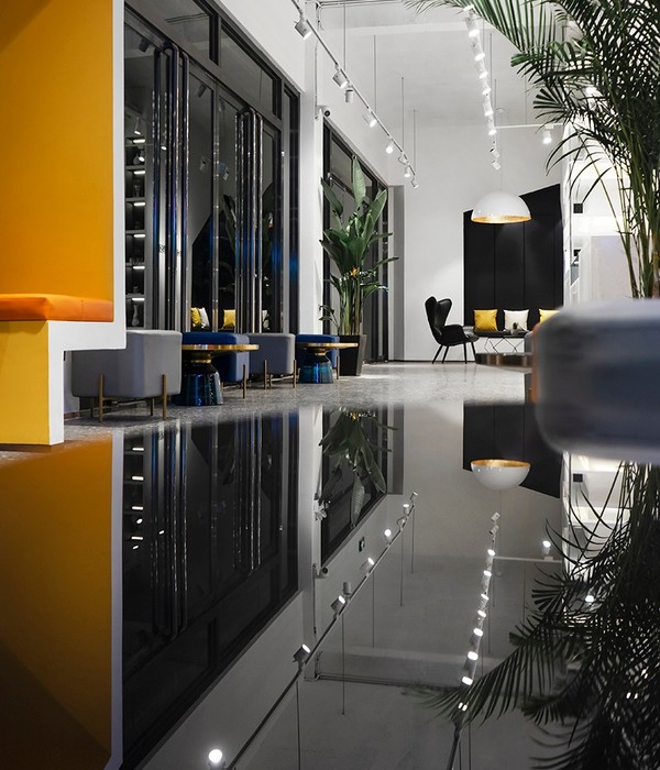
原有临街铺面44间,室内铺面45间。突破传统商业内街格子间排列情况,通过解构的方法,破除商业空间的分隔,将商业空间灵活,开敞地布置到整体商业空间中,相同商业业态组成无分隔的功能体块,再通过各个体块的旋转,尽可能地形成室内外无差别的连贯空间,建立新的空间秩序。内部商业空间中,无论从哪个入口进入商业内街,经过每个组团商业片区和开放活动空间,都将依次形成虚与实,收与放的空间节奏,通道两侧商业店铺围合收的空间节奏,入口和广场形成放大的空间节奏,为顾客提供较好的游逛体验。在虚实节奏中,围绕开放空间布置形成以咖啡、定制、手工等业态为主的休闲广场和以开放餐吧等业态为主的美食广场。两个广场空间,借助室外立面线挂小青瓦材料的使用与绿植的搭配,营造斑斓的光影交替效果。室内商业空间三个入口和两个广场位置均布置视觉端景,从室外步行街走过或进入室内都有较好的视觉引导性和美观性。
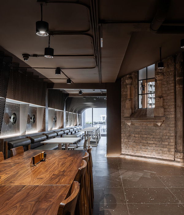
空间形式上吊顶形式延续室外双坡屋顶,通道两侧商业店铺共同组成双坡吊顶形式。吊顶采用格栅与金属板交替,既可暗示每间店铺的位置,又能使视线、光线穿透,避免层高造成压迫感。开放式商业店铺灵感来源于西方market开放形式,将现状相对封闭的店铺化繁为简,使室内的视觉感受较为开阔。所有店铺之间无通顶隔墙,保证室内商业空间整体连贯;通道直接与店铺吧台交接,消费者与店主沟通更接近,且可近距离观看到商店内食品操作,增强体验感。朝向室内的店铺体块形式与朝向步行街的店铺体块关系交错、咬合,强调两个体块整体性,保证整体功能分区边界清晰。通过外立面的虚实关系,增加内部空间的公共空间,外立面的大面积开窗以引入阳光、空气,同时步行者可以看到室内公共空间;为解决排水问题,研究场地竖向并在室内外都设置截水沟。
Breaking through the arrangement of traditional commercial inner street lattices, through the deconstruction method, breaking the separation of commercial space, the commercial space is flexible and openly arranged into the overall commercial space, and the same commercial business forms a functional block without separation, and then through each. The rotation of individual blocks creates as much as possible a coherent space between the interior and exterior and creates a new spatial order. In the internal commercial space, no matter which entrance enters the commercial inner street, after each group commercial area and open activity space, the virtual and real space will be formed in turn, and the space rhythm of the collection and release will be adopted. The rhythm, entrance and square form an enlarged spatial rhythm to provide customers with a better wandering experience. In the rhythm and rhythm, around the open space, a leisure plaza with coffee, custom, and handicrafts, and a food court with an open bar and other formats are formed. In two square spaces, with the use of the outdoor facade hanging the small blue tile material and the green plant, a gorgeous light and shadow alternate effect is created. There are visual end views in the three entrances and two squares of the indoor commercial space. When visitors enter from the outdoor pedestrian street or enter indoor areas, there is better visual guidance and aesthetics.
In the form of space, the ceiling form continues the outdoor double-sloping roof, and the commercial shops on both sides of the channel form a double-slope ceiling form. The ceiling is alternated with a metal plate, which not only indicates the location of each store, but also allows the line of sight and light to penetrate, avoiding the pressure caused by the height of the floor. The open commercial store is inspired by the open form of the Western market, which simplifies the relatively closed store, making the indoor visual experience more open. There is no cross-wall between all the shops to ensure the overall commercial space is coherent; the channel directly communicates with the shop bar, the consumers communicate with the owner closer, and the food operation in the store can be closely watched to enhance the experience. The store body block form facing the interior is intertwined with the store body block facing the pedestrian street, and the two body blocks are integrated to ensure the clear boundary of the overall function partition. Through the virtual and real relationship of the facade, the public space of the internal space is increased, and the large area of the facade is opened to introduce sunlight and air, and the pedestrian can see the indoor public space; to solve the drainage problem, the research site is vertical and a water intercepting ditch is provided both indoors and outdoors.
从商业策划角度考虑,新的业态根据数据分析重新调整,设计者对商业空间的发展、物理和行为空间的理解,对商业空间、店铺、消费者三者关系的理解;对商业空间、创新业态、可持续运营三者关系的理解;对建筑立面、室内、景观、灯光、店招、地面铺装、形象标识、指示系统等方面进行了全方位的改造和重新设计。
From the perspective of business planning, the new format is re-adjusted according to data analysis, presenting the designer’s understanding of the development of commercial space, physical and behavioral space, the relationship between commercial space, shops and consumers, and the relationship between the business space, innovation operation and sustainable operation. All aspects of the building facade, interior, landscape, lighting, shop recruiting, ground paving, image identification, indicating system, etc., are transformed and redesigned completely.
▼步行街夜晚的灯光效果,光线从穿孔板和砖墙上的孔洞中透出来,the light effect of the pedestrian street at night, the light glows through the perforated metal sheets and the holes of the brick walls
▼步行街夜晚的灯光效果,光线从玻璃立面中透出来,the light effect of the pedestrian street at night, the light glows from the glass facade
室内商业空间材料与室外步行街铺装材料保持联系。地面材料从室外延续进室内,保证室内外整体性;室内材料布置与室内空间保持一致。店铺、通道及广场在相同色系及拼法的铺装材料下,分别增加单个颜色的比例。店铺内黑白搭配,形成渐变关系,增加室内空间趣味性;通道内以白色为主,配合使用少量灰色和粉红色;三个入口以灰色为主,配合使用少量白色和粉红色;休闲广场和美食广场以粉红色为主,配合使用少量灰色和白色地铺。另外,考虑到店内空间面积较小,铺装与通道和室外相比比例缩小,调整为300*300mm大小铺装,适合室内的空间感受。
▼地面铺装设计,三个入口以灰色为主,配合使用少量白色和粉红色;休闲广场和美食广场以粉红色为主,配合使用少量灰色和白色地铺,the ground pavement, the three entrances are mainly gray, with a small amount of white and pink; leisure square and food areas are mainly pink, with a small amount of gray and white floor tiles
▼地面铺装设计,通道内以白色为主,配合使用少量灰色和粉红色,the the ground pavement, the channel is mainly white, with a small amount of gray and pink
同时,我们还为场地设计了一整套景观标识系统,将信息剪切到了场地系统之中: 导向指示的功能属性,在步行街中起到的引导作用; 步行街环境构成中的一部分,将步行街风格、文化升华;在南横街布局的点、线、面中,它起到的是点和以点代面的作用。整个基地从地面铺装到建筑立面和屋面到内街室内, 主要运用了三角几何元素,所以精神堡垒导视用曲面与之形成对比,材料采用反光的镜面金属材料,折射反射出每一个经过南横街的面孔与身影,体现新贵阳的现代性、多元化和包容性。
At the same time, we also designed a set of landscape Signage system for the site, building a information linkage system within the area: The functional attributes of the guiding instructions play a guiding role in the pedestrian street; part of the composition of the pedestrian street environment, sublimation of the pedestrian street style and culture; in Nanheng Street, each point represents the whole area. The entire base is paved from the ground to the building facade and roof to the inner street interior, mainly using triangular geometric elements, so the spirit fortress guide is contrasted with the curved surface, the material uses reflective mirror metal material, and the reflection reflects each passing. The faces and figures of Nanheng Street reflect the modernity, diversity and inclusiveness of new Guiyang.
▼总平面图,site plan
▼平面图,plan
▼立面图,elevation
项目名称:南横步行街 项目地点:中国贵阳 项目面积:6892平方米 设计公司:木月建筑事务所 主持建筑师:毛颖,张书航 设计团队:付艺彬,李元涛,曾玮 参与人员:沈王,张诗敏,陶颖,张真珍,王月玫 结构咨询:许尉华 设计内容:建筑设计、室内设计、景观设计、导视设计 设计周期:2018.04-2019.01 建设周期:2018.11-2019.06 项目业主:贵州全林集团 摄影师:Peter Dixie
Project Name: Nanheng Pedestrian Street Location: Guiyang,China Area: 6892 ㎡ mixed-use Design Firm: MOON Architects Principal Architects: Mao Ying,Zhang Shuhang Design Team: Fu Yibin,Li Yuantao,Zeng Wei Participants: Shen Wang,Zhang Shimin,Tao Ying,Zhang Zhenzhen,Wang Yuemei Structural Consultant: Xu Weihua Type: Architecture Design,Interior Design,Landscape Design,Sign Design Design Period: 2018.04-2019.01 Construction Period: 2018.11-2019.06 Client: Quanlin Group Photography: Peter Dixie
{{item.text_origin}}

