Found on the second floor of a ninety-eight-year-old building is I SEE ALL. Located in Osaka, the Japanese Boutique’s interior and furniture designed by Yusuke Seki is a tongue-in-cheek
. True to its namesake, I SEE ALL entertains the idea of a very honest storefront and experience – allowing the backend workings of a shop to have equal attention as the front. Inside the smooth white walls and polished concrete floor of the already refurbished building, the storefront aesthetic is characterised by jarring vermillion steel shelf. Spanning at 4.6 metres and located thoughtfully at eye level, the shelf functions as a red tape distinguishing the boundary between the sales and staff area. Like a designer
, Seki has thoughtfully introduced an alternative to a heavy partition that would erase the existing bay windows, the main charm to the former bank building. It’s an unmissable, graphical and effective intervention that is true to the designer’s nature of
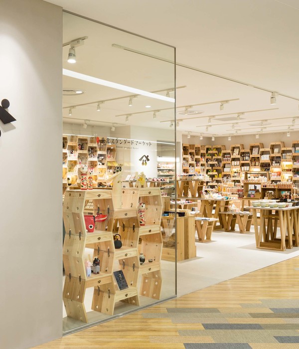
The arresting colour of the steel beam is a stark contrast against the minimal palette but effectively draws attention to the custom furniture. I SEE ALL’s bespoke joinery is a collection of merchandise tables that exposes the drawers’ mechanics. With only one side covered and the remaining three baring all, the interaction with the table’s drawers offers another appealing telling of the ‘invisible labour’ of micro-works often rarely recognised. Seki also designed the tabletop to be slightly lifted from leg frames invites a lightweight feeling, removing any awkward heavy grounding of the space that has already been anchored by the custom shelf. I SEE ALL really is a store that that attempts to follow the rules of the trend yet refuses by making small but effective gestures to challenge the norm.
Words by Kimberley Hui.
图片 ©
摄影 @
语言:English
阅读原文
{{item.text_origin}}

