104 cafe, is not just another cafe.
It holds as a place for eating, coffee breaking, meeting, group working, spurring employees to interact more, sparking fresh ideas and boosting collaborations. It holds the purpose of being a multi-functional place, not just a proper "Cafeteria" or another "Cafe", as stated by the designer.
We waste lots of time, space and resources, huddled in meetings. So why don't we integrate resources to create a more effective and efficient space?
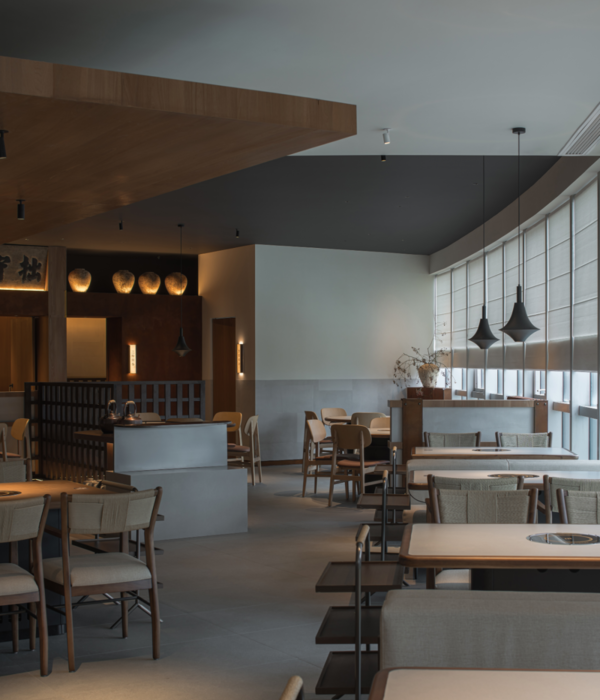
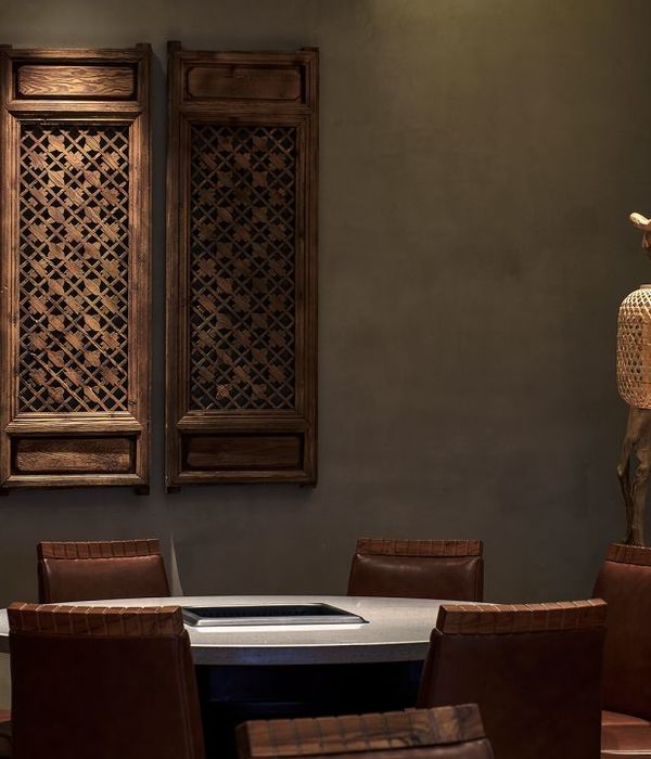
At first sight, the curved ceiling leads the eyes to focus into a space that aligns into a fence at the back. It extends the area, symbolizing life’s rise and fall. To make these match perfectly, the designer had extended the branding colours into the triangular wooden fence. Creating a mysterious private section, meanwhile also fashioning a space with different layers.
The red colour expresses passion and warning. Both are arranged in the wall cleverly in order to divide the different service sections of the space, which then further extends the dimension and creates different layers within space. Through the combination of simple elements and colours, the design represented the exclusive theme of this cafeteria.
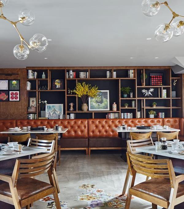
The best part about the space is the Art pieces on the wall is from a kid's gallery which sponsors from the corporation's foundation. It's full of love, care and creates corporation unique values.
Other then the form and style of the restaurant, the more challenging part was to convey the spirit of the multi-functional space.
{{item.text_origin}}


