There is more than a touch of glamour to the refurbishment of this mid-century Portland home by Jessica Helgerson Interior Design (JHID). Plush gold fabrics sit side by side with decadent purple and lavender velvets. Vintage chairs are reflected in the mirrors of the living room, something of a real-life jewel box itself, faceted as it is with panels of antique mirrors making the space appear to light up like the inside of a diamond.
Listed on the National Register of Historic American Places, the 1885 house had its restrictions. There was no random pulling down of walls or taking out of windows, but that wasn’t high on Helgerson’s list anyway.
“The existing details were so exquisite and the proportions so lovely we felt that we needed to proceed with caution with everything we did. Our goal was to reflect our clients’ love of modern design while being absolutely respectful of the existing architecture,” said Helgerson.
The design team was enchanted by everything that was original and meticulously kept the classical architecture of the home intact. The aim was to add to it by dusting off the vintage furniture collection, an Aladdin’s cave of mid-century modern chairs, belonging to the owners of the property, Greg and Sandra Cost. But it was Sandra’s love of glamour that inspired so many of the luxe finishes in the house.
The kitchen was where the most change took place. Previously updated in the 1980’s, the daffodil yellow cabinetry required a thorough going over. There were some intense structural changes needed to open it up, a new ceiling beam and footings in the basement. JHID replaced the ceiling with the original tin-pressed ceiling and took up the flooring. Noticing the rest of the house had original timber floors with their own inlay border detail, they implemented the same in the kitchen, linking it back into the fabric and history of the rest of the house.
They were unable to remove the old fireplace in the breakfast nook, but as it turned out, it became one of the elements that Helgerson found most attractive about the room. A secret door was put into the kitchen cabinetry by the builder to access a pantry, and any windows pulled out from the area were meticulously replaced and replicated.
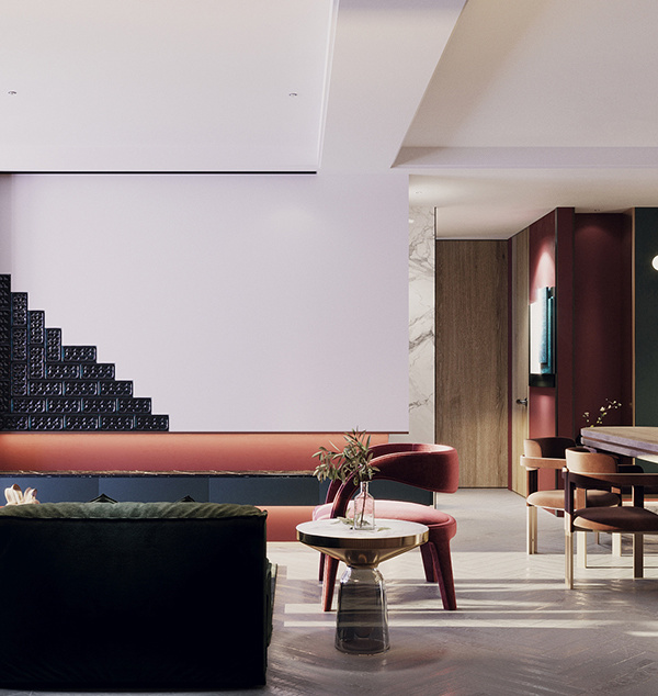
There’s no question they’ve employed a bold colour palette in this traditional home. Bright, bold colours grab your attention through the artwork, the furniture selection and the choice of lighting. “Our colour palette consists of rich jewel tones and an unlikely pale lavender that wound up being the perfect pairing with the existing warm woodwork,” said Helgerson.
But what really strikes you is that these bright colours read just like jewels set into a soft velvet jewellery box. Turquoise, topaz, aquamarine and amethyst – the contents of the house really do glitter like beautiful bright stones resplendent in their mirrored box.
[Images courtesy of Jessica Helgerson Interior Design. Photography by Aaron Leitz.]
{{item.text_origin}}

