Steps 旗舰店 | 回归优雅的购物体验
Interior Designers:say architects
Year :2021
Photographs :Minjie Wang
Construction Company :Shanghai Cultivator Decoration Design Co. Ltd.
Partner In Charge : Yan Zhang, Jianan Shan
Project Team : Ziyi Sun, Binyan Xie, Sheng Hang, Yawen Fan
The Client : Steps lifestyle
City : Hangzhou
Country : China
A retail space that follows no trend. The first offline store of the beauty collection brand Steps was designed by Say Architects and landed in Hangzhou Hubin Pedestrian Street. This project is a joint exploration of Steps and a reflection on the reckless atmosphere of the entire retail industry.
At present, the beauty collection stores in the retail market create a sense of FMCG, emphasizing the youth and fashion sense of the brand. The stores emphasize the accessibility of the store from the beginning of the design to increase the flow of people entering the store. The founding team of Steps would like the first offline store to be different from other brands, emphasizing its own elegant, soft and comfortable brand feeling. Why must the consumption scene of beauty products be in noisy and full web celebrity-conscious retail stores, rather than enjoy the selection process and purchase experience in the quiet and soft space as buying books? Recalling that more than ten years ago, shopping was an elegant and leisure lifestyle when e-commerce did not rise. Now, due to the rapid development of social media, shopping has often become a fast way of immediate consumption to check in new stores, and customers can not enjoy the shopping experience well after entering the store. The fast in and out consumption method eliminates the meaning of the existence of the retail space itself. Therefore, Say hopes to let people return to the comfortable and elegant shopping experience of the past and let the space back to the space itself through the store design of Steps, rather than the temporary consumption carrier grafted on the social network's existence.

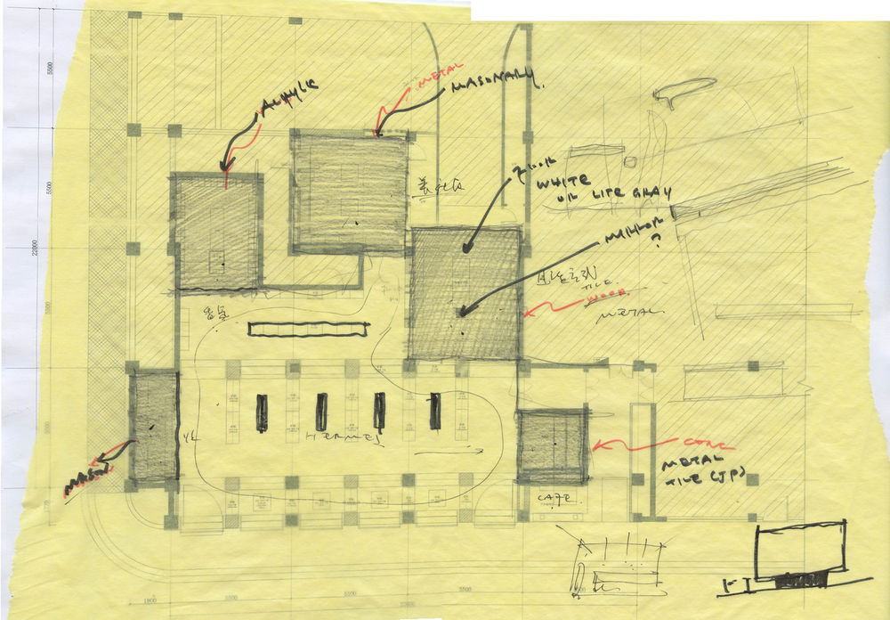
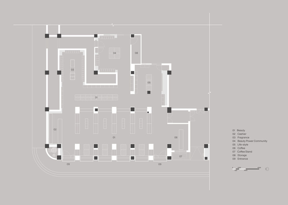
Say would like customers to have a sense of stillness away from the pedestrian street when they walk through the dazzling pedestrian street to the Steps. In the design, Say incorporates the design concept of "Beauty Book Layout". Comfortableness, softness, elegance, and slowness are the central vocabulary of the store design of Steps to reduce the speed of guests shopping, improve the space experience. Furthermore, shopping is originally a comfortable lifestyle. Although the most intuitive output of building a brand is the appearance of the product and the store, its brand image and characteristics are through the whole. Not only from the store image but the business format of Steps is also different from other beauty collection brands, emphasizing user stickiness and user community; it's also an attempt by Steps to pull customers back to the traditional shopping experience. Steps hope to implant the functional area of "Beauty power Community" and integrate the community into the brand in the space. The number of people entering the stores does not explain the brand value, while the user stickiness and the public praise are the core of retail. Say divides the main functions in the store into six segments: product display, cashier area, fragrance area, Beauty power community, lifestyle area, and coffee area. The last five regions serving as the five boxes in the space are arranged clockwise around the product display area.
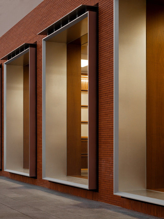
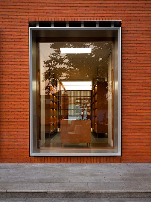
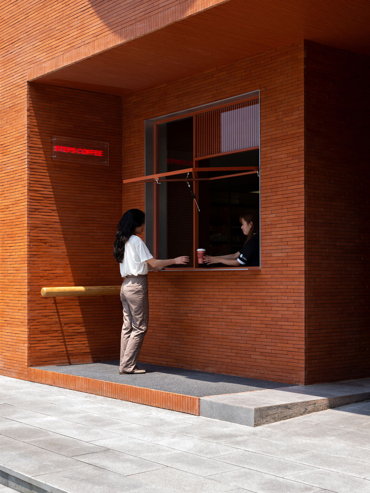
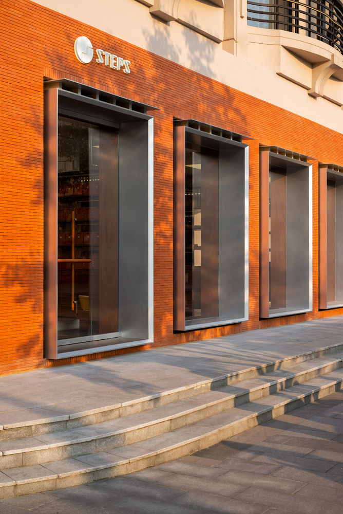
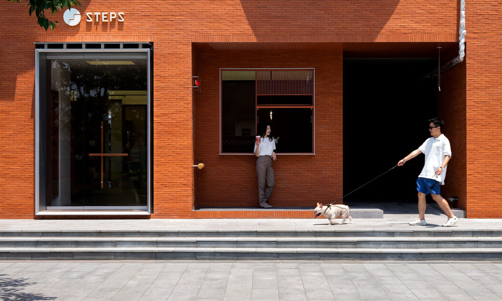
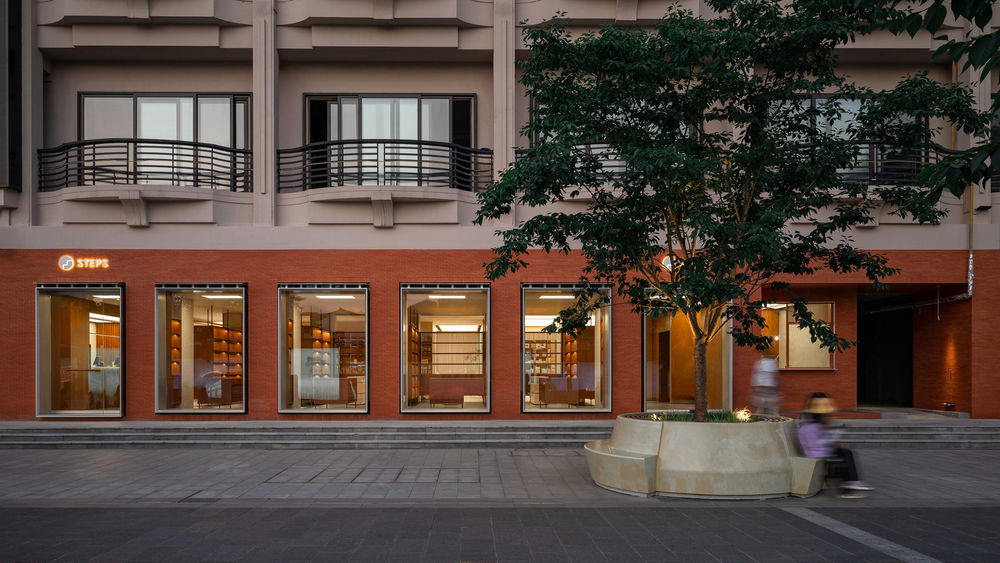
The storefront design of Steps does not blindly increase the exposed area of the store, but extracts the modulus on the column network of the original building, adds part of the columns to form a facade rhythm with comfortable proportion, and echoes the original structure layout. The facade ceramic tile selected is the same size as the grey brick unique to Hangzhou Lakeside Pedestrian Street. The colour difference of the ceramic brick and the size error of the finished product are ignorable, reducing the irregular collage problem challenging to solve on the brick facade. The red storefront stands out from the retail format of the whole street but is also in harmony with the grey brick veneer of the entire pedestrian street. On the right side of the storefront is the coffee stall Steps Coffee, not only for guests in the store but also for an independent cafe open to the public. The recessed Steps Coffee provides a resting grey space for guests who buy coffee outside the shop and guests' pets. From the lakeside pedestrian street to the Steps store, the first thing you see is the Steps Coffee instead of the store display surface, which makes people feel more intimate and is also a means to soften the fast shopping experience.

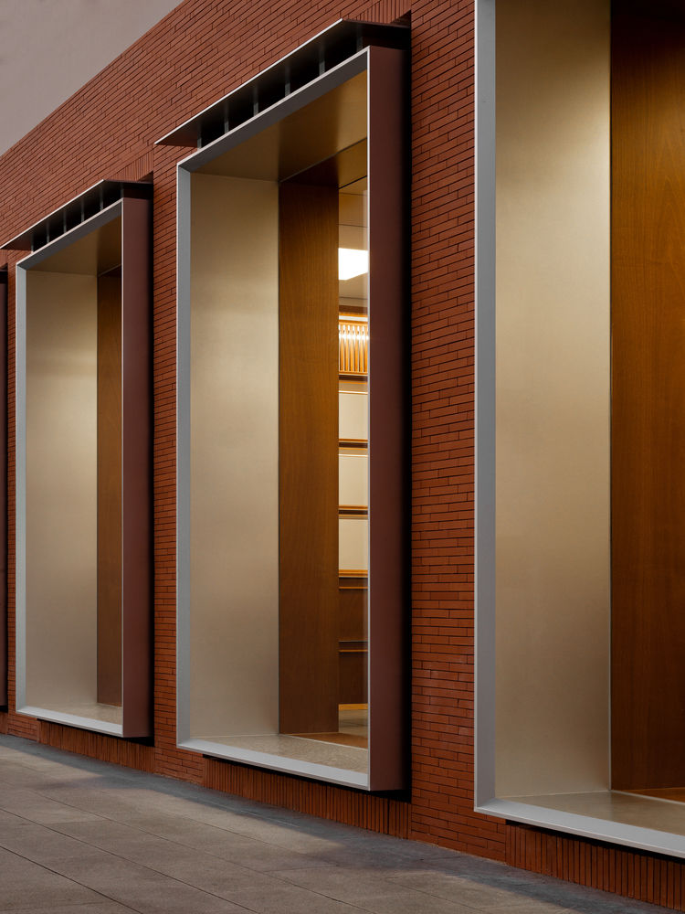
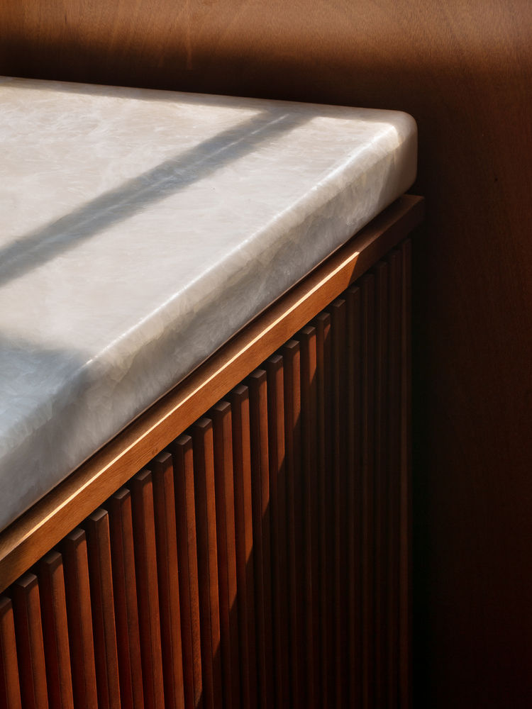
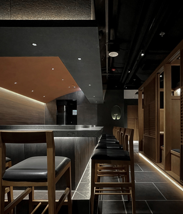
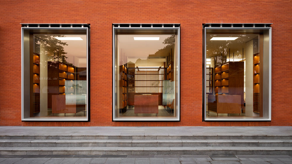
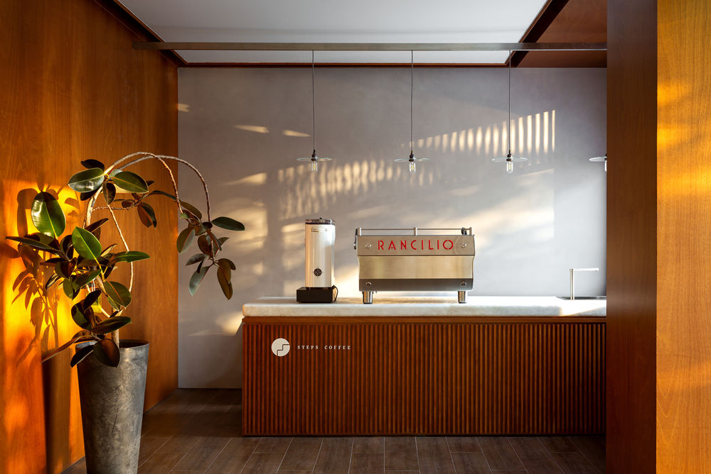
The coffee bar in the shop is a warm and soft whole piece of jade that serves as a countertop, whose side is composed of the teak grille, whose design between the cabinet components leaves a seam, with the clean and straightforward overall coffee bar. On the left side of the Steps Coffee port, there is a window of six arrays, among which, the left and right are the two shop entrances and exits; the window consists of prominent metal window frames and cornice; between the cornice and the window frame are connected by six metal components just like a wooden roof. It permeates an elegant and classical temperament with sizeable super-white glass while also conveying a modern feeling.

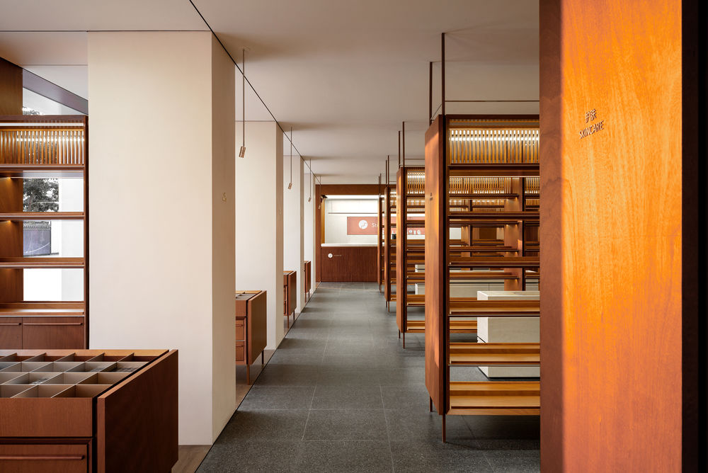
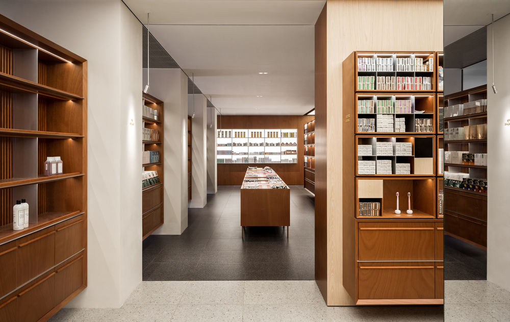
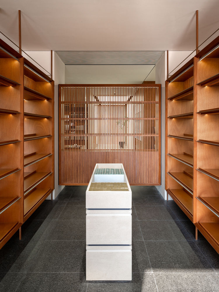
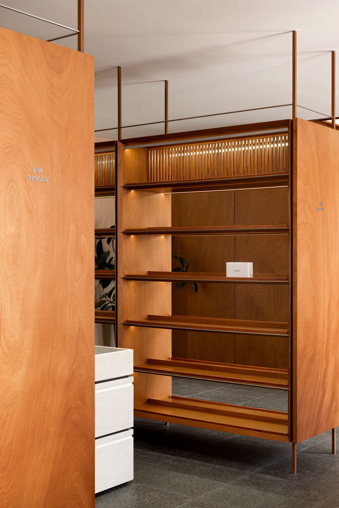
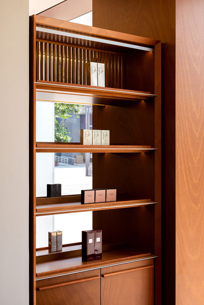
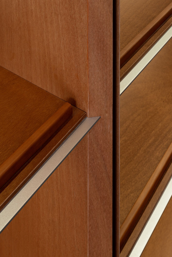
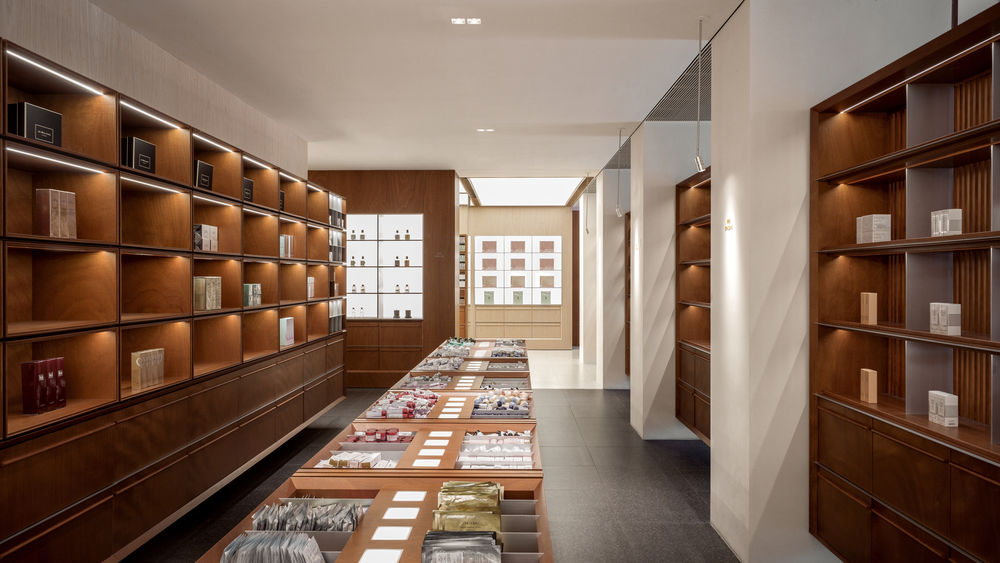
In&out Display. Look into the room through the window frame as if the indoor shopping scene becomes a painting. The shopping experience is also directly displayed to the passers-by outside the shop. Enter the store from the southwest corner entrance adjacent to Steps Coffee, and the first arrival is the beauty product display area. The product display cabinets are shelves displaying teak frames combined with beige space tone, forming a comfortable atmosphere. The soft colours make it easier for guests to stay and focus more on the product. Indoor columns and elevation columns spacing is consistent, corresponding to each other. And you can see the pedestrian street outside through the window between each column. Shelves between columns are separated from walls on both sides as if the cabinet is suspended in the air. Each floor of the showcase is enclosed with solid stainless steel, and the closing position of the wood partition plate is also angle-cutting treatment, which makes the entire cabinet look light and clean.
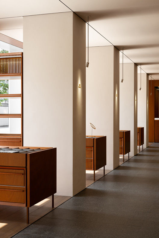
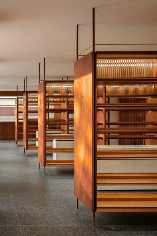
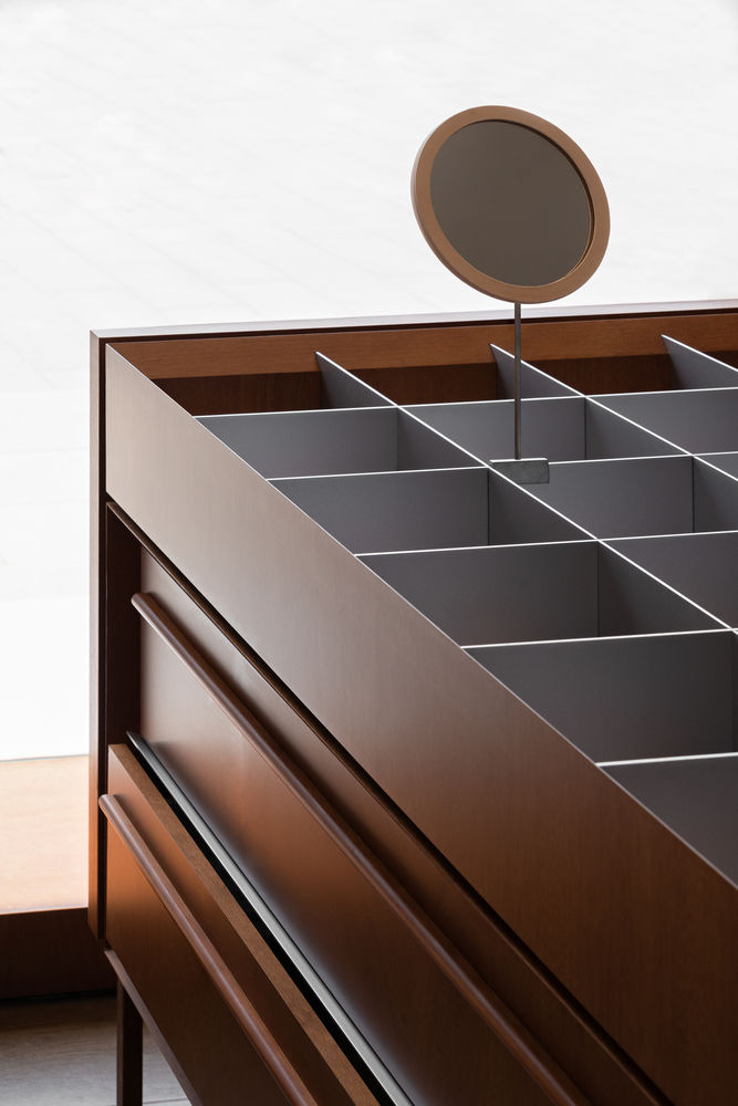
Between the vertical showcase is the landing sample showcase, mainly showing the small sample products of all kinds of cosmetics. This kind of display product categories are many, need to be taken and fetched conveniently, and accommodate different product placement sizes. So, Say designed modular late-adjustable display cabinets, and the display area consists of solid sandblasted aluminium panels divided into squares for easy placement of products. You can change the size of the grid by extracting the aluminium plate to meet the needs of different sizes when displaying the product size change in the future. Along the streamline is into the beauty product display area in the inner part, where the space connects the fragrance area, Beautypower community, and lifestyle area with the more comfortable space scale here.
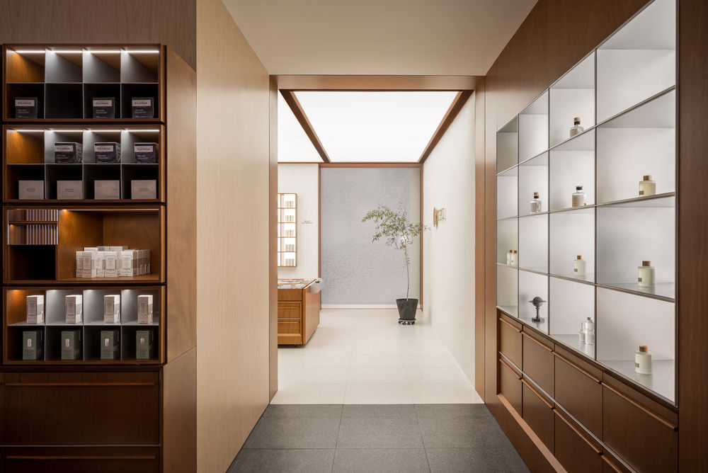
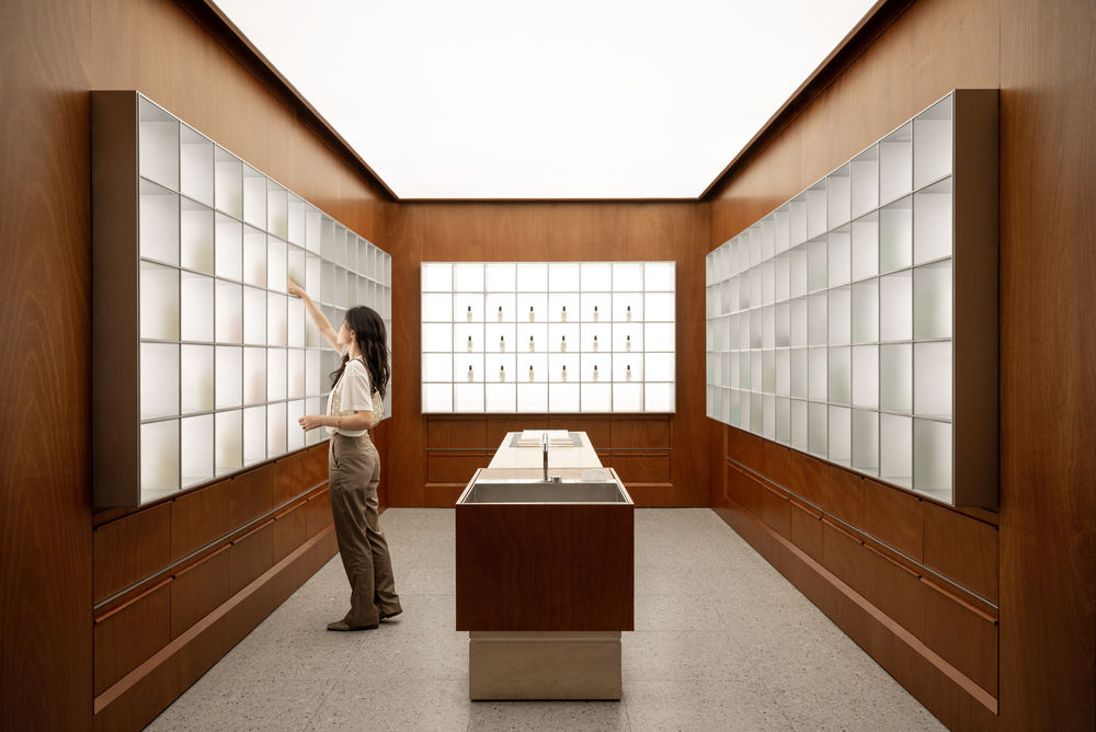
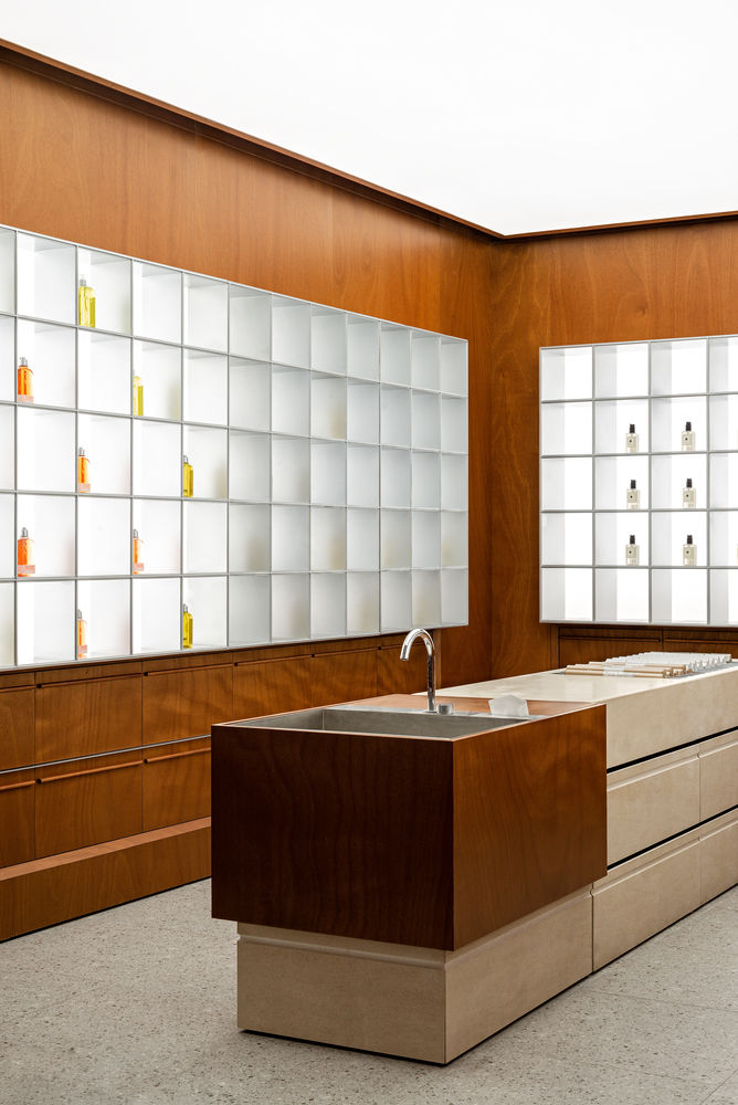
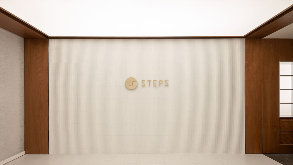
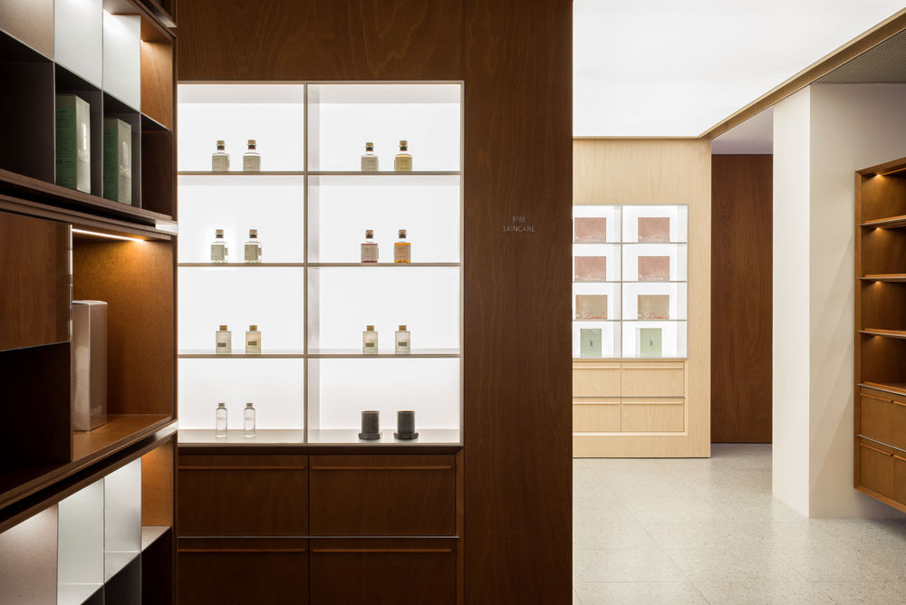
Clear program allocation. These five large pieces of coffee, cashier, fragrance, Beautypower community, and lifestyle are lit up by the whole luminous ceiling respectively, the ground is also changed from dark colour floor tile to light colour floor tile using the space material and the design techniques are unified but different from other space. It is very convenient for guests anywhere in the store to judge their location according to the space lighting method, making the whole shopping experience clearer and simple. Upon entering each area, a clear sense of spatial division suggests different exhibits, so customers can perceive it themselves without telling the customer area function. Meanwhile, the wall of the fragrance area entering each space is a teak veneer embedded in the wall by the luminous metal showcase, products are lit from the back, and the centre of the space is a trial table.

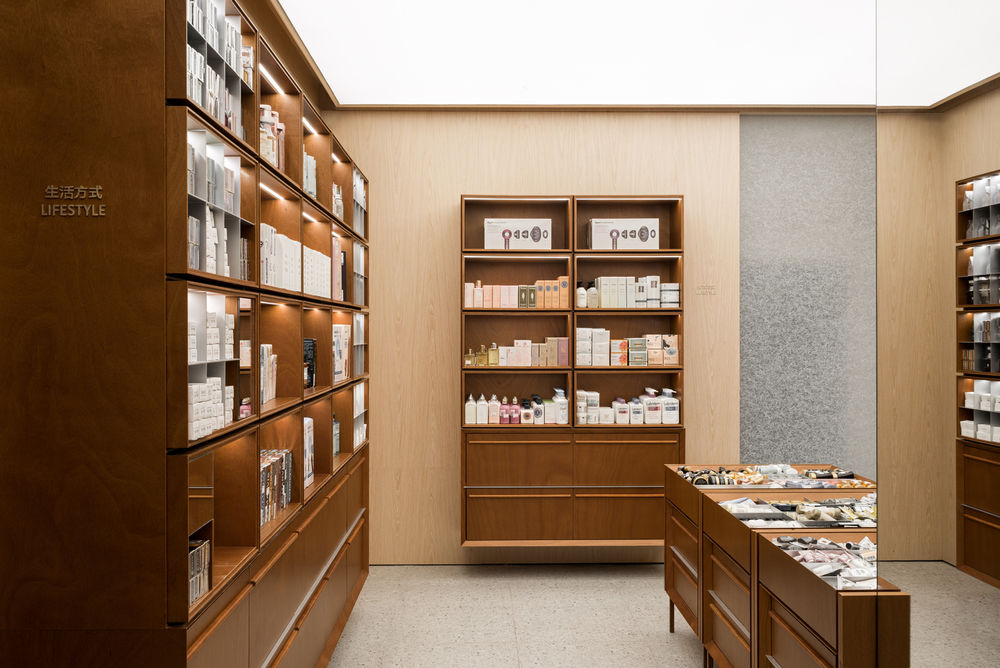
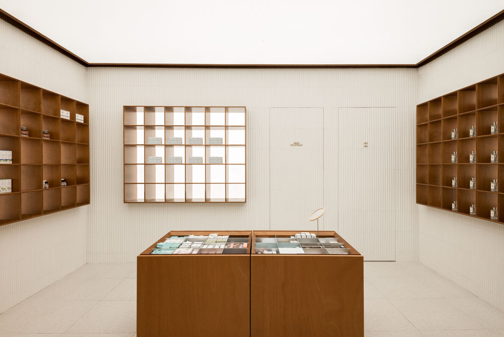
On the wall showcase, the colour of the exhibits is reflected on the metal surface through light, making the space visually richer. The central trial table is made of sandstone. The lifestyle area is the wall with light colour wood veneer combined with the dangling teak showcase, and the light colour wood veneer is with a more lively atmosphere, fitting the product categories displayed in the area. And because the wall tone is more carefully chosen, the space also feels brighter. Moreover, showcases are modular designs to adapt to the different display ways in the future. From the channel next to the lifestyle area, you can enter the Beautypower community, the core of the Steps business format, and this area will be a multi-function space in the future, which can be used as product release, beauty makeup class, broadcast room as well as product shooting. The wall of the area is collages of the white glazed tile, backlit wooden showcase embedded in the wall, and four movable sample display stands are placed in the centre of the space, which is also modular design to accommodate different sizes of products. When a press conference or a beauty makeup class is needed, the central exhibition booth will be withdrawn and placed in the storage space.
Say hopes that retail brands, due to increasing market competitive pressure, are screaming to attract more customer attention. In Steps, we want to keep the classic and elegant traditional shopping experience in this modern but meaningless retail industry. Say hopes that the customers can feel that Steps are not relying on social media exposure, whose existence emphasises a lifestyle where you can enjoy space without taking photos and posting online. Shopping is a comfortable and relaxed experience, and retail brand-like steps can be associated with customers like friends. This kind of smooth, comfortable, and slow shopping experience is not only retained in luxury brands. The mass-market brands can also bring us back to the original elegant shopping experience.
▼项目更多图片


