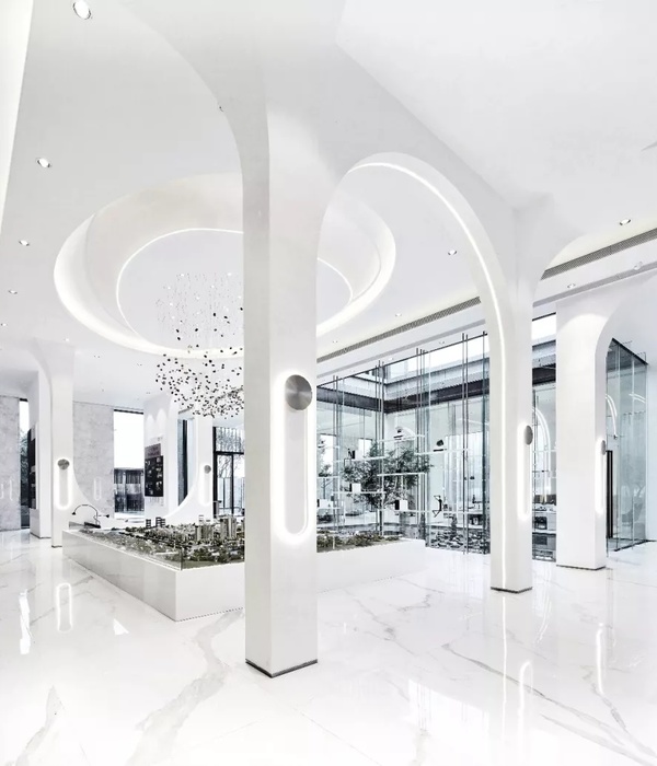
重庆 MISS VINTAGE 奢侈品店 | 优雅与精致的时尚秀场
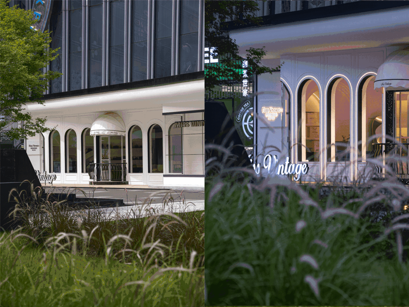
“一个女孩应该拥有两样:她自己和她想成就的。” “A girl should be two things:who and what she wants.“ MISS VINTAGE奢侈品集合店坐落于重庆金科悦FUN正街,毗邻光环购物中心,源源不断的人流经过门前。在当下对审美、品质和消费体验过程有极高要求的前提下,我们打造的不仅仅是契合主题;如何让空间点亮来者的探寻之旅,感受到空间气质和品味,收获如若至宝的爱物,便是我们揣摩的核心路径。 The MISS VINTAGE luxury collection store is located in Chongqing Jinkeyue FUN Main Street, adjacent to the Halo Shopping Center, with a steady stream of people passing by the door. Under the premise that there are extremely high requirements for aesthetics, quality and consumption experience process, what we create is not only to fit the theme; how to make the space light up the exploration journey of visitors and harvest the treasures of love is ours Figure out the core path.
Miss Vintage奢侈品集合店致力于做更有品质的奢侈品平台,货品分为品牌直采、个人寄卖、个人回收三大板块。品牌创始人张展先生于英国留学期间与行业结缘,怀抱对奢侈品的热爱,自08年起至今从事奢侈品行业15年,行业内少有的高学历从业者。
Miss Vintage Luxury is committed to being a more high-quality luxury platform. The products are divided into three major sections: brand direct purchase, personal consignment, and personal recycling. The founder of the brand, Mr. Zhang Zhan, became acquainted with the industry during his studies in the UK and embraced his love for luxury goods. He has been engaged in the luxury goods industry for 15 years since 2008, and is a rare highly educated practitioner in the industry.
Miss Vintage的产品包括:包包,手表,首饰,配饰,服装,鞋靴;品牌涵盖:Louis Vuitton、Dior、Chanel、Gucci、PRADA、Hermès、Valentino、Burberry、Celine、YSL、Cartier、Tiffany、Bvlgari、VCA、Patek Philippe、Audemars Piguet、Piaget、Jaeger-Le Coultre、Vacheron Constantin等涵盖市面所有奢侈品类。
Miss Vintages products include: bags, watches, jewelry, accessories, clothing, shoes and boots; brands include: Louis Vuitton, Dior, Chanel, Gucci, PRADA, Hermès, Valentino, Burberry, Celine, YSL, Cartier, Tiffany, Bvlgari, VCA, Patek Philippe, Audemars Piguet, Piaget, Jaeger-Le Coultre, Vacheron Constantin, etc., cover all luxury goods on the market.
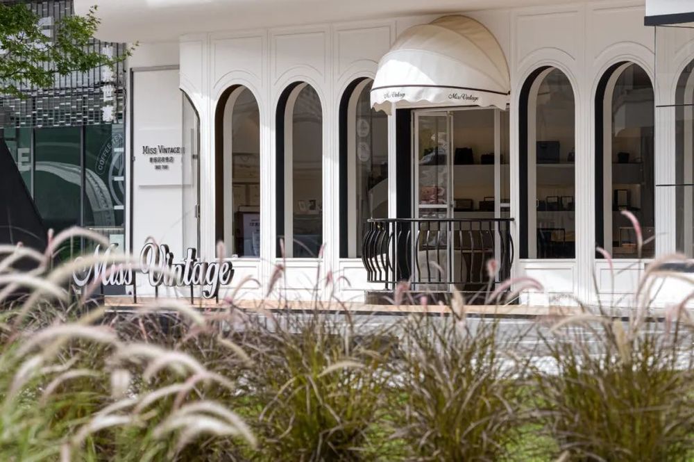
品牌方找到我们的时候,希望能区别现在多数中古店的杂货铺陈列方式,打造一个纯粹且干净的空间,借此凸显产品的多样化,所以我们聚焦Miss Vintage的品牌定位,塑造自由、优雅、与众不同的时尚风格。正如Gabrielle Bonheur Chanel所言,时尚会过去,但风格永存,简洁是真正优雅的基调,我们希望它像一个优雅精致的女性秀场,每一件奢侈品都能被完美的展示,每一位进来的顾客都能感受到空间气质和品味,打破既定的中古店概念,用经典的方式引发一场精致与优雅的相遇。
When the brand found us, they hoped to be able to distinguish the way of grocery store display in most old-fashioned stores, to create a pure and clean space, thereby highlighting the diversification of products, so we focused on the brand positioning of Miss Vintage, creating a free, elegant, Distinctive fashion style. As Gabrielle Bonheur Chanel said, fashion will pass, but style will last forever. Simplicity is the keynote of true elegance. We want it to be like an elegant and refined womens show, where every luxury item can be perfectly displayed, and every one who comes in All customers can feel the temperament and taste of the space, breaking the established concept of medieval stores and triggering a delicate and elegant encounter in a classic way.

我们以“秀场SHOW”为概念,以“潮汐”为设计载体,流动曲线,朦胧意境,优雅氛围,将售卖场以秀场形式来贯穿,表达女性柔软的轮廓与独立自信的内心。
We take Show Show as the concept and tidal as the design carrier, with flowing curves, hazy artistic conception, and elegant atmosphere, and run through the sales floor in the form of a show, expressing womens soft silhouette and independent and confident heart.
商业设计应服务于商业,应该带有很强的目的性,甚至设计的本质就是创造商业的价值以及某种更贴近人们现实生活空间水平的提升与完善,,当MISS VINTAGE建立的态度是经典的、恒久的,一种更自信的态度,也就建立了品牌的定位和受众群体,消费者会被这种气息所吸引,从而感受这个空间的态度,设计师建立的态度不是所谓潮流的设计形式,而是经典和优雅之间的链接,是过去与未来的对话。
Commercial design should serve business and should have a strong purpose. Even the essence of design is to create business value and to improve and improve the level of space that is closer to peoples real life. When MISS VINTAGE establishes a classic attitude , permanent, a more confident attitude, which also establishes the brands positioning and audience, consumers will be attracted by this atmosphere, and thus feel the attitude of this space, the attitude established by the designer is not the so-called trendy design form , but a link between classic and elegant, a dialogue between the past and the future.
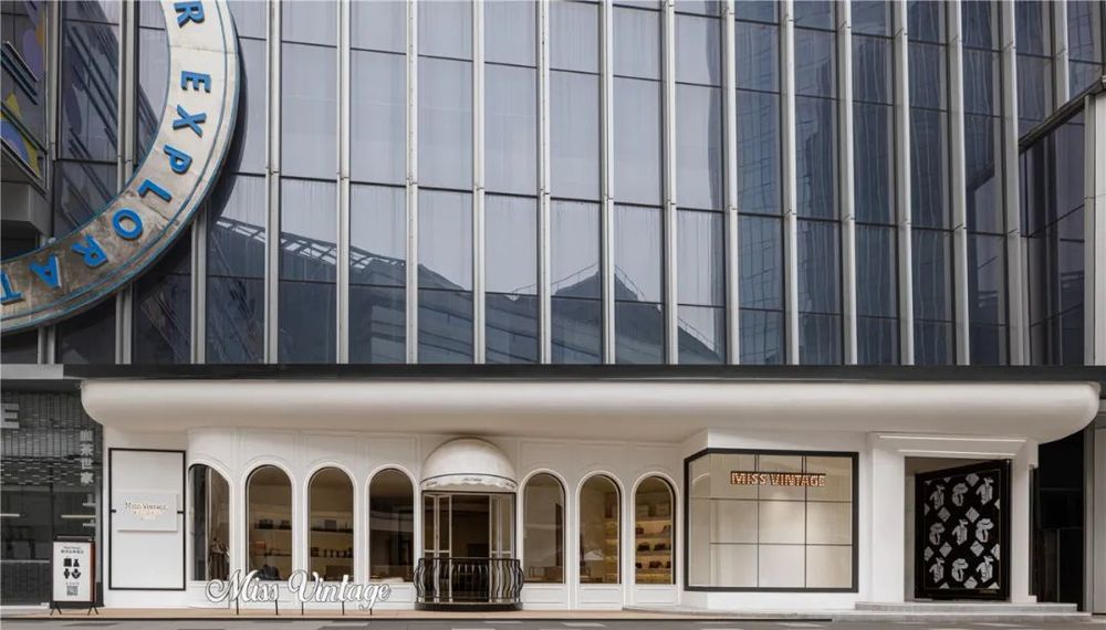
因拥有方正大气的外立面且门口没有遮挡物,行人从遥远处即可直视项目立面。特殊的地理位置,形成最佳的观赏与互动的空间关系。
Due to the square and atmospheric facade and no obstructions at the entrance, pedestrians can directly see the project facade from a distance. The special geographical location forms the best spatial relationship between viewing and interaction.
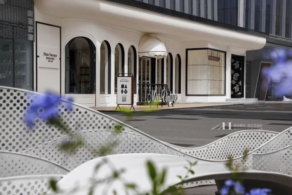
整个外立面的设计重点只有一个,一秒内抓住所有行人的注意力。设计师将原本封闭硬朗的玻璃幕墙外立面设计全部拆除,以纯粹直接的黑色线条及纯净柔美的曲面构筑组建出雕塑般的空间外观,建筑的简洁性、构造的清晰度和材质的纯粹感成为空间新的美学载体。
The entire façade is designed with only one focus, grabbing the attention of all pedestrians within a second. The designer demolished the original closed and tough glass curtain wall façade design, and constructed a sculptural space appearance with pure and direct black lines and pure and soft curved surfaces. The simplicity of the building, the clarity of the structure and the purity of the material Become a new aesthetic carrier of space.
夜幕降临,其理性的线条感和柔软的灯光形成对比穿透玻璃幕墙,将触及每一个路过的行人,融入街区与城市,建筑与产品,从来自洽,所见即所得中是熟悉而赤诚的感觉。
When night falls, the contrast between its rational lines and soft lighting penetrates through the glass curtain wall, touching every pedestrian passing by, integrating into the neighborhood and city, architecture and products, from self-consultation, WYSIWYG is familiar and sincere Feel.
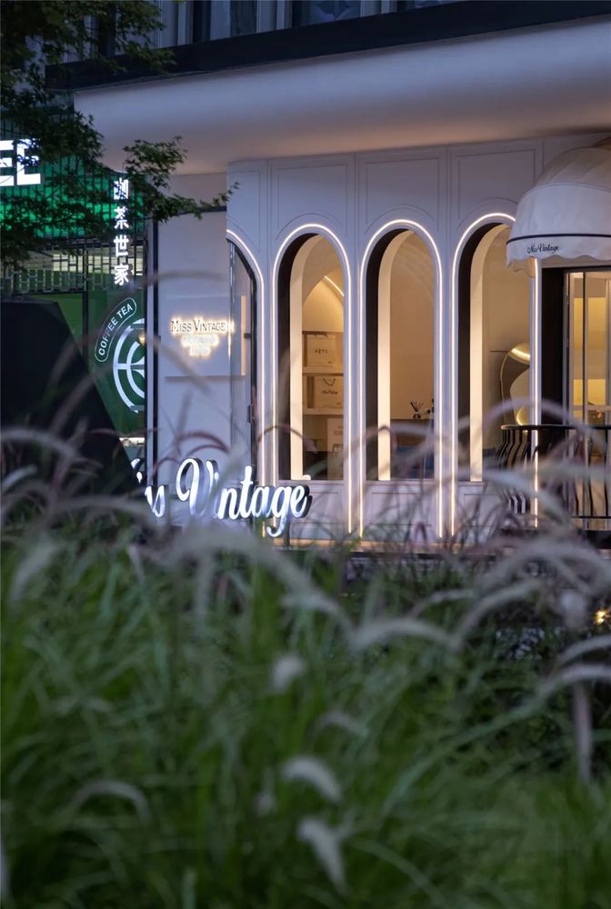
设计师巧妙的以一扇可替换广告内容的超幅玻璃旋转门作为大门,蜿蜒的入口,既为序曲也可为终章,开放而又神秘,空间仿佛成为一个能量场,节奏与秩序合体释放出建筑的原生力量。隐去了设计手法主观性的痕迹,循序中寻求变化,在保持着极简的同时感受纯粹与经典的魅力。
The designer cleverly uses an oversized glass revolving door that can replace the advertising content as the gate. The winding entrance is both a prelude and a final chapter. It is open and mysterious. The space seems to be an energy field, where rhythm and order are combined. Unleash the raw power of architecture. It hides the traces of the subjectivity of design methods, seeks changes in sequence, and feels the charm of pure and classic while maintaining minimalism.
产品零售区域设计师从潮汐中拾取其自然形态,用黑色亮光砖和米白色压光砖拼接出如流动的地面,充满律动感和时间性的形式,使每一个弯折都生成了自然的方向感,引导着访客的视线,延伸室内视觉空间,又仿佛秀场的T台一般,让顾客行走在时尚之间。顶面的蝴蝶水晶吊灯停留在蜿蜒的吊顶尽头,富有精致而灵性。
The designer of the product retail area picks up its natural form from the tide, splicing black bright bricks and off-white calendered bricks to create a flowing ground, full of rhythm and temporal form, so that every bend generates a natural direction The sense of sight guides the visitors sight, extends the indoor visual space, and is like the T-stage of the show, allowing customers to walk between fashions. The butterfly crystal chandelier on the top stays at the end of the winding ceiling, which is exquisite and spiritual.
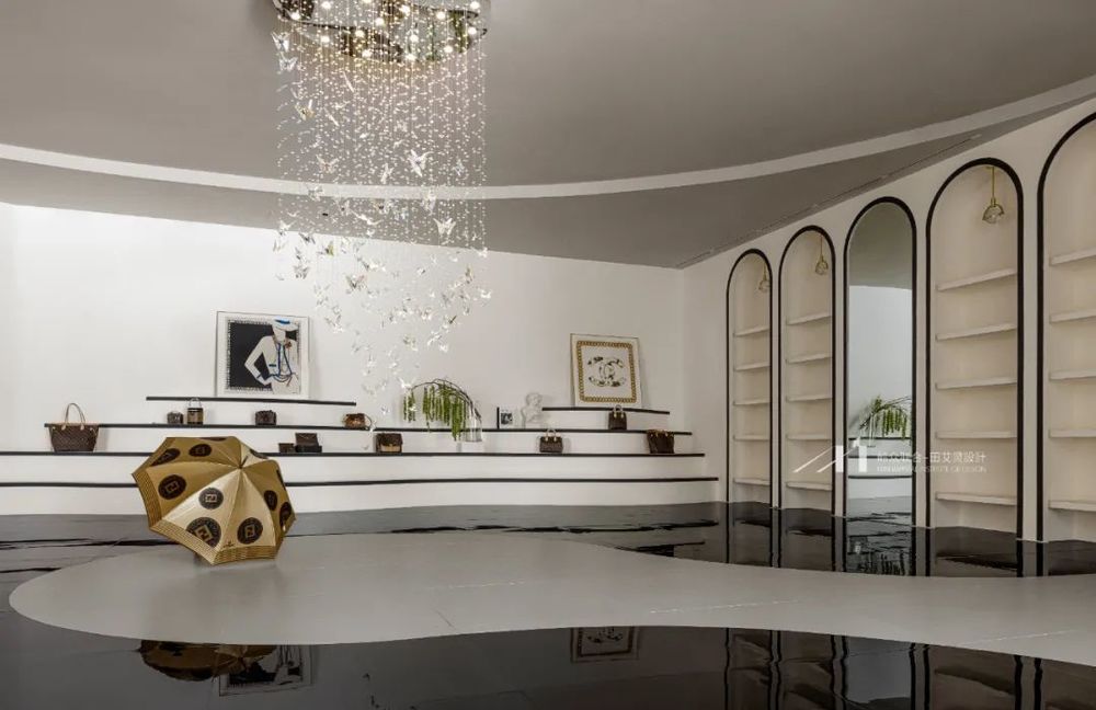
纯粹、直接、经典的建筑手法再筑空间形态,整体大面积白色处理,将建筑框裱出来。室内主要提取优雅自由的弧形和硬朗经典的黑色线条元素,在高下相顷,长短相形中,完成功能的划分,消解了场景的孤寂。灵动的陈设和多元的布局使陈列区、洽谈区等各空间静默存在又彼此串联相依。
Pure, direct and classic architectural techniques recreate the space form, and the overall large area of white treatment frames the overall building. The interior mainly extracts elegant and free arcs and tough and classic black line elements. In the contrast between high and low, the division of functions is completed and the loneliness of the scene is eliminated. Smart furnishings and diverse layouts make the exhibition area, negotiation area and other spaces exist silently and are connected in series with each other.
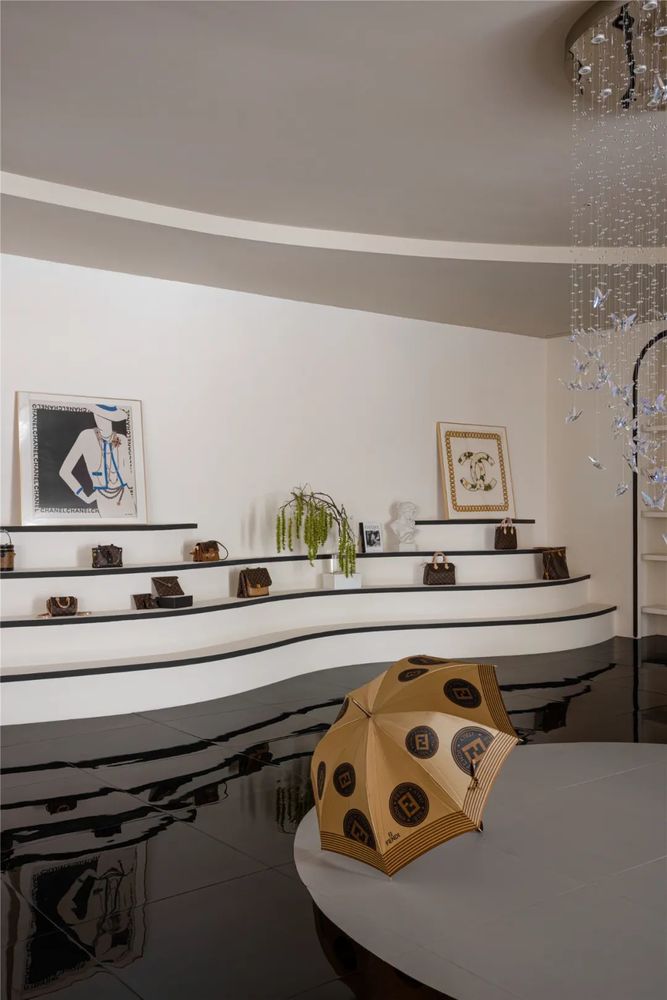
独树一帜的阶梯状陈列台,致敬了Chanel经典的秀场布局,经典的黑色线条勾勒出轻柔蜿蜒的边际线,层层叠加的优雅流线代表着水纹的形态,形成灵活的阶梯式座位,展示着空间的自由感与开放性。
The unique stepped display stand pays homage to Chanels classic show layout. The classic black lines outline a soft and sinuous edge, and the layers of elegant streamlines represent the shape of water patterns, forming flexible stepped seats. It shows the sense of freedom and openness of the space.
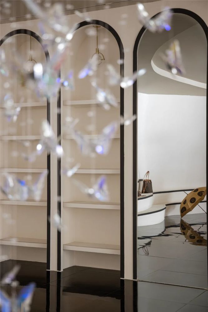
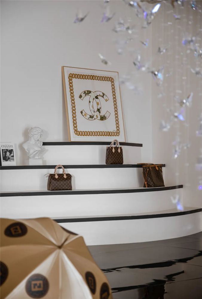
克制后的松脱,在动态与静态陈列中取得平衡。明与暗并不是非此即彼。一个好的商业空间作为商业的链接,生长形式必须与客群进行交流,空间的自然生长,人与空间的共鸣,由观者去完成叙事。
The release after restraint strikes a balance between dynamic and static display. Light and dark are not either. A good commercial space is the link of business, the growth form must communicate with the customer group, the natural growth of the space, the resonance between people and the space, and the viewers complete the narrative.
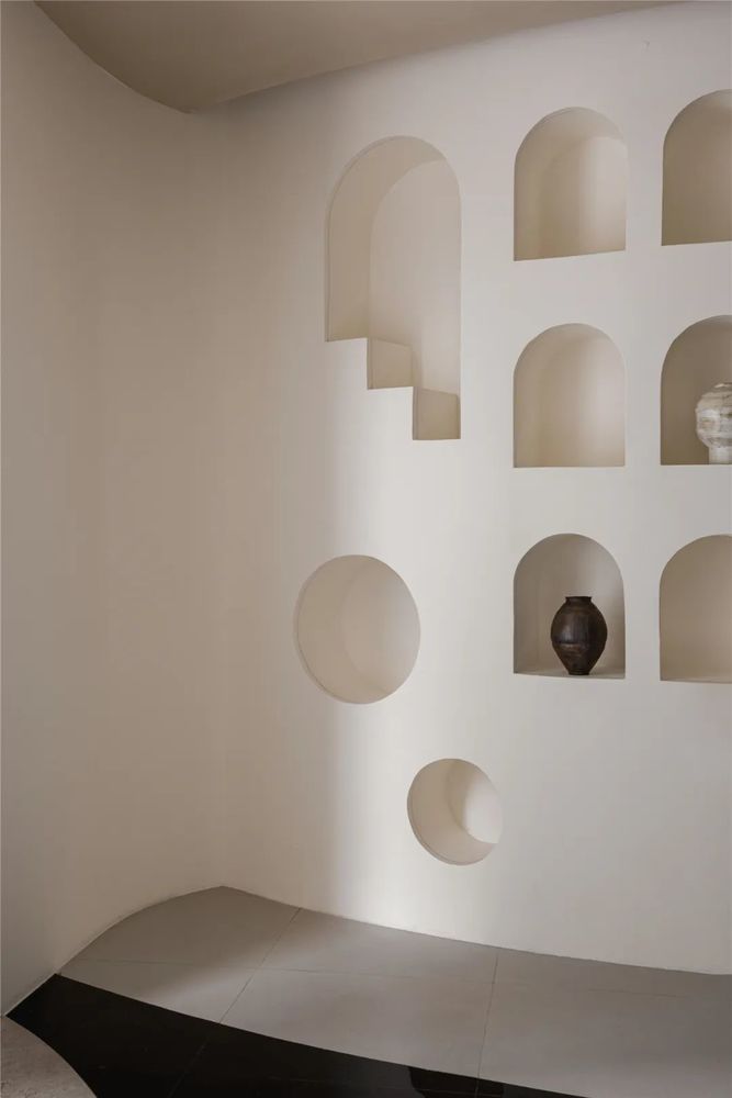
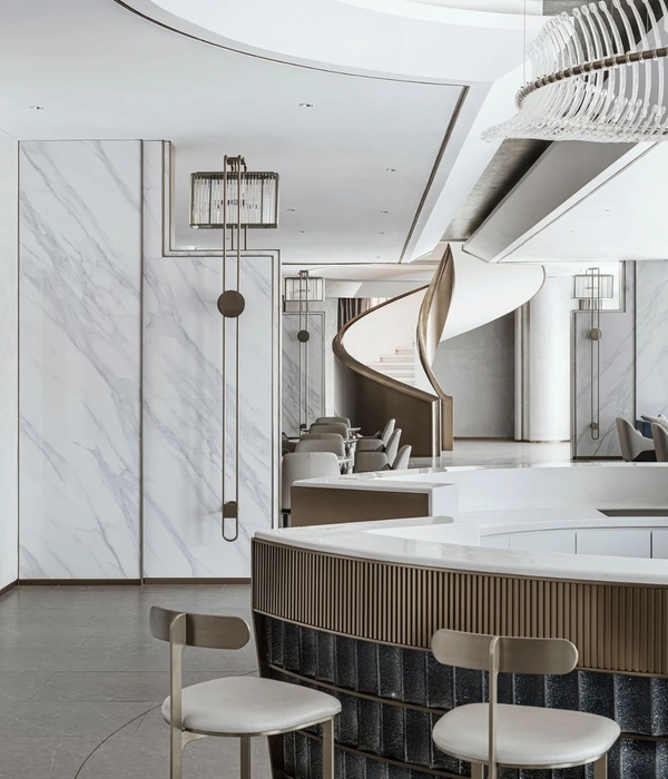
空间的中心位置我们放置一个圆形陈列墙,顺势而为的各种造型壁龛,是延展的又是向心的,完整的又足够灵活,蜿蜒曲面建筑曲面时而管弦齐奏,热烈激昂仿佛巨浪即将翻卷至云端。
In the center of the space, we place a circular display wall, and various niches that follow the trend are both extended and centripetal, complete and flexible enough. The waves are about to roll into the clouds.
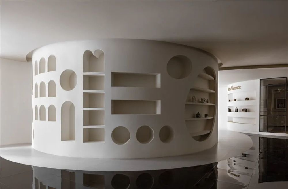
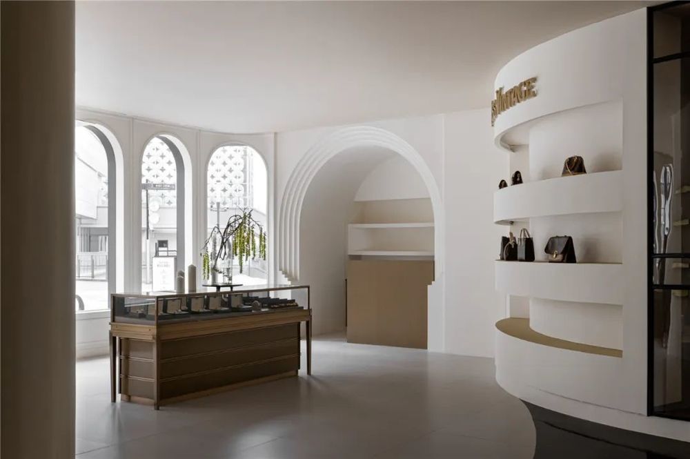
设计师对材料的精挑细选也决定了空间的造型和布局,柔软的灰白色墙面和浅褐色的顶面打造出融合而有层次大空间,复古的暗金色穿插彰显低调的品质。
The designers careful selection of materials also determines the shape and layout of the space. The soft gray-white walls and the light brown top surface create a large space that is integrated and layered, and the retro dark gold is interspersed to show the low-key quality.
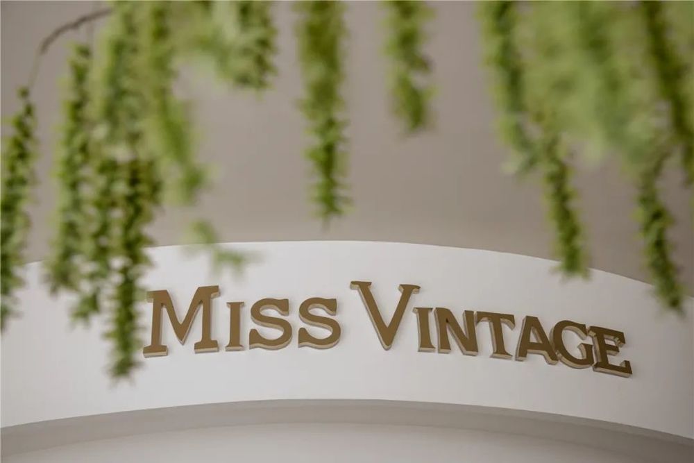
品牌与空间的融合我们希望谁都不会喧宾夺主,因此空间侵略性的退让,构造一种生活场景,展陈方式可聚可散,自由组合。同时设计师有着超越潮流之外的感性认知,在感性与理性、内在与外在之间,在建筑中形成独特的生存状态。
The integration of brand and space We hope that no one will overwhelm the guest, so the space is aggressively retreated to construct a life scene, and the display methods can be gathered or scattered, and combined freely. At the same time, designers have perceptual cognition beyond the trend, between perceptual and rational, inner and outer, forming a unique living state in architecture.
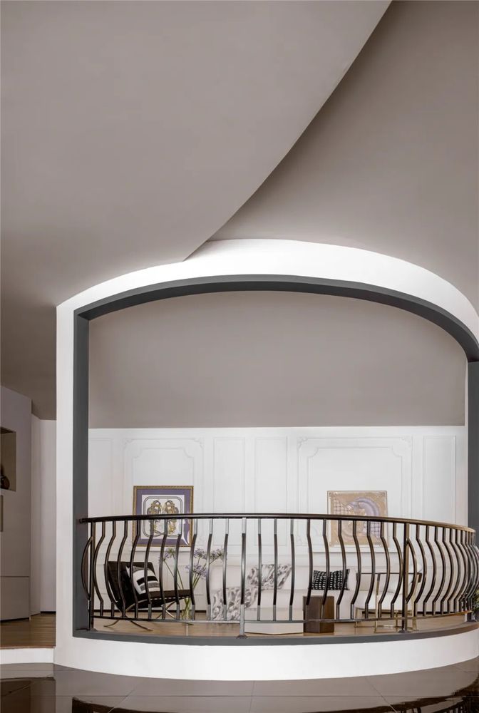
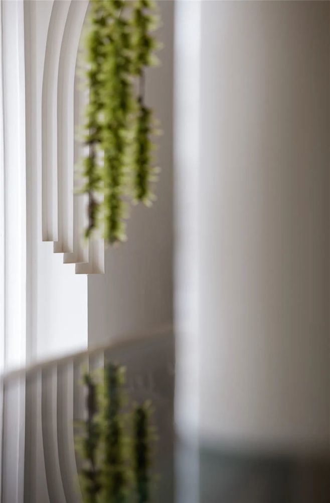
在空间的最内侧,设计师根据位置特点设计了更有趣的VIP座位区,地面抬高一步做了功能分割的同时又不影响时间的视野,以经典的法式栏杆增添品牌忠实客户的空间的独特精致感。
In the innermost part of the space, the designer designed a more interesting VIP seating area according to the location characteristics. The ground is raised one step to divide the functions without affecting the vision of time. The classic French railings add the uniqueness of the space to the brands loyal customers. Sophistication.
物体本身存在的价值就是多样性的,可以通过某一种物质中的材质,或是某一种物体构造去模糊空间和另一个界面的关系,空间也就存在了更大的价值变化。空间与品牌产生对话,建立一个态度,向市场发出一个声音,追求一种经典的美。
The value of the existence of the object itself is diverse, and the relationship between space and another interface can be blurred through the material in a certain substance or the structure of a certain object, and there will be greater changes in the value of space. The space has a dialogue with the brand, establishes an attitude, sends out a voice to the market, and pursues a classic beauty.


Information
项目名称:Miss Vintage 奢侈品集合店
Project Name: Miss Vintage Luxury Collection Store
设计机构:岭众联合-田艾灵设计
Design Company:Elin Imperial Institute of Design
全案空间主理设计师:刘佳佳
Chief Design:Liujiajia
Soft decoration : Luoyiyue
软陈配饰产品:桓墅空间艺术设计机构
Soft accessories:Hertrue art design
领衔人/艺术总监田艾灵女士1999年从四川美术学院毕业、进修于米兰理工大学设计与战略管理硕士等。2002年创立了十二分空间设计;2020年裂变创立了软装品牌桓墅空间艺术设计机构;2022年在足够的作品沉淀力和全系统落地执行力的基础上,厚积薄发创立专注于更专业、更系统领域、面向全国高阶空间设计需求的品牌“岭众联合-田艾灵设计。”
