The Dutch Financial tech firm Bridgevest have relocated their offices from the centre of Rotterdam to Veerhaven, in South Holland. They brought in the interior design company, Studio Tomorrow to transform this former bank, built in the 1890’s, into a stunning new office space.
The real beauty of this fitout is not simply the way Studio Tomorrow have kept the sublime, original, architectural details, but how they’ve incorporated contemporary elements with such an sympathetic application. The design shows not just an aesthetic appreciation of the past, but a strong connection to the future.
“We dig in the past, gather today, and draw conclusions towards the future. Besides having an eye for aesthetics and beauty, dignity lies in the manner we treat our materials with respect,” said the designers.
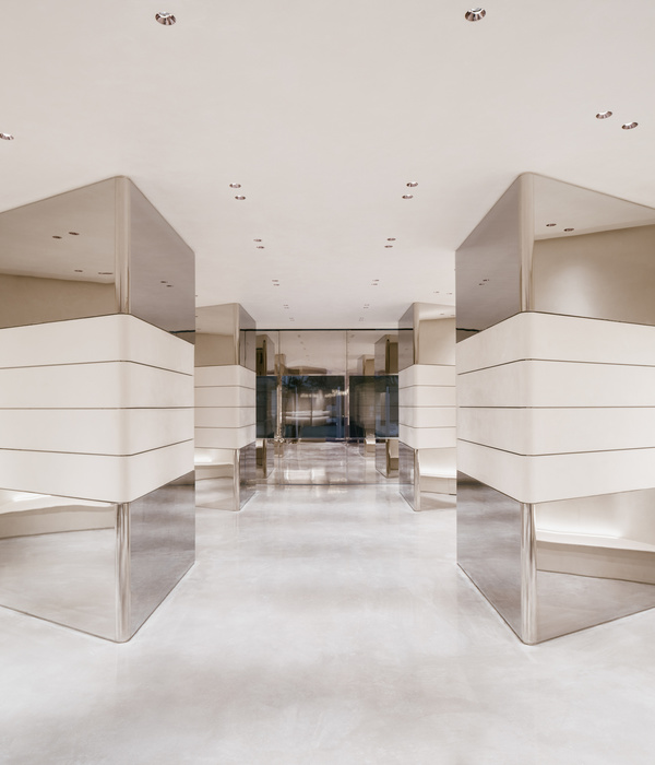
How have they done it? It’s all about balance by keeping the original elements and giving them space to breathe whilst incorporating moments that are clear statements of contemporary design. Take the lighting for starters. The super fine LED lighting from Vibia is simply exquisite. No question it ranks as one of the starring elements here. Its delicate and clean lines, the perfect articulation of thin black lines, contrast so beautifully with the original, ornate, oversized skirting and cornices. For the lighting to be one of the heroes of this space means the rest of the space has been designed so precisely, so simply and elegantly, that the lighting has the capacity to take centre stage.
But it’s not just the beautiful pendants that make this building so aesthetically enthralling. The colour palette is inspiring. From the soft salmon that juxtaposes divinely with the crisp, white painted fenestration, to the pale greens in the offices, to the powder blue concrete flooring, it’s all just so beautifully orchestrated. Pastel is a hard colourway to pull off without a space feeling overtly feminine and soft, but here it allows the original architecture to sing. There’s nothing flouncy or dandy about these pastels. Instead it reads as understated elegance.
“To come to a good design we give space to serendipity and letting intuition decide which way to go on one hand,” the designers said.
The space feels open and light. There’s no sense of stuffing in as many people in as you can, like an overcrowded lift. Offices are roomy and open, workstation areas too have the same feeling of luxe found elsewhere in the fitout.
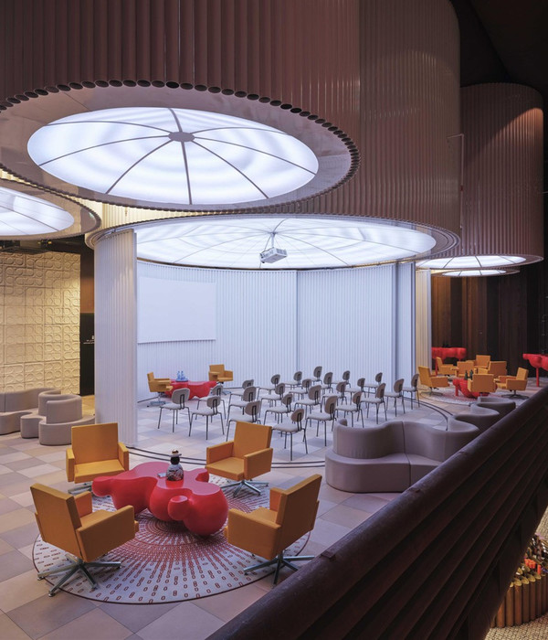
And then there’s the fun elements like the custom-designed 100 square metres of wall carpet. Ostensibly for acoustic properties it’s became somewhat of an artistic feature, linking the different floors to the building, with it’s different textures and patters changing over the various levels.
“Because of our experience in the carpet industry, we’re well known with all textile related production processes. We’re fascinated by the idea what well designed textiles can do for an interior and their users. They provide tactility, comfort and acoustic values. But more important, we use our textiles to emphasise the identity of a space. They reflect the soul of an interior and its users,” said the designers.
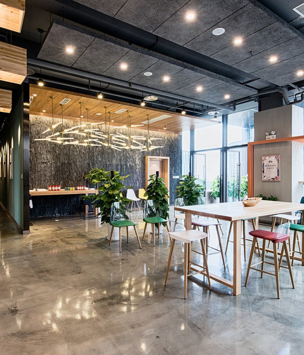
Studio Tomorrow have married contemporary furniture into the space with delightful precision. The fine, steel based stools used in the breakout areas compliment the wire lighting suspended above. Yes there’s the more traditional black, swivel task chairs in the open work areas, but there’s an element of theatre about the way they’ve fitted out the offices. One is reminded somewhat of a 1950’s banking office with the minimalist desk and leather work chair. The addition of the pale pink covered chaise in the starkly minimalist room has a 1940’s psychotherapists office feel to it. It’s fun and bold! But moreover it challenges our thoughts about what offices can look like for us today.
“Our designs are well balanced and outspoken at the same time. They have courage and a slight bold character, but never loose their eye for detail. And as aesthetic as our interiors can be, we’re always searching for slight unbalance,” commented the design team.
It is hard to know which individual element makes this project so delightful. No doubt, as Aristotle quoted, “The whole is greater than the sum of its parts.” And there’s a whole lot to love about this space collectively. Not to mention all the individual parts that, whilst out on their own might not say much, all put together, are pretty smashing.
[Images courtesy of Studio Tomorrow. Photography by Studio Moost.]
{{item.text_origin}}

