▲点击蓝字“知行 Design 中华优秀作品第一发布平台!
锐度设计|| 苏宁雲著·空港营销中心
锐度设计
△营销中心建筑夜景
#形式
探寻城市底色
西安,古称长安,是十三朝古都积淀而成的人文艺术高地,也是历经时代变革,打破城墙围合的国际化都市。文化自信、新旧共存、多元兼容的城市气质,成为锐度走向目标客群、唤起共鸣的路引。锐度从城市与人文角度出发,将本案定位于一个城市展示界面和文化休闲场所的两用空间。
Xi ’an, known as Chang ’an in ancient times, is a highland of humanities and arts accumulated from the ancient capital of 13 dynasties. It is also an international city that has gone through the changes of The Times and broken the walls of the city. Cultural confidence, coexistence of old and new, diverse compatible urban temperament, become sharpness toward the target customer group, evoke resonance of the road. From the perspective of city and humanity, Sharpness locates the case in a city display interface and cultural leisure space.
△营销中心建筑夜景
#形态
远见城市未来
项目位于西安空港新城,是西安国际化大都市未来拓展的重点区域,锐度和苏宁置业基于区域城市蓬勃发展的时代意志,赋予项目新的定义。设计从“东情西境”入手,同既定的建筑与景观产生对话,在“动”与“静”、“形”与“色”的和谐共融下,以体验至上的空间手法,塑造面向城市的未来场景。
The project is located in Airport New City of Xi ’an, which is a key area for the future expansion of Xi ’an international metropolis. Based on the will of The Times for the rapid development of regional cities, Raydu and Suning Real Estate give the project a new definition. The design starts with "the east and the west" and has a dialogue with the established architecture and landscape. Under the harmonious integration of "dynamic" and "static", "shape" and "color", the space technique of "experience first" is used to shape the future scene facing the city.
△空港新城总体城市设计图
丨营销中心丨
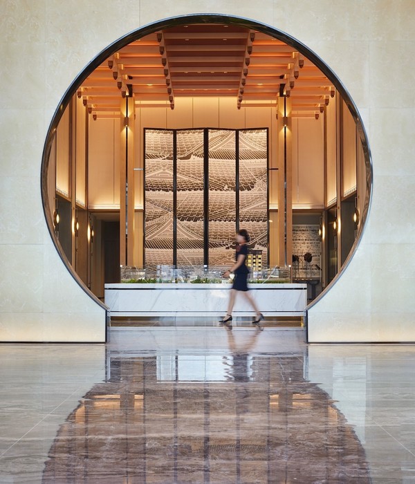
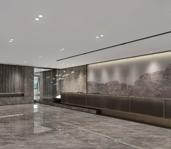
前厅删繁就简,以挑空渲染出大气格调,灰色的石材与金属的适配性分割,不仅打破背景墙面的呆板,也增加了细节表现。以舒展尺度格栅构建动线,将行人由前厅引入,开启未来之旅。
The front hall is simplified, to select the empty rendering atmosphere style, gray stone and metal partition, not only break the rigidity of the background wall, but also increase the performance of details. The moving line is constructed with the stretch scale grille, and the pedestrian is introduced by the front hall to start the journey of the future.
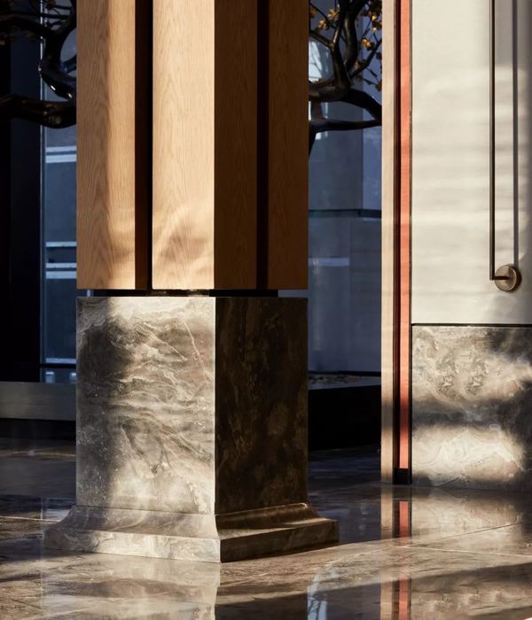
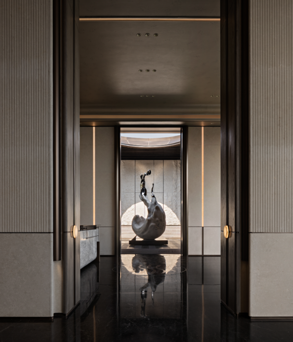
移步向内,随着格栅动线的牵引,导入几何线条,在金属和石材的体块分割下,营造潜移默化的序列感与纵深感。搭配线条感十足的灯饰,以简洁、干净回应现代人的理性与克制。
Step inward, with the traction of the moving line of the grille, the geometric lines are introduced, creating a subtle sense of sequence and depth under the division of metal and stone blocks. Tie-in line feeling dye-in lamp is acted the role of, with concise, clean response modern rationality and restraint.
光影以极强的序列感,奏响起空间的乐章。自然光线透过格栅自高处而下,墙面和地板仿佛瞬间消融,构建出通透与自然的空间感受。
Light and shadow play the movement of space with a strong sense of sequence. Natural light flows down through the grille, and the walls and floors seem to melt instantly, creating a transparent and natural space experience.
原木色系与空间的轻盈相结合,仿佛抹去了城市尖锐的棱角,让一切归于平静舒缓的状态。如同一件等待人们探索与观赏的艺术品,试图在历史与当代间,探寻人与空间的情感连接点。
Log color is combined with the lightsome of the space, as if to erase the sharp edges and corners of the city, let everything return to calm and slow state. Like a work of art waiting to be explored and appreciated, it tries to explore the emotional connection between people and space between history and contemporary.
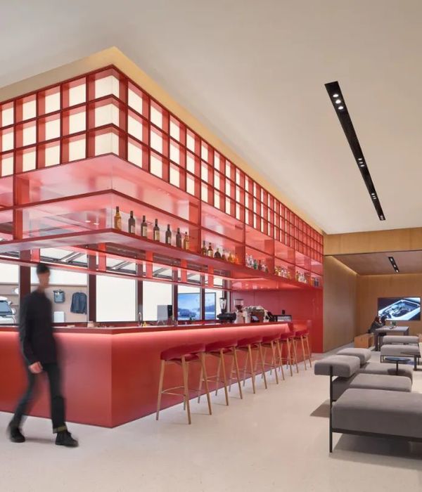
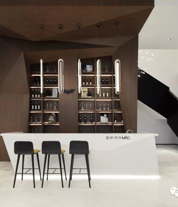
水吧区延续整体自由与从容的气度,以铁艺、金属、玻璃作为陈设,与温润的木色相得益彰,在多种元素的碰撞衔接中,营造出整个空间拙朴的氛围。
Water bar area continues the overall freedom and calm bearing, with iron, metal, glass as furnishings, and warm wood color complement each other, in the collision and cohesion of a variety of elements, to create a simple atmosphere of the whole space.
舒缓的环境在无形中勾勒人们的情绪,茶室同样以简约的笔触来铺陈,谦逊的色彩、自然的天光让这里看似静止,又充满温暖而舒适的变化。
The soothing environment draws the outline of people’s emotions indescribably. The teahouse is also presented with simple strokes. The humble colors and natural skylight make it seem static, but full of warm and comfortable changes.
点与线、圆与角,相互贯穿且相互碰撞,在色彩的激荡中不期而遇,儿童区家具和摆件尽显愉悦和童趣,天马行空却又不喧宾夺主,一切都是恰到好处。
Point and line, circle and Angle, perforate each other and collide with each other, encounter by chance in the agitation of color, children’s area furniture and ornaments show pleasure and tong qu, unimaginative but not overwhelming, everything is just right.
丨居住样板丨
#01
质感 现代
在整体风格设计上,以白灰为主色调,给空间以无穷想象,又在统一色调中做细节变化,强调空间不同立面的主次关系,更体现居住者的独特品味及优雅风范。
In the overall style design, the main color of white and gray, to give the space with infinite imagination, and in the unified tone to do details change, emphasize the primary and secondary relationship between different elevations of the space, but also reflect the unique taste and elegant style of residents.
#02
简约 轻盈
空间以米白为主色调,营造出一种优雅舒适的氛围,在极简色彩中用软装去构造饱满度,寻得视觉平衡,表达出家的归属感和满足内心的触动。
The space is mainly colored with rice white, creating an elegant and comfortable atmosphere. In the minimalist color, soft decoration is used to create fullness, find visual balance, express the sense of belonging of the monastic and meet the inner touch.
苏宁雲著·空港示范区作为苏宁置业在西安的焦点项目,锐度从历史中来,向未来走去,通过探索厚重古城文脉,感受城市布局中的现代“张力”,营造出历史与未来连结、城市与文化共生的空间之美,承载空港新城的骄傲与活力。
Su Ningyun as suning real estate in Xi ’an, the airport demonstration area, the focus of the project, sharpness came from history, headed for the future, by exploring the thick ancient city context, feel the modern "tension" in the layout of cities, create the history and future link, the beauty of the city and cultural symbiosis of space, carrying the pride of the airport new town and vitality.
项目名称:苏宁雲著·空港示范区
Project name: Suning Yunzhu airport Demonstration Area
项目地点:陕西·西安
Project location: Xi ’an, Shaanxi province
服务类别:营销中心&样板间
Service category: Marketing center & model room
项目面积:1350
Project area: 1350
竣工时间:2021 年
Completion date: 2021
硬装设计:锐度设计(西安分公司)
Hard decoration design: Sharpness Design (Xi ’an Branch)
软装设计:锐度设计(软装公司)
Soft decoration design: Sharpness Design (soft decoration company)
项目撰文:锐度品牌中心
Project: Sharpness Brand Center
项目摄影:西安一刻影像
Project photography: Xi ’an Moment Image
内容策划/Presented 策划 Producer:知行排版 Editor:Tan 校对 Proof:Tan 图片版权 Copyright:原作者知停而行
{{item.text_origin}}


