Hanjie Wanda Square, Wuhan, China, 2011-2013
Hanjie Wanda Square is a new luxury shopping plaza located in the Wuhan Central Culture Centre, one of the most important areas of Wuhan City. The multifunctional organisation of the master plan – which includes cultural and tourist facilities as well as commercial, office and residential components – acts as an attractor to the area for visitors, inhabitants and commuters alike. Following competitions with design entries from national and international architects, UNStudio’s overall design was selected by Wanda as the winning entry for the facade and interior of the Hanjie Wanda Square. Construction is currently underway and the Hanjie Wanda Square is expected to be completed in 2013. It will house international luxury brand stores, world-class boutiques, catering outlets and cinemas.
UNStudio’s design concept capitalises on the strategic location for the shopping plaza within the context of the master plan area. The concept of luxury is incorporated by means of ideas focussing on craftsmanship of noble, yet simple materials. Unstudio’s approach considers the Hanjie Wanda Square as a contemporary classic, combining both contemporary and traditional design elements in one concept.
Synergy of flows
As water was utilised as a main organisational principle in the design for the Wuhan Central Cultural Centre the theme ‘synergy of flows’ is used as a starting point for the organisation of the buildings.
For the design of the Hanjie Wanda Square this entails guiding attention and visitor flows from the main routes towards the facades and entrances of the building. From the three main entrances visitor flows are guided to two interior atria.
The concept of synergy of flows is key to all of the design components; the fluid articulation of the building envelope, the programming of the dynamic façade lighting and its content design, the pattern and space articulation of the public landscape surrounding the building and the interior pattern language which guides customers from the central atria to the upper levels and throughout the building via linking corridors.
Interior concept
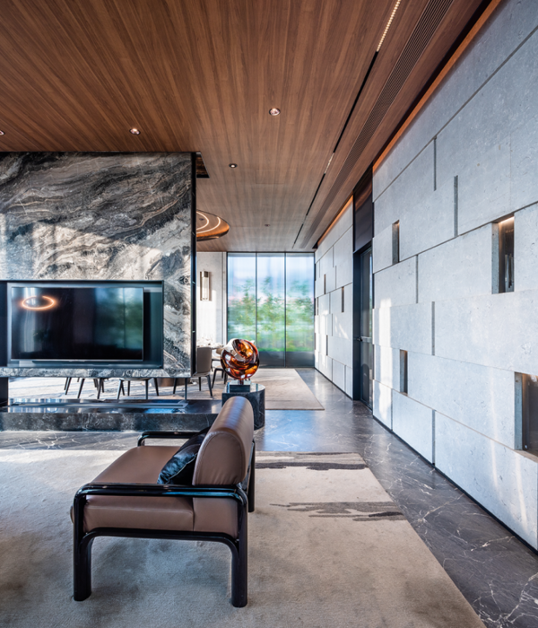
The interior concept is developed around the North and South atria, creating two different, yet integrated atmospheres. The atria become the centre of the dynamic duality of the two Hanjie Wanda Square identities: Contemporary and Traditional. Variations in geometry, materials and details define these differing characters. With two main entrances, the North atrium is recognised as a main venue hall, and the South atrium as a more intimate venue hall. The North atrium is characterized by warm golden and bronze materials reflecting a cultural, traditional identity. In the South atrium Silver and grey nuances with reflective textures reflect the city identity and its urban rhythm. Both atria are crowned by skylights with a funnel structure which connect the roof and the ground floor, in addition to integrating the panorama lifts. While the atria have strong and distinct identities, the corridors act as connectors between the two yet maintain their own character.
Façade design
The façade design focuses on achieving a dynamic effect reflecting the handcrafted combination of two materials: polished stainless steel and Alabaster. These two materials are crafted into nine differently shaped, but standardized spheres. Their specific positions in relation to each other recreate the effect of movement and reflection in water, or the sensuous folds of silk fabric.
The geometry ranges from full stainless steel spheres to a sequence of differently trimmed spheres with Alabaster inlay. The spheres have a diameter of 600 or 500mm and are mounted at various distances on 900 x 900mm brushed aluminium panels, which can be preassembled and mounted on site.
The architectural lighting is integrated into the building envelope’s 42.995 modules. Within each sphere either one or two LED-fixtures emit light onto the alabaster to generate glowing circular spots whilst simultaneously creating diffuse illumination on the back panel. Various possibilities to combine and control these lights will allow diverse media lighting effects and programming of lighting sequences related to the use and activation of the Hanjie Wanda Square.
中国武汉,2011-2013
汉街万达广场是将国际奢侈品卖场,世界一流精品店,餐饮店和影院集为一体的豪华购物广场。UNStudio设计的万达广场作是结合现代和传统的设计元素的当代经典之作。所有的设计部件:连贯的围护结构,动态外立面照明及其内容,建筑周围的景观和空间的规划,以及内部从中庭到楼上和所有走廊上的指示标语都体现了协同和流动的理念。内部的设计理念是围绕南北正厅,创造两个截然不同,但却浑然一体的氛围。几何形状,材料和细节的变化体现了这些不同的符号。北中庭以温暖的金色和青铜材料为主,体现了文化和传统的气息。南中庭在一些细微之处采用带有反光效果的银色和灰色材料,体现了都市的形象和节奏。两个中庭都配备了全景升降机,中庭漏斗形的天窗将顶部和地面连在了一起。外立面设计侧重于实现动态效果,运用了抛光不锈钢和雪花石这两种材料的手工组合。这两种材料被制成9种不同的标准球体。它们之间特定的位置能创造出运动的效果和水中的反射,或如真丝面料般的褶皱。
客户:武汉万达东湖置业有限公司
地点:中国武汉
建筑面积:外立面29,920平方米
内部:22,630平方米
项目:豪华购物中心
UNStudio的工作范围:外立面及室内设计
状态:建设中
Client:
武汉万达东湖置业有限公司
Wuhan Wanda East Lake Real State Co., Ltd
Location: Wuhan, China
Building surface: Facade 29.920 sqm
Interior: 22.630 sqm
Programme: Luxury shopping mall
Contribution UNStudio: Facade and interior design
Status: Under construction
Credits UNStudioCompetition
Ben van Berkel, Caroline Bos, Astrid Piber withLuis Etchegorry, Ger Gijzen and Ariane Stracke, Cynthia Markhoff, Veronica Baraldi, Mo Ching Ying Lai, Iris Pastor, Elisabeth Brauner, Jinming Feng, Tomas Mokry, Florian Licht, Patrick Noome, Ali Astgar Schematic Design / Design Development Ben van Berkel, Caroline Bos, Astrid Piber, with Ger Gijzen and Ariane Stracke, Veronica Baraldi, Mo Ching, Ying Lai, Konstantinos Chrysos, Rodrigo Cañizares, Chiara Marchionni, Thomas van Bekhoven, Albert Gnodde , Ka Shin Liu, Michael Wafelbakker, Patrick Noome, Jinming Feng, Cheng Gong, Shuang Zhang, Xinyue Guo Advisors
Structure, facade: Arup
Landscape design: Loos van Vliet
{{item.text_origin}}

