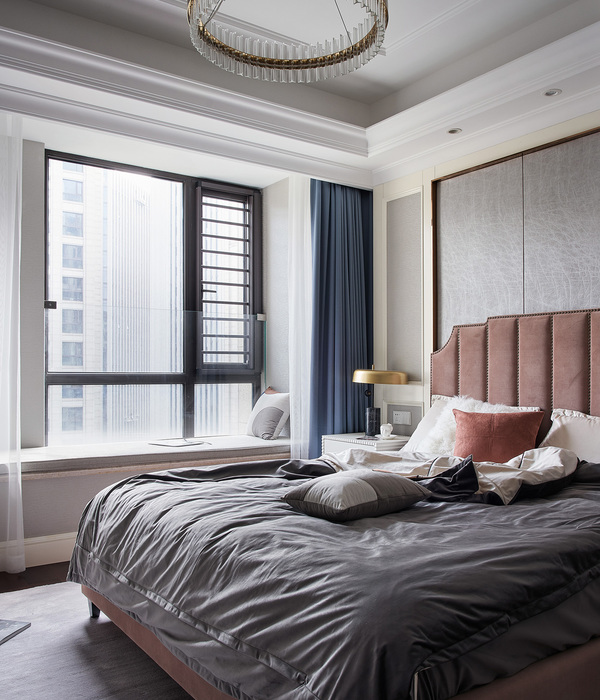
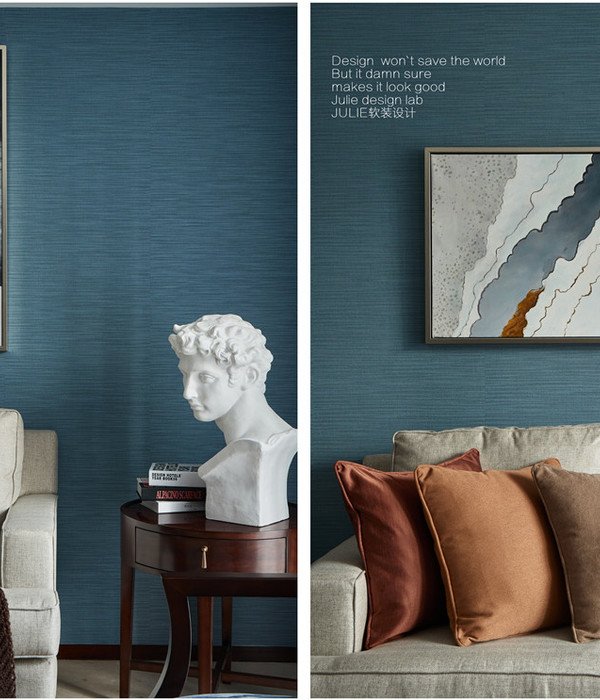
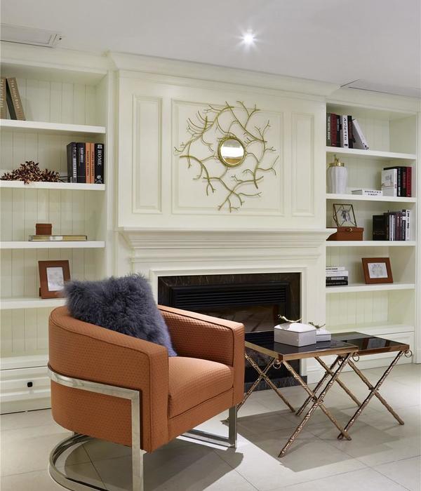
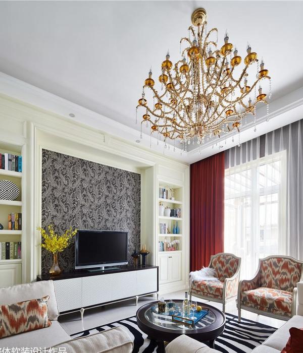
Right from scratch, architect Natalia Belugina devised an apartment in residential complex "Garden Quarters" as a showcase of modern art.
Architect Maya Kandelaki and manager Alexey Mironov contributed to the implementation of the project.
Initially, the three-room apartment was for sale. The design project has targeted specific audience of buyers, i.e. young people keen on concise albeit fancy interior. It is a blend of simple lines, and a love of vast, open space coupled with a love of modern art. Once she was through with the project, it appeared to be so "dear" that prompted her not to let it go.
There are places of power that charge us. When the author of the project first visited the construction site it was all about bare concrete walls and nothing else. However, Natalia realized right away that she would design there a sort of light, airy, even "marine" interior. Right from the start, she got an insight that it will hold contemporary artifacts.
It was easy to proceed with the project. Even though residential complex "Garden Quarters" offers plenty of design options, Natalia had luck with what she has got: it was an open space apartment with rectangular walls and only one structural column. Area: 110 sqm Gorgeous wood windows facing two sides allow plenty of light inside, thus making the interior more spacious.
The architect ditched the idea of partitioning the apartment into a number of small rooms; she absolutely ruled out any wardrobes, having opted for built-in coat closets — all in order to avoid stiffness and maximize open space The color range is of course black and white, which has become a hallmark of design solutions by Natalia Belugina.
She had hard time selecting art objects. Designing the wall above the sofa in the living room was particularly formidable task, because this part of interior would be crucial for the entire interior.
Other rooms, bedroom, and office were filled with artifacts, becoming inspired and integral. In the meantime, the wall in the living room remained bare.
And just a day before the final shooting, artist Kirill Basalaev sent his painting: it washuge, textured, "scratched" and incredibly attractive. As soon as we put it against the wall, it became obvious to us: it was ideal centerpiece of the interior.
And the day before we discovered some works of sculptor Sergei Sobolev. A chaise lounge, which is in the living room and reminiscent by its shape of a nautical theme seemed so lonely in this strict, architectural, straightforward living room, but when we put in front of it Sergey's "Sprout" sculpture — the jigsaw puzzle became complete.
Year 2019
Work started in 2018
Work finished in 2019
Status Completed works
Type Apartments / Single-family residence / Multi-family residence / Social Housing / Country houses/cottages / Tower blocks/Skyscrapers / Student Halls of residence / Modular/Prefabricated housing / Lofts/Penthouses / Chalets, Mountains houses
{{item.text_origin}}

