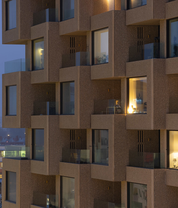
A canvas characterized by its rough texture, which arises from the aesthetic configuration created by the concrete block masonry. It is the skin of this house that seeks the balance between the material, the spatiality it contains and the ornament it exhibits. The work distributes its program in three levels, the first being composed of the garage area and the main access, the second of the social area, while the third level corresponds to the resting area with three bedrooms. The spatial organization is aimed at minimizing the impact on the terrain, taking advantage of the ascending sloping topography, which is manifested with a front facade of three levels and a rear of only two.
With a simple and direct language, the architectural concept strived for a volume conceived to be functionally tailored to its inhabitants, with its spaces that adjoin the courtyard continuously through wide sliding doors, defining a space that opens to the garden - the barbecue. Likewise, a prism implanted in isolation from its surrounding environment allows the availability of permanent ventilation and lighting of the building. Taking advantage of the strength of its location, the house empowers the exterior and absorbs it, allowing the light to flow through the interior of each environment. The rest of the construction combines structural elements such as reinforced concrete walls and columns with cement blocks, which has been left bare, devoid of any type of treatment or subsequent coatings. Rather, taking advantage of the texture, the chromatic composition of the building was complemented by applying black colour on the cement. In search of a systematic contrast to the masonry, a natural wood veneer was applied as an unbalancing factor. The rest of the materiality of the project is defined by the translucent glassware framed with black aluminium carpentry that is used to bind it to the architectural texture. The interior design of Casa Moca shows a rational and comfortable distribution of the rooms, managing to determine the most logical route between them.
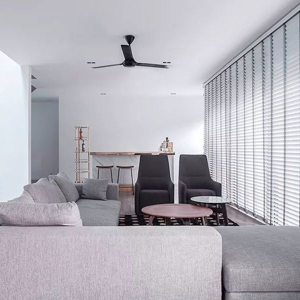
Carrying out this organization necessarily involves being clear about the master walls, which fully identify open spaces, this being a contemporary trend of interior design and minimalism by establishing a more open relationship between the different rooms of the house. In this way, the repertoire of materials has been simplified to the extreme, in order to achieve a modern environment that conveys simplicity. The floors have been paved with a light grey laminate, a tone that provides a slight contrast to the white of the walls and ceilings that enclose all the interiors, and at the same time, becomes the harmonizer with the chromaticity of the exterior of the house. And finally, the wood of all the carpentry is one of the attractions of the house, being used in a systematic way both in the doors and in the custom-made furniture.
{{item.text_origin}}

