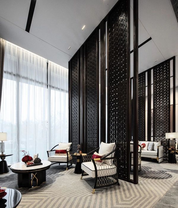
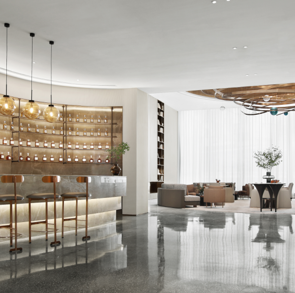
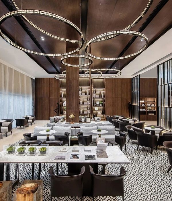
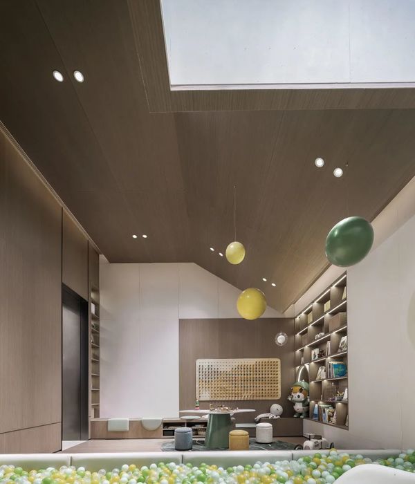
- 项目名称:隐竹日料餐厅
- 设计公司:杭州设谷空间设计有限公司
- 项目年份:2017,12
- 客户:杭州润竹餐饮有限公司
- 项目位置:杭州新天地
在此项目前,「隐竹」在杭州已有多家分店,是一个成熟的日料品牌。这次新店的设计,除了打造新旗舰的定位,设计师更注重传递品牌的深度,与对日料文化的品牌理解。
At present, “YIN CHIKU” has many branches in hangzhou, is a mature Japanese brand. In addition to the positioning of the new flagship, the designer pays more attention to the depth of the brand and the brand understanding of Japanese materials culture.
前堂 | The house
第一眼看,她更像是位于喧嚣商业体中的美术馆。餐厅的前堂一返常见商业的鲜亮与活泼,反而选择了陈列空间的留白与不争。低反差的颜色选择,柔和的灯光,平滑流畅的造型线条,无不在降低空间装饰的存在感。收敛锋芒,纯粹简单,追求“不说”的禅境。
At first glance, she looks more like an art gallery in the hustle and bustle of business. When the front hall of the restaurant returned to the bright and lively business, it chose the white space of display instead. The color choice of low contrast, downy lamplight, smooth and fluent modelling line, all reduce the existence feeling of space adornment. Converges the sharp edge, the pure simple, pursues “does not say” the zen environment.
▼美术馆般的前堂空间,a gallery-like front hall
大堂 | The lobby
大堂是简化的和室,用敷居与暖帘分隔空间。食客之间彼此共联,分享氛围。
Lobby is simplified and room, with application and warm curtain space. Diners connect with each other and share the atmosphere.
▼由前堂进入内部空间,entry way to the internal space
木材,铜,铁,接近陶土的肌理涂料,俱是日本手作匠人最常用的材质。我们在惊叹侘寂之美时,并不是因为材料的朴素粗糙,而是因为匠人的智慧,手艺,忘记时间的投入,将朴素与粗糙创造出的神奇。在隐竹的前堂,匠心的体现,是材质的调和,是视觉几何的平衡,是远见的粼粼光影、触摸时心底响起撞击回响的目锤纹。很多时候我们会发现,在形容匠人精神时,我们是词穷的,只能调用更多的感官去体验心中洞穿宇宙的银针落地。这种专注内里的表达,在商业体中创造出泾渭分明的反差。让隐竹独居魅力。
Wood, copper, iron, close to the clay texture paint, are the most common materials used by Japanese hand builders. When we marvel at the beauty of wabi-sabi, it is not because of the simplicity and roughness of the material, but because of the ingenuity and skill of the craftsman, who has forgotten the investment of time and has created the magic of simplicity and roughness. In the front hall of hidden bamboo, the embodiment of craftsmanship is the harmony of materials, the balance of visual geometry, the gleam of vision, and the eye hammer print of percussive reverberation in the heart when touching. Many times we will find that when we describe the spirit of the craftsman, we are poor in words and can only use more senses to experience the silver needles of the universe penetrating the heart. This expression of concentration creates a clear contrast in business. Let hidden bamboo alone charm.
▼木材,铜,铁,接近陶土的肌理涂料,俱是日本手作匠人最常用的材质,wood, copper, iron, close to the clay texture paint, are the most common materials used by Japanese hand builders
和而不同 | Draw but different
和室是日本传统建筑,风格简单,但细部设计却是殚精竭虑。简单与复杂的对立统一,在虚饰繁杂的都市生活中,创造天地自然。故和室被称为“隐居之所”,或“城市中的山野隐居处”,是通往冥想之路的路口。在项目中,充分发挥了和室建筑灰空间的对话作用,也制造了一些戏剧感的细节。
Hoku is a traditional Japanese building with a simple style, but the details of the design are exhausting. Simple and complex oppositional unity, in the vanity multifarious city life, create the world nature. Therefore, it is called a “retreat”, or “mountain retreat in the city”, which is the road to meditation.In the project, the dialogue function of the grey space of the room building was fully played, and some dramatic details were also created.
▼用餐空间以“和室”的形式布局,the dining area is arranged in a form of Hoku
小厢 | Small compartments
小厢是浓缩的传统日本数寄居建筑:平整的离地平台,由走廊联结,踏步,地台,障子门结构。空门窗,暖帘,用夹丝玻璃替代宣纸的障子门,营造了三种联结外界的对话尺度。有趣的是,对话的比重也有被设计,大面积的夹丝玻璃安全地联结店外,半透的暖帘可以看到一个身影,直截的空窗,仅能看见或急或缓的脚步。在纯粹的就餐空间中,坐姿正襟的食客也能找到富余变化的视觉乐趣,有所选择,将视线停留在乐意处。每个厢相互独立,避免平台共振的打扰。障子门间、地台间的空隙,成为气流的良好通道,保证餐厅的空气内部循环,新风系统带来的新鲜空气由顶部入,浊气沿着底部通道排出。常见于“枯山水”中的沙石造景,更增加了餐厅场景的庭院感,有了延伸至日式庭院的想象空间。
▼小厢位于平整的离地平台之上, small compartments are built on a flat off-ground platform
The alcove is a concentrated traditional Japanese settlement building: a flat off-ground platform, connected by a corridor, a footstep, a platform, and a barrier door. Empty doors and Windows, warm curtains, with wire glass instead of rice paper shuizi doors, create three kinds of connection outside the dialogue scale. It is interesting to note that the proportion of dialogue are designed, the wired glass of large area safely connecting outside, semi-permeable quilted door curtain can see a figure, straight window, can only see or fast or slow pace. In the pure dining space, the diners sitting upright can also find the visual pleasure of rich and varied changes. They have choices and keep their eyes on the happy place. Each box is independent of the other, avoiding the interference of platform resonance. Barrier of doors, the space between the platform and become good air flow channel, to ensure that the restaurant inside the air circulation, bring fresh air from the top into the fresh air system, a polluted gas along the bottom of the channel. The sand and stone landscape commonly seen in the “dry landscape” adds a sense of courtyard to the dining room scene and has an imaginary space extending to the Japanese courtyard.
▼夹丝玻璃替代了宣纸的障子门,wire glass are used in the traditional rice paper shuizi doors
长桌厢 | Long side
长桌厢是最简单的,也是最复杂的。一门而入,空间里只有长桌,方椅,连房顶折线都去除的无影墙。食客会费解,会拘谨,会有一种对空间、对料理的敬畏,对料理的期待也更加强烈。这时,与商场联结的廊窗形成了有趣的视觉联结:经过的消费者会看见一室严肃的食客,在一个纯粹的空间中,进行一场等待料理的仪式。
The long desk is the simplest and most complex. A door and enter, in the space only have long desk, square chair, even the no shadow wall that housetop fold line removes. The diners will be puzzled and restrained, and there will be a kind of reverence for space and cuisine, and the expectation of cuisine is even stronger. At this time, the gallery window formed connected to store interesting visual connection: after consumers will see serious diners, one room in a pure space, in a ceremony waiting for food.
▼长桌厢,dining room with a long table
当宴会开始,也许在一赞叹后,气氛一下柔软起来。食客们因为料理越来越喜悦,放下拘束,享受当下。这时从廊窗中,则是另一种只围绕食物与食客的美好关系。无论是平静还是喧嚣,设计师为隐竹带来的,一定是一种「有效」对话。在行色匆匆的商业体中,能在潜在客群的心里留下情感的涟漪,比在单纯视觉挑逗,更有价值。
When the party began, perhaps with a sigh, the atmosphere softened. Diners are more and more happy with the food, letting go of their inhibitions and enjoying the present. At this time, from the porch window, there is another kind of good relationship between food and diners. No matter be calm or blatant, what stylist brings for hidden bamboo, it is a kind of “effective” dialogue certainly. In a hurry-go-fast business, it can leave emotional ripples in the hearts of potential customers, more valuable than mere visual flirtation.
▼平面图,plan
▼立面图,elevations
项目名称:隐竹日料餐厅
设计公司:杭州设谷空间设计有限公司
项目年份:2017/12
主笔设计:谢银秋 龚海明
参与设计:卢凡及 丛钲轩 白浩祥 汪婉莹 叶邵正
项目位置:杭州新天地
建筑面积:350
摄影师:王大丑
客户:杭州润竹餐饮有限公司
{{item.text_origin}}

